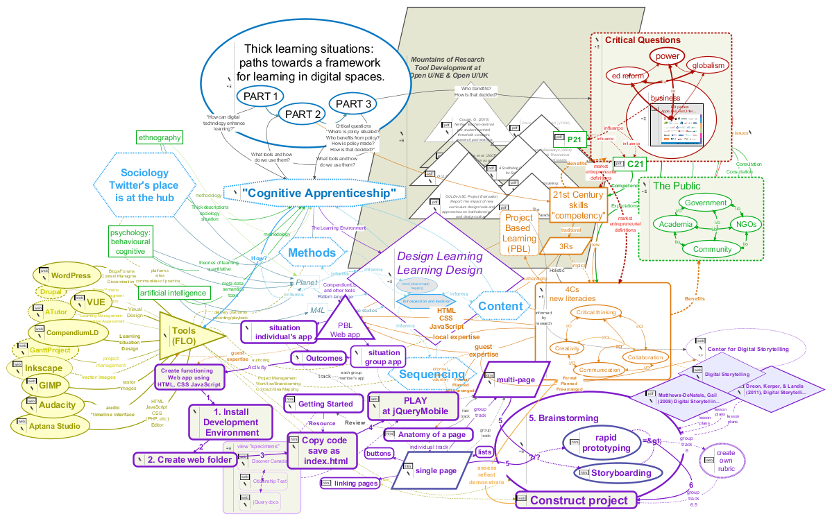
It's 53 pages on paper, with an activity in the middle.
In this Visual Understanding Environment (VUE) map
I tried to use colour and positioning to keep
the activity front and centre.
I find the current version still too tall, but the best solution would be to add distance perspective, not to squash it.
I looked at mountains of research into uses of technology in knowledge sharing, and over a dozen tools
that have been developed or adapted in ways that illustrate, facilitate, store, organize, record,
retrieve, and report the items and communications that form situations where learning happens. I conclude idea-mapping
has especially "thick" applications to planning, describing, delivering, and assessing learning situations. I discover
that software already exists that has considered this connection, but those who actually plan, describe, deliver, and
assess learning situations need to know more about it.
Fouchaux (2013) Thick learning situations: paths towards a framework for 21st-century learning design .
Appendices A-H .
Not everyone likes mind maps. People with anxiety and people who don't like mess may just see visual chaos. I showed one
person, a self-identified "linear thinker," a much simpler map they didn't find helpful; another, who
is dyslexic, said she can't stand to look at the map below. Anyone planning to use this kind of
software with groups should plan contingencies for such possibilities.

