Dec 21

Can (messy) mind maps enable tidy linear strategies within messy situations?

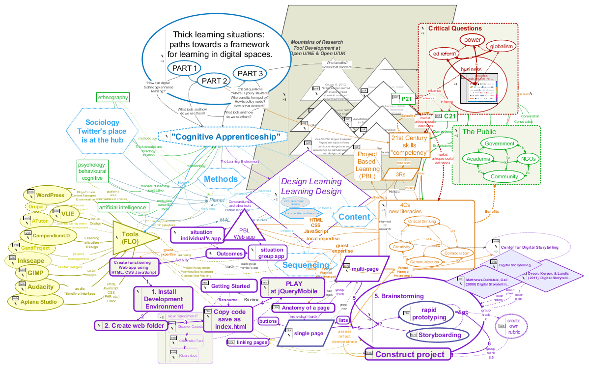
Graphic: a very messy mind map of a complex project.My research into educational, mostly open source software tools identified ones that have proven multi-tasking abilities within “authentic” learning situations (Conole and Fill, 2005; Conole, 2008). Among these, the so-called “Mind Mapping” tools stand out for what I think are several very good reasons. The image to the right, a “mind map” of a recent research project, shows the good, the bad and the ugly.

the rules common to all information systems do not cover the messy, ambiguous, and context-sensitive processes of meaning making, a form of activity in which the construction of highly “fuzzy” and metaphoric category systems is just as notable as the use of specifiable categories for sorting inputs in a way to yield comprehensible outputs.

—Jerome Bruner (1996 in Illeris, 2009, pg. 162)

It seems under-researched maybe, but I believe I saw indications, and I certainly have anecdotal evidence, that mind maps may lack meaning to people who for whatever reason(s) must solve problems in predominantly linear ways. In at least one case I’ve seen a mind map—the one of my research project at the top of the post—elicit genuine anxiety in a person with clinical anxiety disorder!

Messiness: the face of authentic learning

It’s certainly true that mind maps can get confusing. Connections become interwoven in admittedly “messy” ways—which, I argue, makes them particularly suitable to solving exactly the types of messy problems we increasingly face—although they often appear in ways that can understandably throw self-identified “linear thinkers” quite literally for a loop. It’s small wonder many people believe mind maps don’t, won’t, will never work for them. However, the same solutions cartographers have applied for centuries work in these maps too (Buckingham Shum and Okada, 2007), and are available in free tools with powerful multitasking abilities. Messiness is a fact of authentic learning situations (Collins, Joseph & Bielaczyc, 2004, pg. 19). Clinical settings and attempts to eliminate messiness can even be counter-productive (pg. 20). Describing the linear step pattern shown below in Fig. 1 (red line) Patricia Seybold says, “…we keep trying to shoehorn” Wicked Problems into that linear approach” (2013, pg. 3). I think what I’ll call linear imposition, the imposing of a linear framework or template on a non-linear situation, is at the root of Jean Lave’s “paradox” she says often causes institutionalized learning to fail (Lave, 1993, pg. 78). I believe ethnographers such as Lave have had an important impact on design thinking in education research and instructional design because of their “attempts to characterize relationships and events that occur in different educational settings. …ethnographic research produces rich descriptions that make it possible to understand what is happening and why” (Collins, Joseph & Bielaczyc, 2004, pg. 21). By “rich” descriptions Collins, Joseph & Bielaczyc mean “‘Thick,’ as in Geertz,” and by mapping these connections we contribute to the design of ‘thicker’ learning situations we hope result in deeper learning.

designVUE: lining up the non-linear

The problem is, while we may place things on lists and in lines to organize and sequence an approach, those things may have their own interconnections and internal organizations, especially if the “things” are groups of people with competing rights and interests. And so the line we draw prior to achieving full understanding of a problem is actually an imposition that changes the nature of the existing problem and causes new problems to arise. As Conklin has shown, solving problems is an iterative process.

How Humans Solve Opportunity-Driven Problems

graph plotting a linear step by step solution (red) overlayed by a process actually observed in practice (green)

Figure 1: From a 1980’s study at the Microelectronics and Computer Technology Corporation (MCC) that looked into how people solve problems. Each peak in the green line can be understood as heading “back to the drawing board,” yet each return to the drawing board carries all the experience of the previous attempts. Source: Conklin, 2006 ©2006 John Wiley & Sons, 2013 CogNexus Group. For an excellent discussion, see also Seybold, 2013.

Mitigating Mind-Map Anxiety

Mind-map anxiety might be mitigated by applying well understood principles of cartography. Buckingham Shum and Okada (2007) say the analogy to cartographic representations of physical space is valid, providing “…an ‘aerial view’ of a topic by highlighting key elements and connections,” and calling mind maps “vehicles for summarising and negotiating meaning” (pg. 27). designVUE is one college design department’s enhancement of another university’s contribution to the open source software world and visual understanding. I think designVUE’s quick formatting tools and presentation mode lets us do some of the things map makers do. Some of these things are, or should be, in grade-level curriculum requirements—perhaps giving students hands on access to free tools like designVUE might support the teaching and learning of many.

Map coloring is the act of assigning different colors to different features on a map. There are two very different uses of this term. The first is in cartography, choosing the colors to be used when producing a map. The second is in mathematics, where the problem is to determine the minimum number of colors needed to color a map so that no two adjacent features have the same color.
—Wikipedia article

There’s nothing more linear than a time-line; as the first image shows, a mind-mapping tool makes it easy to display linear progression, so if this is the only objection, it soon crumbles. In designVUE you choose the colour scheme (“fill,” “line,” font “style”) and shape.

With the Quick Prototyping tool draw a line of bubbles in a quick succession of clicks…

mind map bubbles in a line

Image 1. In VUE you can use the Prototyping tool to draw a line of bubbles with a directional arrow between, or with standard tool place the thought bubble on a line or arrow.

Any individual “bubble” in the map may consist of much messier activities. Brainstorming, for example, is a spiral of ideas, questions, answers, and arguments. In designVUE you can use colour to visually set an activity apart, but you can also create pathways that hide and reveal specific sets of bubbles—overcome cognitive overload. Or group bubbles within each other as I’ve done here with a question, answer and pro/con set that illustrate IBIS1, a system that often goes hand-in-hand another highly successful application of mind-maps: “dialogue mapping2.”

mind map bubbles of a new color added in a spiral

Image 2. Part of a brainstorming session suggesting a circular and iterative process, shown in a different colour. With “Pathways” you can hide entire sections and choose different sequences.

But wait! Yes, there’s more! In these days of collaboration linear thinkers and their strategies are as important as ever. designVUE has a presentation tool that allows teams to construct linear pathways through maps of even the most complex dialogues, in order to gain clarity, reach consensus, and explain decisions to others. designVUE also does metadata in OpenCalais, allows you to store resources and documents in the bubbles, share maps as interactive HTML documents, reuse the same maps in multiple other maps… I’m only scratching the surface.

Image 3. Showing Pathways in the workspace. Also shown are the IBIS icons for question, idea, pro and con arguments.

The Pathways panel allows you to create standard (linear) PowerPoint-like slides and bullet points, though not as effortlessly as the commercial product. VUE’s true power as a presentation tool takes some time to appreciate and master, but if your goal is to enhance a learning situation by creating memorable and meaningful visual connections between the content, and then using the same tool to convey those ideas to an audience this tool might be what you’re after.

mind map bubbles of a new color added in a spiral

Image 4. The Pathways panel allows you to show and edit more traditional PowerPoint-like slides. In effect VUE’s “Pathways” can be separate but related presentations, or audience-specific variations on a theme.

Panel closeup. The images can be sized, additional ones and text added to each slide that need not be shown in other views:

Image 5. Closeup of the expanded Pathways Panel. The order and whether it’s shown is determined here.

In Presentation mode, hitting Enter can shift to yet another view of the groups of ideas in the presentation. There’s definitely a learning curve but my early impression is this can potentially change the way you do presentations. I highly recommend this VUE tutorial for ideas and examples.

Image 6. In Presentation mode, hitting Enter can shift to yet another view of the groups of ideas in the presentation. See this VUE tutorial for examples (note the PDF for download beneath the video player).

Summary

The types of 21st century problems we increasingly understand need taming—as they defy solving by their very nature—are “wicked problems.” This necessarily includes nearly all matters of public education, indeed of public policy as a whole, where the conflicting and intersecting rights and responsibilities of multiple stakeholders is always …messy! Governments are coming to recognize this. See the Australian Public Service Commission site for one well explained example (Commonwealth of Australia, 2007). In Canada Quebec and New Brunswick have already discovered the importance of understanding certain problems’ ‘wickedness’ in these ways. “As distinguished from problems in the natural sciences, which are definable and separable and may have solutions that are findable, the problems of governmental planning—and especially those of social or policy planning—are ill-defined; and they rely upon elusive political judgement for resolution. (Not “solution.” Social problems are never solved. At best they are only re-solved—over and over again.)” (Rittel and Webber, 1973, pg. 160).

Mind mapping, undertaken thoughtfully and with purpose (see Jeff Conklin’s video: The Limits of Conversational Structure), has proven its value in all aspects of teaching and learning. As a teacher I used it much as John Budd did here, and as an instructional designer I use it as a graphic organizer. When mapping strategies are used to both record, and then map dialog to describe real situation, and when that’s done openly and collaboratively as in situations such as Conklin has described and reproduced in practice for years it can lead to shared understanding and conflict resolution.

I don’t think it’s fair, or rational, to presume that everyone is going to instantly drop PowerPoint and buy into a mindmap-based workflow, and that’s not what I’m suggesting. While dialogue mapping can handle wicked problems, it can also do meeting minutes, so consensus can be achieved and documented by the most mutually comfortable and practical means—and the cartographers have a single one stop tool to gather and document the entire process, or to communicate it to others.

Conlusion

If we embrace all the 21st century models, or “competencies” seen emerging, the primary and inescapable one at the base of many others is asynchronous collaboration via digital networks. Can it not simply be that the divergent thinkers map their thoughts in collaboration with linear thinkers who further delineate the why and how of their musings? Taking up perhaps the next most agreed upon 21st century learning objective, critical thinking, it seems likely we can seek solutions to simple problems and taming strategies for wicked ones, discerning the difference. Mind mapping tools are web enabled and metadata ready. A strategy for taming wicked problems that uses mind maps, argument mapping or Conklin’s trademarked Dialogue Mapping, keeps track of pros, cons, and rationale, and documents decisions making around simple problems, but offers a powerful tool for the building of the shared understanding that must precede consensus around the taming of wicked ones. Formal training can be found, but the VUE, designVUE and various Compendium software sites themselves, Conklin’s and YouTube are probably the place to start—to get an, ahem… visual understanding of what mind maps and mind mappers might bring to which ever debate you’re having.

Maybe “Can messy mind maps enable tidy linear strategies within messy situations?” isn’t the right question. In my experience it still requires steps and sequencing to deal with the issues, but the graphic organization—the visual understanding—provided by maps in programs like VUE and Compendium, in the right hands, can really help you get a grip on the situation. It very well may need both types of thinking, and that well may require collaboration. Maybe the question to be asking is, “Are there any concept and conversation cartographers in your workplace or your PLN?”

§

Read more about mind maps


    Notes:

  1. Issue-Based Information System (IBIS) was invented by Werner Kunz and Horst Rittel as an argumentation-based approach to tackling wicked problems – complex, ill-defined problems that involve multiple stakeholders. (more)
  2. Dialogue Mapping™ is trademarked by Jeff Conklin & CogNexus Institute, who describes it as “…a radically inclusive facilitation process that creates a diagram or ‘map’ that captures and connects participants’ comments as a meeting conversation unfolds. It is especially effective with highly complex or “Wicked” problems that are wrought with both social and technical complexity, as well as a sometimes maddening inability to move forward in a meaningful and cost effective way.” (more) [Demonstration PDF]

§

the assumptions proposed here amount to a preliminary account of what is meant by situated learning. Knowledgeability is routinely in a state of change rather than stasis, in the medium of socially, culturally, and historically ongoing systems of activity, involving people who are related in multiple and heterogeneous ways, whose social locations, interests, reasons, and subjective possibilities are different, and who improvise struggles in situated ways with each other over the value of particular definitions of the situation, in both immediate and comprehensive terms, and for whom the production of failure is as much a part of routine collective activity as the production of average, ordinary knowledgeability.
—Jean Lave

More VUE

The Visual Understanding Environment (VUE) is an Open Source project based at Tufts University

VUE is very well documented. The English user guide is here.

designVUE is a branch of VUE. It is an open source project based in the Design Engineering Group of the Mechanical Engineering Department at Imperial College London.

CompendiumLD is either fierce competition… or you can do as I do and use both! See the Learning Design-specific “stencils” in the screen shots. They’re easily ported to other Compendium flavours, and you could apply the concept in VUE with your own icons and very little extra trouble.

Reference

Bruner, Jerome (1996) Culture, mind, and education in Contemporary Theories of Learning – Learning theorists … in their own words, Knud Illeris ed., 2009, NY: Routledge; Edition published in the Taylor & Francis e-Library, 2009.

Buckingham Shum, Simon and Okada, Alexandra (2007). Knowledge Mapping for Open Sensemaking Communities. In: Researching open content in education – OpenLearn 2007, 31 Oct 2007, Milton Keynes, UK.

Collins, Allan & Joseph, Diana & Bielaczyc, Katerine (2004), Design Research- Theoretical and Methodological Issues, The Journal of the Learning Sciences, Vol. 13, No. 1, Design-Based Research:Clarifying the Terms. Introduction to the Learning Sciences Methodology Strand (2004), pp.15-42

Commonwealth of Australia (2007) Tackling Wicked Problems: A Public Policy Perspective, [Archived]

Conklin, Jeffrey (2006) Dialogue Mapping: Building Shared Understanding of Wicked Problems, West Sussex: John Wiley & Sons., Ltd., 242 pp.

Conklin, Jeff (2006b) Dialogue Mapping Demonstration, [unspecified journal, citation incomplete] CogNexus Institute, pp. 249-251 [Demonstration PDF].

Conole, G. and Fill, K. (2005). A learning design toolkit to create pedagogically effective learning activities Journal of Interactive Media in Education 2005(08). [PDF: jime.open.ac.uk/2005/08]. Gráinne Conole and Karen Fill, University of Southampton. Page 1 Published 26 September 2005 ISSN: 1365-893X [uses CompendiumLD]

Conole, G. (2008). Capturing Practice: The Role of Mediating Artefacts in Learning Design. Handbook of Research on Learning Design and Learning Objects. (Eds.) Lockyer, L., Bennett, S., Agostinho, S. and Harper, B. ISR Press. [Pre-print of learning design chapter on using compendium].

Lave, J., & Wenger, E. (1991). Situated learning. Legitimate peripheral participation. Cambridge, England: Cambridge University Press.

Lave, Jean (1993) The practice of learning in Contemporary Theories of Learning – Learning theorists … in their own words, Knud Illeris ed., 2009, NY: Routledge; Edition published in the Taylor & Francis e-Library, 2009.

National Collaborating Centre for Healthy Public Policy (2012) Tackling Wicked Problems in the Built Environment: Of Health Inequalities and Bedbugs [Workshop details]

Rittel, Horst and Melvin Webber (1973) “Dilemmas in a General Theory of Planning,” Policy Sciences 4, Elsevier Scientific Publishing, Amsterdam, pp. 155-169.

^ Seybold, Patricia B. (2013) How To Address “Wicked Problems” – Use Dialogue Mapping to Build a Shared Understanding and Evolve a Group’s Thinking, book review, [HTML | PDF]

Nov 24

JavaScript the least of (my) hurdles with MIDI.js

On #musedchat Monday Nov 18 I saw an opportunity to mention an open source Scoring/Engraving tool and was soon encouraged to send more links to open source resources. I’ve been collecting such links in the bookmarks of various browsers for years, and I’ve followed through on my initial interest to various degrees, so in some cases I found myself checking links along with my memory. In one case—MIDI.js—I said a big “Oh yeah! I was gonna try installing that, wasn’t I?”

How easy it is to try out any of the hundreds of thousands of interesting and potentially useful JavaScript offerings one can find on the Internet depends a lot on how much documentation the developer and interested community have provided and good examples of the code in (ahem) “authentic situations.” No matter how good it is, if you want it you’ll soon have to view source and dig in. The code behind MIDI.js looked to me daunting, but on closer inspection it turned out the biggest hurdle was recognizing the playlist of MIDI files is an array of Base64-encoded strings hard-coded in the file. If you know what that is, and if you can encode your MIDI file as a Base-64 string then copy/paste it over the ones in the original example—and if you set up the folder structure identically to the original (clone the Git repository straight into /xampp/htdocs if you work with a LAMP setup like mine)—it just works! But it looks just like the author’s.

The design is not responsive1 and doesn’t fit my blog or mobile device. The colours are very cool but I don’t need them. The note display has so many pedagogical applications my brain is exploding—but it doesn’t fit on my pages, same goes for the player and buttons. The JavaScript knowledge I need is “just enough” to identify where to safely slice and dice the code and recognize the very few places I might change something. It was more important I knew Base-64 encoding is something I’d likely find a web site to do. The highest-level skill needed here is actually CSS. I need to restyle the player so it fits my pages in the contexts I expect it to be viewed. And I want those notes to play along exactly as they do now, just in a completely different layout.

Here’s what it looks like today. (It’s not worth listening to in anything but Chrome).

An undefined error originally came from this line, but I haven’t found where MIDI.lang is supposed to be defined, and the sentence really doesn’t tell me anything I care to know if I define it as “English.” I made sure the page has a title and I even gave it a language attribute but no luck only by hard-coding it as shown below could I stop it so far. Will dig in [to the MIDI object, its properties and methods] later.

// I added...
// Quick suppression of undefined
MIDI.lang = MIDI.lang || 'en-ca';
/// above...
// this is the language we are running in
var title = document.getElementById("title");
title.innerHTML = "Sound being generated with " + MIDI.lang + ".";
// I also added at line 108
pausePlayStop(true);  // Sorry Gasman. Autoplay is just wrong!
// Just above that I see <code>song[songid++%3]</code>, the '%3' implies something hard-coded that applied to the fact there used to be 3 midi files. To be continued... 
Oct 03

Where learning happens, there shall ye find teachers

It’s hard to imagine anyone arguing that the digital age, social networking, animation, other event timing software (from Adobe Captivate to Mozilla’s Popcorn & Butter) and 24/7 access won’t change—haven’t already changed—the way teaching, learning, and schooling are done in the 21st century. But I’m becoming increasingly vexed by those suggesting technology will replace teachers, that for-profit social networking platforms will replace professional development—or that either of those propositions is a good idea.Wordle including 21st Century Skills and other current terminology

What has been will be again,
what has been done will be done again;
there is nothing new under the sun.

Ecclesiastes 1:9

I’ll dispense with the obvious semantic argument right away: even in self-guided learning there is a teacher—we say “I taught myself!” If informal learning is truly “a spontaneous process of helping people to learn” and it really “…works through conversation, and the exploration and enlargement of experience…” if its “…purpose is to cultivate communities, associations and relationships that make for human flourishing…” then not only do I hope we all find and fill that role almost every day—I shake my head in bemusement at the eagerness with which many, perhaps even TVO’s perspicacious and typically uber-informed Steve Paikin, seem to be anticipating teaching’s impending doom.

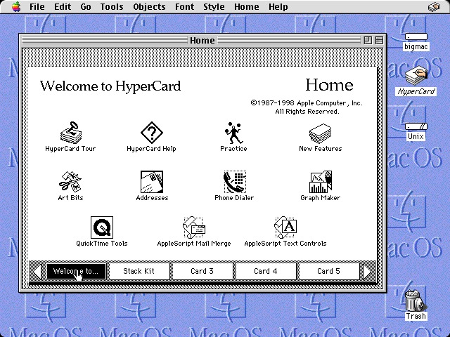
Screenshot of Hypercard from a 1980s era Macintosh Performa

Screen shot of 1980s era Macintosh Performa and Hypercard, technology that “changed the way we learn” over 30 years ago. Source: Stanislav (2011)

Fortunately, I don’t believe the host, nor any of the panel members in this thought provoking series actually believe this rhetoric; in places like Canada where the commitment to public education is for the time being less precarious than many other places, this can still be said with tongue-in-cheek. Overall, throughout the musings of this panel the vital role played by teachers, mentors, coaches, and guides was implicit. The skills, creativity and imagination professional educators bring to the situations they design and create for the purpose of conveying the knowledge they need to share, was celebrated openly. Overall there was full recognition of the approach most strongly suggested by the literature and research—and who can be seen to have been doing the “thickest” (à la Clifford Geertz1) research for decades. [Update: yours truly on Geertz.] I was schooled in the public school system of Bethlehem, PA, USA in the 1960s. My teachers sat us in circles, let students lead reading groups while they circulated giving individualized instruction, we split into groups and did jigsaw investigations, returned and taught our classmates how to put the pieces together. Tropes and talking points, pompous assertions around “industrial” or even “agrarian” paradigms notwithstanding, throughout history educators, including teachers in the trenches, have always led the search for ways to improve and enhance the process of helping people to learn.

The Cognitive Apprenticeship framework of the 80s identified elements of the mentor/apprentice relationship (e.g., “scaffolding“) that have been essential to teaching and learning for centuries, and educators ever since have been mapping these to specific strategies and the software that supports them.

A tool such as Twitter can be a useful tool, even a powerful one in the right hands. But it’s absurd to think a platform limited to messages 140 characters, blocked by governments and firewalls, adopted thus far by a trivial percentage of teachers would be a good pick to “replace professional development,” as one person on the #Learning2030 hashtag asked Wednesday night. Leave alone the fact Twitter’s priority is making money for its shareholders, and that we don’t know what this corporation may do, or not, to protect privacy. About 80% of messaging on Twitter is self-promotion—researchers coined a new term for such Tweople, “Meformers,” in contrast to “informers” (Naaman,Boase,& Lai, 2010). While I agree teachers should try Twitter, I see Twitter being used as a hub, the water cooler in the staff room around which informal learning happens, contacts, connections and preliminary plans to make plans. Just like pencil and paper, Twitter’s the right technology for many jobs. Use it for what it does well.

Several panels have noted how kids “intuitively” adapt to new technology, but I heard none remark that human-computer interface designers have been striving to design “intuitive” interfaces since there have been computers to design interfaces for. A book written on the topic in 1987 was still in use in 2010.

It’s wonderful to be in Ontario having important and fruitful conversations with genuine reformers, so sincerely devoted to student engagement, deep learning and the new possibilities awaiting discovery by all of us. There’s no need to believe we are the first to have these conversations, nor will we be the last.

§

  1. For many decades, forward-thinking, innovative educators have been engrossed with the exploration of applications technology. See, among many examples, posts in my own Cognitive Apprenticeship category and the various works in their reference sections. For evidence of the extensive range technology-enhanced-learning-focused 20th century collaborations across disciplines, look no further than R. G. Segall (1989), Thick descriptions: a tool for designing ethnographic interactive videodiscs, ACM SIGCHI Bulletin, Volume 21 Issue 2, Oct. 1989 pp. 118 – 122. While doing so please remember, there’s nothing new under the sun.

Further reading

Ghefaili, Aziz (2003) Cognitive Apprenticeship, Technology, and the Contextualization of Learning Environments, Journal of Educational Computing, Design & Online learning Volume 4, Fall, 2003.

Harkinson, Josh, (September 24, 2013), Here’s How Twitter Can Track You on All of Your Devices, Mother Jones, retrieved 2013-10-03

Junco, Reynol; Elavsky, C. Michael and Heiberger, Greg (2012), Putting twitter to the test: Assessing outcomes for student collaboration, engagement and success, British Journal of Educational Technology (2012) 1-15. (Wiley Online Library)

Lave, Jean and Wenger, Etienne (1991). Situated Learning: Legitimate Peripheral Participation. Cambridge: Cambridge University Press.

Lave, Jean (1996). Teaching, as Learning, in Practice, Mind, Culture, and Activity (3:3) pp149-164.

Lowe, Tony & Lowe, Rachael (2012) Twitter in learning and teaching – literature review (webducate.net)

Stanislav (2011), Why Hypercard Had to Die, blog post, http://www.loper-os.org/?p=568

Naaman, M., Boase, J. & Lai, C. (2010) Is it really about me? Message Content in Social Awareness Streams. Proceedings of the ACM Conference on Computer Supported Cooperative Work, February 6-10, 2010 in Savannah GA (PDF).

Webducate [‘webducate.net’ website/blog] (2012), Twitter in learning and teaching – literature review http://webducate.net/2012/08/twitter-in-learning-and-teaching-literature-review/, retrieved 2012-12-03

Wenger, E. (2006) Communities of practice, a brief introduction, http://www.ewenger.com/theory/, HTML retrieved 2011-11-03 or http://wenger-trayner.com/wp-content/uploads/2012/01/06-Brief-introduction-to-communities-of-practice.pdf, PDF retrieved 2011-10-03.

Richard studied music as a teenager with Trevor Payne at John Abbott College and attended Berklee College of Music in Boston. He has performed across Canada with full-time rock bands since the early 80s. He’s been a teacher of rock, jazz & classical guitar, first as a sub for his own private teacher, formally at the now defunct Toronto Percussion Centre, and taught at The Arts Music Store in Newmarket, Ontario, for 6 years. He holds the degrees of Bachelor of Fine Arts Music (Special Honours), Bachelor of Education, and Master of Education from York University, plays guitar and trombone, and taught grade 6-8 band, math and computers (HTML and yes, Hypercard!) at the Toronto District School Board and North York School Board.

Sep 30

LilyPond with Frescobaldi: open source music engraving

LilyPond is open source music engraving software. LilyPond “…was designed to solve the problems we found in existing software and to create beautiful music that mimics the finest hand-engraved scores.” It produces some of the finest looking scores you can imagine, and almost any style of note or notation you can imagine. But it’s a scripting language—which for many people makes it very difficult to learn, and much too tedious to use. Enter Frescobaldi.

Frescobaldi is an open source editing tool for LilyPond. I won’t pretend there’s no learning curve, but if you want to print absolutely stunning music scores and enjoy learning technology it’s worth it, and I’ll help you get started. And if you’re a music educator I’ll make some suggestions about how I might use this in teaching, albeit at a high school level or higher, with students who have already learned the basics of reading. Thanks to Frescobaldi’s built-in MIDI player I see applications to ear training, as well as more obvious help with general notation problems. I’ve also screen-recorded some of my first explorations, and I intend to edit them down and add audio, and continue with a video tutorial, hopefully in just a few days.

Both programs run on Windows, Mac or Linux, but there’s no Mac or Linux installer for Frescobaldi, so if you’re not running Windows you may need some extra skills there. First, download and install both programs using the links below. You will not need to launch LilyPond. You’ll launch Frescobaldi, tell it where to find LilyPond and Frescobaldi will take it from there.

Software links

LilyPond is a music engraving program, devoted to producing the highest-quality sheet music possible. Download

Frescobaldi is a LilyPond sheet music text editor. It aims to be powerful, yet lightweight and easy to use. Download

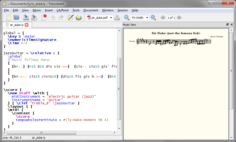
  1. On first launch Frescobaldi opens an empty document. You type and insert LilyPond code in the left Editor panel and then press the LilyPond icon ion the toolbar to render a gorgeous PDF in the right, or Music View panel. hide image Screen shot
  2. Choose EditPreferences… show image
  3. Set path to LilyPond show image
    Windows default: C:/Program Files (x86)/LilyPond/usr/bin/lilypond-windows.exe
  4. Choose ToolsPreferencesSetup New Score… (Ctrl+Shift+N) to open the Score Setup Wizard show image
     Other items on this list will be of great interest soon… I used the Quick Insert tool and the MIDI Player early in my very first score.

    The Score Setup Wizard lets you set the following up front—especially recommended your first time, as once you create the file you’ll need to get code snippets from the documentation, the other tools in the Tools menu, another file, or know what to type.
     You might even want to fill in all the fields and save a MasterSnippet.ly file for later reference. Frescobaldi also has its own built-in Snippets manager.

    1. Titles and Headers show
    2. Parts show
    3. Score Settings show
       Be sure to try the Preview button!

To get started I just picked 8 bars of a Stevie Wonder tune I happened to have loaded in iTunes. You can see the first 2 bars of the lick on the right of the screen shot below. The script on the left side, which you’d have to write from scratch without an editor, demonstrates rather aptly I think, why a tool like Frescobaldi can likely make LilyPond more useful to a much larger community. What will be much easier to demonstrate in a video tutorial is how I copy/pasted a snippet of code from the documentation into the editor and then tweaked it until I got what I wanted. The notes you see on the right are formed entirely by this part of the script on the left. 'is' as a sharp is not intuitive (unless you speak Dutch), but now that I’ve told you perhaps you can see the 4, 8 and 16 that sets note values, ‘r’ for rest, and the lower case note names, key of B Major. The tildes (~) create the ties, and I entered staccato and accents using the Quick Insert tool shown in the left panel of the final screen shot below.
 All your music goes immediately after the % Music follows here. and before the closing curly brace (}) that lines up flush left with the instrument name above it and the code \score below it (see both screen shots beneath the following code snippet).

// You can group and nest notes in curly braces for readability.
// Here I've grouped each beat within each measure on its own line.
{
{b4-.} {r16 b16 dis cis-&amp;gt;~}  {cis-. cis16 gis' fis-&amp;gt;~} {fis8-. fis,16 gis}
}
{
{b8-&amp;gt;-. cis16 cisis16} {dis16 fis gis b-&amp;gt;~}  {b16 cis16 cisis dis-&amp;gt;~} {dis4-.}
}

Screen shot

By the time I’d finished I’d opened the MIDI Player to check my work. You need to press the Engrave button to refresh the output on the right (there are further options under the LilyPond menu). Frescobaldi supplies the bar lines based on the time signature in the score settings, and plays audio—I feel those two facts have pedagogical implications. I slowed down my 8-bar passage using Audacity, played them side by side, and by refreshing the output was able to see and hear what I had right and wrong along the way.
Screen shot
I hope this is enough to pique your interest. There’s another LilyPond editor I plan to try soon too, Denemo, highlighted with even more on the LilyPond site. It looks quite sophisticated, but I can tell I’ve barely scratched the surface of Frescobaldi, which was intuitive enough out of the box to keep me intrigued and progressing—getting this far was fun! Please use the comments section and stay tuned for some video tutorials as I get in further.

§

Richard studied as a teenager with Trevor Payne at John Abbott College and attended Berklee College of Music in Boston. He has performed across Canada with full-time rock bands since the early 80s. He’s been a teacher of rock, jazz & classical guitar at the now defunct Toronto Percussion Centre, and at The Arts Music Store for many years. He holds the degrees of Bachelor of Fine Arts Music (Special Honours), Bachelor of Education, and Master of Education from York University, plays guitar and trombone, and taught grade 6-8 band at the Toronto District School Board and North York School Board.

Jun 18

Bookmarklets for fun and practice

Bookmarklets are JavaScript links that can be stored in your browser’s Bookmarks or Favorites folder, or attached to a bookmarks toolbar, and then used to do something relative to that page. I think bookmarklets have a lot of value for teaching and self-teaching JavaScript.

What can I learn playing with bookmarklets?

You need to create and use a fundamental unit of HTML: a link (also known as “anchor”; <a href="somewhere">Link</a> ). You can start with the most basic javascript:alert('Hello world');. You can learn how to use a closure javascript:(function(){ alert('Hello world'); })();. You’ll be forced from the start to pay close attention to syntax. If you haven’t yet, you’ll quickly figure out how to use Firebug (and/or any modern browser’s “F12 Developer Tools”) to inspect DOM elements to get their id and other properties. Ultimately you’re limited only by your skill, which will improve quickly, and imagination. What would you change about the blog page you’re reading now, if you could?

Where to start?

I started with a pet peeve about a page I visit regularly. My first bookmarklet ever hides the right column in Facebook, so I don’t have to see the ads. Take that, Mark! If you click the link below while on this page nothing will happen. But if you drag the link to your Bookmarks Toolbar (in Firefox, “Bookmarks Bar” in Chrome, etc…) do that while viewing your Facebook page (or any page that coincidentally has a right column div with id="pagelet_side_ads") you will toggle its visibility.

Bookmarklet1: Toggle FB ads Drag the link to your bookmarks bar to try it.

To embed a bookmarklet so it can be dragged to the toolbar you just place a link on your Web page:

<strong>Bookmarklet: <a href="javascript:(function(){var adsDiv=document.getElementById('pagelet_side_ads'),isHidden=adsDiv.style.display==='none';if(isHidden){adsDiv.style.display='inline-block';}else{adsDiv.style.display='none';}})();">Toggle FB ads</a></strong> 

The imagination runs wild

Still milking my own pet peeves, I wanted to collect lyrics of several songs I needed to learn for the weekend warrior band I play in. A recurring pattern is, we find a song by an artist that is a good fit for our sound, and due to that we later add 3 or 4 more by the same artist. Besides, I just like having lyrics handy… why not just get all the lyrics for that artist at once? But that would mean a lot of clicks and copy/paste! With some intermediate JavaScript you can collect all the links and titles, visit each page in a queue, get just the lyrics you want, and display them in one place in a fraction of the time. To engage students and make meaning of any learning situation requires context and relevance. Do you know any young people who like music, and might be engaged by collecting lyrics of their favourite artists?

I may explain this code in another post, but for now it’s about bookmarklets and an example of what one might do with one. If you don’t understand this paragraph you’ll need to do some vocabulary homework. This script only works at www.lyrics.com. That page has a version of jQuery installed so I used it. To write the script I used Firebug to identify IDs and classes of elements on the page that I use as “selectors” to have access. I fiddled in the console until I had a working script. Meticulous syntax is important… your script goes on one line, so semi-colons are in, comments are out.

Bookmarklet: Get Lyrics This works on Artist pages at www.lyrics.com

This script is quite a bit more involved than the first. I did succeed in making it work in the link code like the first one, but there’s an easier way. In order to make more complicated scripts work you should use the bookmarklet to load your script from a file on your server. I created rcf-get_lyrics.js and placed it on this server. You can copy/paste the script below and just change the path to point to your own file.

javascript:(function(){var url="http://www.rcfouchaux.ca/rcf-get_lyrics.js",n=document.createElement("script");n.setAttribute("language","JavaScript");n.setAttribute("src",url+"?rand="+new Date().getTime());document.body.appendChild(n)})();

I’ll discuss the code in more detail in a future post, but quickly, you create a script element and set the source to the file, then append this new element. There’s a unique identifier, which I’m not using for anything right now, created from the time and appended to the url.

Few limits

The most impressive bookmarklet I’ve ever seen, one that immediately became essential to all my JavaScript learning and development, is Alan Jardine’s Visual Event. Visual Event is an open source JavaScript bookmarklet which provides debugging information about events that have been attached to the DOM (Document Object Model; it means the entire web application represented by the “web page” loaded in the browser’s window).

Alan’s script demonstrates how to load a complex script off a server using only a small manageable amount of code in the bookmarklet itself. As you see, I borrowed it but removed his protocol check for simplicity. I think the aforementioned date/time “query string” he adds prevents the browser from caching the script indefinitely, but I didn’t research that—it’s a guess.

Another impressive project that’s available as a bookmarklet is pjscrape. If I wanted to turn my lyrics scraper into a real utility I’d probably start with pjscrape.

Update 2: I’ve placed both the bookmarklets on their own page. I expect I’ll add to the list.

Update 3: I’ve added a variation on the Facebook ad hider, using display:none and targeting only the ads—compare the two and try to figure out what’s different. I’ll add all future updates on the bookmarklets page.

§

  1. This was updated since original publication and now uses id="pagelet_side_ads" and display:none;
May 20

Visual Understanding Environment (VUE) as a presentation tool

VUE, and its design-centric extension, designVUE, are concept-mapping tools with rather extraordinary superpowers. In fact if you think they look like simple tools for making mind-maps I’m here to nudge you to take a closer look. Mind map being created in VUE.

Metadata

Does quickly and invisibly making your content “more accessible, interoperable and valuable” sound good? Have you heard of “…Web 3.0, the Semantic Web or the Giant Global Graph…?” These two well-connected apps support OpenCalais and other meta-data helpers.

While the VUE site is essential for resources and documentation, I recommend installing and using designVUE. Even if you don’t use IBIS argumentation, what they refer to as “bi-directional hyperlinking between files,” known elsewhere in designVUE as “wormholes” (and in Compendium as “transclusion,”) or the ability to place one map within another, is a powerful ability that separates tools like VUE and Compendium from the plethora of mind mapping tools available.

Presentation tool

That’s what I’m learning first—the built-in presentation tool. There’s not much more I can add about it at this point than what’s in this rather comprehensive overview/tutorial (more overview than tutorial, maybe?), so with no further ado…

Next

I seem to be able to screen record these presentations with another open source program, so if that pans out I’ll share it then. I think it’ll definitely take some practice thinking about presenting in a different way, but there’s a great deal of evidence that idea maps, visually connecting the dots, and the activities such as argument mapping that are associated with them a) may have a natural fit with social networks and social learning, and b) organize data in ways consistent with the human brain (see for example Conole & Fill, 2005 and its extensive reference list).

§

More

The Visual Understanding Environment (VUE) is an Open Source project based at Tufts University

designVUE is a branch of VUE. It is an open source project based in the Design Engineering Group of the Mechanical Engineering Department at Imperial College London.

Conole, G. and Fill, K. (2005). A learning design toolkit to create pedagogically effective learning activities Journal of Interactive Media in Education 2005(08). [PDF: jime.open.ac.uk/2005/08]. Gráinne Conole and Karen Fill, University of Southampton. Page 1 Published 26 September 2005 ISSN: 1365-893X

Calais Marmoset is a simple yet powerful tool that makes it easy for you to generate and embed metadata in your content in preparation for Yahoo! Search’s new open developer platform, SearchMonkey, as well as other metacrawlers and semantic applications.

May 10

Are you “informer,” or “meformer?”

Twitter infographicMor Naaman, Jeffrey Boase, and Chih-Hui Lai of Rutgers are on the list of researchers who’ve published early about Twitter. Naaman, Boase and Lai (2010) bring interesting new terminology to the table, casting Twitter as a member of a class of software described as “social awareness streams” Three things distinguish a social awareness stream from other communication: “…a) the public (or personal-public) nature of the communication and conversation; b) the brevity of posted content; and, c) a highly connected social space, where most of the information consumption is enabled and driven by articulated online contact networks.” (pg. 189). Does property “c” include “Personal Learning Networks (PLNs)?”

Research questions

…we use Ward’s linkage cluster analysis to categorize users based on the types of messages that they typically post. … The analysis resulted in two clusters, which we labeled “Informers” (20% of users) and – to suggest a new term – “Meformers” (80%).
Naaman, Boase and Lai (2010, pgs. 191-2), emph. mine

The researchers asked, 1) What types of messages are commonly posted and how does message type relate to other variables? 2) What are the differences between users in terms of the types and diversity of messages that they usually post? 3) How are these differences between users’ content practices related to other user characteristics? The entire study is worth a look (link below), but a summary here might be a good influence on the types of Personal Learning Networks we create.

Messages fit into 4 categories: “information sharing (IS; 22% of messages were coded in that category), opinions/complaints (OC), statements (RT) and “me now” (ME), with the latter dominating the dataset (showing that, indeed, “it’s all about me” for much of the time). Overall messaging divided into 2 types, “Informers” (20% of users) and then Naaman, Boase and Lai suggest a new term: “Meformers,” into which fall the Tweets of 80% of the users in the study. [The Figure] shows the mean of the average proportion of messages in the top four categories for each user” (pg. 191).

graph, informers vs meformers

Mean user message proportions for the four main categories, breakdown by cluster.
Source: Naaman, Boase and Lai (2010, pg. 191)

What else do we know?

Tony & Rachael Lowe have done a Twitter in learning and teaching – literature review collecting what we’re learning about Twitter in one place. They highlight in particular one by Reynol Junco, C. Michael Elavsky, and Greg Heiberger (2012), Putting twitter to the test: Assessing outcomes for student collaboration, engagement and success in which they show that faculty participation on the platform, integration of Twitter into the course based on good theory-driven pedagogy, and requiring students to use Twitter are key to improving outcomes that I intend to review on its own soon.

Further questions

Here are some of mine:

Are these numbers still true in 2013?
Are we informers sometimes and meformers the rest of the time?
Are there other “clusters” to be discovered?

Please use the comments and ask some of your own questions here!

§

Reference

Junco, Reynol; Elavsky, C. Michael and Heiberger, Greg (2012), Putting twitter to the test: Assessing outcomes for student collaboration, engagement and success, British Journal of Educational Technology (2012) 1-15. (Wiley Online Library)

Lowe, Tony & Lowe, Rachael (2012) Twitter in learning and teaching – literature review (webducate.net)

Naaman, M., Boase, J. & Lai, C. (2010) Is it really about me? Message Content in Social Awareness Streams. Proceedings of the ACM Conference on Computer Supported Cooperative Work, February 6-10, 2010 in Savannah GA (PDF).

Apr 07

Learner Privacy

Heidi Siwak has what strikes me as a very important post on student privacy, that really extends to participants of any kind in all kinds of online learning situations. She’s shared the slides from a presentation she did for the Association for Media Literacy that raises some important issues, and makes some important arguments. I highly recommend her post and presentation, linked above with a direct link to Information and Privacy Commissioner/Ontario’s Operationalizing Privacy by Design: A Guide to Implementing Strong Privacy Practices.

A lot of research is still required here, but it will become easier when those in the know have compiled some practical lists of things we may want to do, and best practices for addressing learning participants’ privacy. I have this contribution to the list.

Quite recently I was responsible for posting a set of learning videos that are streaming from YouTube onto my own organization’s Web site as “embedded iframes.” I instinctively chose the high-privacy URL pattern from the choices. Heidi’s post vindicates my gut feeling, which falls under Office of the Information and Privacy Commissioner/Ontario’s Foundational Principle #2, Privacy as the Default Setting. This should be considered a “best practice” for educators.

The pattern is (irrelevant pieces faded)…
https://www.youtube-nocookie.com/embed/EOicdh2C8A0?rel=0
Two parts of that are for the end-user’s protection: https sends information in an encrypted format, and youtube-nocookie.com is a domain YouTube—to their credit—has set up for privacy by not using cookies to read and write to your hard drive, exposing information about your surfing habits.

A third part worth noting is the ?rel=0 at the end. That protects my organization and the end-user from random “Related Videos” after the video, that may or may not be appropriate. If your YouTube link for any reason already has a ?anything=anything you should leave that intact and add &rel=0 to the end, e.g., ?x=y&rel=0.

The other part of the URL is the video ID. If you follow that link it takes you to the first video in a series of 5, on YouTube. We “embedded” them on our own site because there’s much more to it than that, so if you’re interested in that content, the entire series (Working Together: The Ontario Human Rights Code and the Accessibility for Ontarians with Disabilities Act) is here.

Please feel free to comment, and leave any tips you may have for preserving Privacy By Default.


Further Reading

Association for Media Literacy
HTTP Secure (Wikipedia)
Office of the Information and Privacy Commissioner of Ontario


§

Mar 13

On Webmasters and PluginMonkeys (reprise)

I’m very fond of saying I first learned web design—HTML, JavaScript and CSS—the same way I learned guitar: by “stealing” other people’s best licks. When I took music in Pennsylvania public schools in the 60s we had an itinerant music teacher once or twice each week, and classroom teacher-led music once or twice more. We learned every good boy deserves fudge and we sang songs “by note,” and songs “by rote.” We were taught musicianship. But there was never any suggestion the goal was for any of us to become professional musicians. I’ve been thinking about that ever since I learned “entrepreneurship” is receiving top billing local curriculum as a universal 21st Century competency (e.g., C21, P21). Not that there’s anything wrong with that!

Informal learning is valid and important

Graphic, reads I learned html same way as guitar, by stealing other people's licks

Part 1 of this series was written over a year ago when I first heard the man I considered my Jimmy Page of the JavaScript world, Douglas Crocker, refer to my kind dismissively as “Webmasters…Generally they weren’t very smart.” Dion Almaer suggested the term “jQuery Plugin Monkeys,” to much laughter. To summarize, I’ve embraced the term in much the way U.S. Democrats embraced “Obamacare.” To continue, then as now I’ve always approached the WWW as an educator asking, “How can this help me share what I know?” I learned, informally, what I needed to know, when I needed to know it. Dedicated CompSci folks always did much more, and way cooler stuff in much less time (and their stuff scales!). Yet I think knowing their language gives my ideas a better chance of being realized. Continue reading

Feb 19

Design Learning, Learning Design

In 1981 “cognitive apprenticeship” was a nascent framework proposed by early researchers with an eye on computer-assisted design of computer-enhanced learning environments that are “situated.” This means “authentic”

The research on the tailors did not result immediately or even very soon in an alternative to the theory for which it offered a critique. It did impel me to go looking for ways to conceptualize learning differently, encouraged by those three interconnected transformations that resulted from the project: (1) a reversal of the polar values assumed to reflect differing educational power for schooling and “other” forms of education; (2) a reversal in perspective so that the vital focus of research on learning shifted from transmitters, teachers or care givers, to learners; and (3) a view of learning as socially situated activity. This work couldn’t replace existing theories, but it provided incentives to ask new questions about learning.
—Jean Lave (1996:155)

activities taking place in the context of, and with the full support of, a “community of practice.” In general the other participants are—for the time being—more proficient than the learner at the given craft or activity. Learners and practitioners interact in a wide variety of ways, often over considerable time, that can be characterized as strategies or phases—observing and practising, receiving scaffolded (progressively adapted by the practitioners) coaching until working independently. The overly-theoretical sounding name has mostly gone by the wayside, but the concepts and application have matured. Still employing ethnography to gather thick qualitative descriptions, there’s now stronger input from the fields of design and architecture. The new name is “Design Learning.” I see parallels in research into tool redesign conducted at Open University NE and Open University UK.

“computers … can make the invisible visible … they can make tacit knowledge explicit … to the degree that we can develop good process models of expert performance, we can embed these in technology, where they can be observed over and over for different details” (p. 125).
Allan Collins, 1991:125

In 1992 Allan Collins and Ann Brown built on their earlier research (e.g., Collins, Brown, and Newman, 1989; Collins, Brown, Holum, Duguid, 1989; Collins, Brown, Holum, 1991) and conducted what they dubbed design experiments.; “Design experiments were developed as a way to carry out formative research to test and refine educational designs based on principles derived from prior research,” i.e., cognitive apprenticeship. There is a direct line from the Cognitive Apprenticeship Framework to Design Learning, (Collins et al., 2004) and recent experiments in the redesign of learning design tools (Conole et al., 2007) (LAMS, 2008) (OULDI-JISC, 2012).

They built on the work of Herbert Simon (1969) who regarded the “design sciences,” such as architecture, engineering, computer science, medicine, and education, as the “sciences of the artificial,” that have been neglected because of the lack of rigorous theories. John Seely Brown and and David Kearns co-founded the Institute for Research on Learning (IRL) in 1986 and adopted ethnography—the description of peoples’ customs and cultures—as its main research method. The Institute forged new understandings of how individuals enter and join learning communities, achieve acceptance, then themselves grow and evolve as vessels of community knowledge. As they do so they often increase interaction and engagement—i.e., collaboration—with secondary networks outside their primary one (Lave & Wenger, 1991) (Lave, 1996). Does it sound just a bit like joining Twitter?

Ethnography attempts “thick descriptions” in the style of Geertz. One of the more fundamental truths of pedagogy spotlighted by this approach is its “messy” and iterative nature. The motto of instructors and learners alike may be “If at first you don’t succeed, try, try again,” but it’s always with an eye toward improving on previous attempts.

Case studies are touted by a wide assortment of education stakeholders. They are used up front in planning, as course content, or as summary program assessment. A good case study can be a thick, descriptive ethnography of a situation.

By studying a design in practice with an eye toward progressive refinement, it is possible to develop more robust designs over time. […] Ethnography provides qualitative methods for looking carefully at how a design plays out in practice, and how social and contextual variables interact with cognitive variables. […] Design experiments are contextualized in educational settings, but with a focus on generalizing from those settings to guide the design process”
(Collins, Joseph, & Bielaczyc, 2004).

The Open University Learning Design Initiative have been working across several OU faculties and with 4 other universities to pilot curriculum design activities, identify and develop tools, and otherwise contribute to academic and practitioner research. If you’ve followed my Tweets or blog the past several weeks you’ve already heard of CompendiumLD. Follow the link to see more tools and other output from this prolific group.

All told these and associated authors (see also Conole, 2007, Conole et al., 2008) consulted close to 50 case studies, but they did not fall into a common pitfall of well-read academics: the automatic presumption of expertise. On the contrary, they embrace the messiness as evidence of authenticity and opportunity for iterative improvement. “The concept of a ‘learning design methodology’ has been integral …however, different readings of the term could, and were, made. …resisting a single definition has enabled us to connect more readily with diverse literatures and to orientate resources and tools towards user needs.” (OULDI-JISC, 2012)

I think that’s academic for, “There are no mistakes, only opportunities.” (—Tina Fey?)

Case studies and design experiments allowed these and other researchers to, among other things, map tools and strategies to the six instructional methods of cognitive apprenticeship and to develop a Scaffolding Design Framework to focus its use.


§


Reference

Brown, J. S., Collins, A., & Duguid, P. (1989). Situated cognition and the culture of learning. Educational Researcher, 18 (1), 32-41.

Collins, A., Brown, J. S., & Newman, S.E. (1989). Cognitive apprenticeship: Teaching the crafts of reading, writing, and mathematics. In L. B. Resnick (Ed.), Knowing, Learning and Instruction: Essays in Honor of Robert Glaser (pp.453- 494). Hillsdale, NJ: Lawrence Erlbaum Associates.

Collins, Allan; Brown, John Seely; and Holum, Ann (1991). Cognitive apprenticeship: Making thinking visible. American Educator: The Professional Journal of the American Federation of Teachers, 15(3), 6-11, 38-46, [reprint available on line at http://elc.fhda.edu/transform/resources/collins_brown_holum_1991.pdf (PDF) accessed 2012-09-17] or from The 21st Century Learning Initiative http://www.21learn.org/archive/cognitive-apprenticeship-making-thinking-visible/ (HTML), accessed 2013-02-19.

Collins, Allan; Joseph, Diana and Bielaczyc, Katerine (2004). Design Research: Theoretical and Methodological Issues, The Journal of the Learning Sciences, 13(1), 15-42.

Conole, G. (2007), ‘Describing learning activities: tools and resources to guide practice’ in Rethinking pedagogy for a digital age, H. Beetham and R. Sharpe (Eds), Oxford: RoutledgeFalmer.

Conole, G. (2008), ‘Capturing practice: the role of mediating artefacts in learning design’, in L. Lockyer, S. Bennett, S. Agostinho, and B. Harper (Eds), Handbook of Research on Learning Design and Learning Objects: Issues, Applications and Technologies.

Ghefaili, Aziz (2003). Cognitive Apprenticeship, Technology, and the Contextualization of Learning Environments, Journal of Educational Computing, Design & Online learning Volume 4, Fall, pp 1-27.

Geertz, Clifford (1973) Thick Description: Toward an Interpretive Theory of Culture, pp. 3-30, in The Interpretation of Cultures: Selected Essays, NY: Basic Books, 470 pages.

OULDI-JISC (2012) Cross, Simon; Galley, Rebecca; Brasher, Andrew & Weller, Martin, Final Project Report of the OULDI-JISC Project: Challenge and Change in Curriculum Design Process, Communities, Visualisation and Practice, Institute of Educational Technology The Open University, July 2012, www.jisc.ac.uk/media/documents/programmes/curriculumdesign/OULDI_Final_Report_instit%20story.pdf.

Simon, H. A. (1969) The sciences of the artificial. Cambridge, MA: MIT Press.