Mar 13

On Webmasters and PluginMonkeys (reprise)

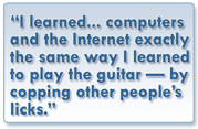
I’m very fond of saying I first learned web design—HTML, JavaScript and CSS—the same way I learned guitar: by “stealing” other people’s best licks. When I took music in Pennsylvania public schools in the 60s we had an itinerant music teacher once or twice each week, and classroom teacher-led music once or twice more. We learned every good boy deserves fudge and we sang songs “by note,” and songs “by rote.” We were taught musicianship. But there was never any suggestion the goal was for any of us to become professional musicians. I’ve been thinking about that ever since I learned “entrepreneurship” is receiving top billing local curriculum as a universal 21st Century competency (e.g., C21, P21). Not that there’s anything wrong with that!

Informal learning is valid and important

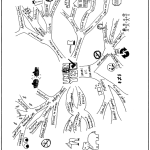
Graphic, reads I learned html same way as guitar, by stealing other people's licks

Part 1 of this series was written over a year ago when I first heard the man I considered my Jimmy Page of the JavaScript world, Douglas Crocker, refer to my kind dismissively as “Webmasters…Generally they weren’t very smart.” Dion Almaer suggested the term “jQuery Plugin Monkeys,” to much laughter. To summarize, I’ve embraced the term in much the way U.S. Democrats embraced “Obamacare.” To continue, then as now I’ve always approached the WWW as an educator asking, “How can this help me share what I know?” I learned, informally, what I needed to know, when I needed to know it. Dedicated CompSci folks always did much more, and way cooler stuff in much less time (and their stuff scales!). Yet I think knowing their language gives my ideas a better chance of being realized. Continue reading

Feb 19

Design Learning, Learning Design

In 1981 “cognitive apprenticeship” was a nascent framework proposed by early researchers with an eye on computer-assisted design of computer-enhanced learning environments that are “situated.” This means “authentic”

The research on the tailors did not result immediately or even very soon in an alternative to the theory for which it offered a critique. It did impel me to go looking for ways to conceptualize learning differently, encouraged by those three interconnected transformations that resulted from the project: (1) a reversal of the polar values assumed to reflect differing educational power for schooling and “other” forms of education; (2) a reversal in perspective so that the vital focus of research on learning shifted from transmitters, teachers or care givers, to learners; and (3) a view of learning as socially situated activity. This work couldn’t replace existing theories, but it provided incentives to ask new questions about learning.
—Jean Lave (1996:155)

activities taking place in the context of, and with the full support of, a “community of practice.” In general the other participants are—for the time being—more proficient than the learner at the given craft or activity. Learners and practitioners interact in a wide variety of ways, often over considerable time, that can be characterized as strategies or phases—observing and practising, receiving scaffolded (progressively adapted by the practitioners) coaching until working independently. The overly-theoretical sounding name has mostly gone by the wayside, but the concepts and application have matured. Still employing ethnography to gather thick qualitative descriptions, there’s now stronger input from the fields of design and architecture. The new name is “Design Learning.” I see parallels in research into tool redesign conducted at Open University NE and Open University UK.

“computers … can make the invisible visible … they can make tacit knowledge explicit … to the degree that we can develop good process models of expert performance, we can embed these in technology, where they can be observed over and over for different details” (p. 125).
Allan Collins, 1991:125

In 1992 Allan Collins and Ann Brown built on their earlier research (e.g., Collins, Brown, and Newman, 1989; Collins, Brown, Holum, Duguid, 1989; Collins, Brown, Holum, 1991) and conducted what they dubbed design experiments.; “Design experiments were developed as a way to carry out formative research to test and refine educational designs based on principles derived from prior research,” i.e., cognitive apprenticeship. There is a direct line from the Cognitive Apprenticeship Framework to Design Learning, (Collins et al., 2004) and recent experiments in the redesign of learning design tools (Conole et al., 2007) (LAMS, 2008) (OULDI-JISC, 2012).

They built on the work of Herbert Simon (1969) who regarded the “design sciences,” such as architecture, engineering, computer science, medicine, and education, as the “sciences of the artificial,” that have been neglected because of the lack of rigorous theories. John Seely Brown and and David Kearns co-founded the Institute for Research on Learning (IRL) in 1986 and adopted ethnography—the description of peoples’ customs and cultures—as its main research method. The Institute forged new understandings of how individuals enter and join learning communities, achieve acceptance, then themselves grow and evolve as vessels of community knowledge. As they do so they often increase interaction and engagement—i.e., collaboration—with secondary networks outside their primary one (Lave & Wenger, 1991) (Lave, 1996). Does it sound just a bit like joining Twitter?

Ethnography attempts “thick descriptions” in the style of Geertz. One of the more fundamental truths of pedagogy spotlighted by this approach is its “messy” and iterative nature. The motto of instructors and learners alike may be “If at first you don’t succeed, try, try again,” but it’s always with an eye toward improving on previous attempts.

Case studies are touted by a wide assortment of education stakeholders. They are used up front in planning, as course content, or as summary program assessment. A good case study can be a thick, descriptive ethnography of a situation.

By studying a design in practice with an eye toward progressive refinement, it is possible to develop more robust designs over time. […] Ethnography provides qualitative methods for looking carefully at how a design plays out in practice, and how social and contextual variables interact with cognitive variables. […] Design experiments are contextualized in educational settings, but with a focus on generalizing from those settings to guide the design process”
(Collins, Joseph, & Bielaczyc, 2004).

The Open University Learning Design Initiative have been working across several OU faculties and with 4 other universities to pilot curriculum design activities, identify and develop tools, and otherwise contribute to academic and practitioner research. If you’ve followed my Tweets or blog the past several weeks you’ve already heard of CompendiumLD. Follow the link to see more tools and other output from this prolific group.

All told these and associated authors (see also Conole, 2007, Conole et al., 2008) consulted close to 50 case studies, but they did not fall into a common pitfall of well-read academics: the automatic presumption of expertise. On the contrary, they embrace the messiness as evidence of authenticity and opportunity for iterative improvement. “The concept of a ‘learning design methodology’ has been integral …however, different readings of the term could, and were, made. …resisting a single definition has enabled us to connect more readily with diverse literatures and to orientate resources and tools towards user needs.” (OULDI-JISC, 2012)

I think that’s academic for, “There are no mistakes, only opportunities.” (—Tina Fey?)

Case studies and design experiments allowed these and other researchers to, among other things, map tools and strategies to the six instructional methods of cognitive apprenticeship and to develop a Scaffolding Design Framework to focus its use.


§


Reference

Brown, J. S., Collins, A., & Duguid, P. (1989). Situated cognition and the culture of learning. Educational Researcher, 18 (1), 32-41.

Collins, A., Brown, J. S., & Newman, S.E. (1989). Cognitive apprenticeship: Teaching the crafts of reading, writing, and mathematics. In L. B. Resnick (Ed.), Knowing, Learning and Instruction: Essays in Honor of Robert Glaser (pp.453- 494). Hillsdale, NJ: Lawrence Erlbaum Associates.

Collins, Allan; Brown, John Seely; and Holum, Ann (1991). Cognitive apprenticeship: Making thinking visible. American Educator: The Professional Journal of the American Federation of Teachers, 15(3), 6-11, 38-46, [reprint available on line at http://elc.fhda.edu/transform/resources/collins_brown_holum_1991.pdf (PDF) accessed 2012-09-17] or from The 21st Century Learning Initiative http://www.21learn.org/archive/cognitive-apprenticeship-making-thinking-visible/ (HTML), accessed 2013-02-19.

Collins, Allan; Joseph, Diana and Bielaczyc, Katerine (2004). Design Research: Theoretical and Methodological Issues, The Journal of the Learning Sciences, 13(1), 15-42.

Conole, G. (2007), ‘Describing learning activities: tools and resources to guide practice’ in Rethinking pedagogy for a digital age, H. Beetham and R. Sharpe (Eds), Oxford: RoutledgeFalmer.

Conole, G. (2008), ‘Capturing practice: the role of mediating artefacts in learning design’, in L. Lockyer, S. Bennett, S. Agostinho, and B. Harper (Eds), Handbook of Research on Learning Design and Learning Objects: Issues, Applications and Technologies.

Ghefaili, Aziz (2003). Cognitive Apprenticeship, Technology, and the Contextualization of Learning Environments, Journal of Educational Computing, Design & Online learning Volume 4, Fall, pp 1-27.

Geertz, Clifford (1973) Thick Description: Toward an Interpretive Theory of Culture, pp. 3-30, in The Interpretation of Cultures: Selected Essays, NY: Basic Books, 470 pages.

OULDI-JISC (2012) Cross, Simon; Galley, Rebecca; Brasher, Andrew & Weller, Martin, Final Project Report of the OULDI-JISC Project: Challenge and Change in Curriculum Design Process, Communities, Visualisation and Practice, Institute of Educational Technology The Open University, July 2012, www.jisc.ac.uk/media/documents/programmes/curriculumdesign/OULDI_Final_Report_instit%20story.pdf.

Simon, H. A. (1969) The sciences of the artificial. Cambridge, MA: MIT Press.

Jan 19

Mind mapping for learning design

UPDATED: when you’ve read this, see my latest update on Gráinne Conole’s latest contributions to these ideas, linked at the end.

Mind map of CompendiumLD showing Getting StartedThe past 30 years in education research has seen the influx of big ideas from computer science, social anthropology, design and even architecture. We now say learning is situated in authentic social contexts many call communities of practice.

This has had some pretty significant effects on research itself (e.g., ethnographic case studies, action research), and learning design tools, themselves designed to reflect this current situation, but for reasons I won’t waste any more time pondering, the uptake still seems relatively slow. Gráinne Conole, with others at the Institute of Educational Technology, Open University UK, looked into an idea/concept/mind mapping tool, Compendium, that was already under development there, and in yet another demonstration of the efficacy of open source, created CompendiumLD, Compendium “Learning Design,” allowing designers to visualize the many connections that exist within learning situations. I believe such tools will play an increasingly important role in the design, planning and implementation of learning experiences.

Continue reading

Dec 13

Mind mapping, concept mapping—making the relationships between ideas visible

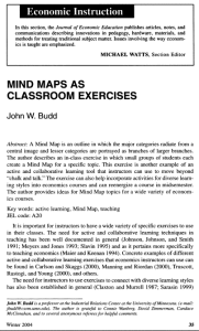
In his 2004 article published in The Journal of Economic Education John Budd describes an in-class exercise “…in which small groups of students each create a Mind Map for a specific topic.” He says creating mind maps is “…an example of an active and collaborative learning tool that instructors can use to move beyond “chalk and talk” …and incorporate diverse learning styles.” The author presents ideas for mind map topics for a wide variety of economics courses, and several lovely examples of students’ maps, drawn freehand and collaboratively. “hierarchies and associations flow out from a central image in a free-flowing, yet organized and coherent, manner.”Mind Maps can be lesson planners, lesson plans, and lessonsFirst page of article, Budd (2004)  about Mind Maps

There is now a good selection of mind- or concept-mapping software educational experience designers may find very helpful in making thinking visible, by offering ways to illustrate the connections between ideas. Nearly all of them are built for Internet collaboration. My goal in this post is just to share an inkling I’ve been getting that such software can find a role in lesson planning, lesson plans, and as John Budd and others have found, in the lessons themselves.

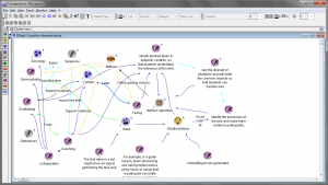
I wrote about one such program, Compendium, back in March, and I’ve tried my hand at mapping an understanding of cognitive apprenticeship. First I simply listed the pieces of the Collins, Brown and Holum (1991) framework, assigning symbolic icons to imply their role, positioning them visually so as to reflect their hierarchy. Then I use colour-coded arrows to indicate relationships between them. In the software these objects can all be opened as dialog boxes, which can store further details. “Mouseover” or “rollover” effects (anything the software does in response to a user placing their mouse pointer over something on the screen) let you peek inside.

UPDATE: I learned 2012-12-15 in Compendium Institute Newsgroup Digest #1389, that Compendium will receive a long overdue overhaul, and the source code seems to be finding its way to more friendly repositories. This recording of a Compendium developer meeting contains details, and may also be of interest to see how Compendium is used to add idea-mapping to the task of recording minutes. The recorded meeting demonstrates another technology-based approach to making thinking visible (and audible).

attempted Mind Map of cognitive apprenticeship

Fig. 1—Mapping the Cognitive Apprenticeship Framework
Trying to cover all the bases: making thinking visible while designing a lesson. Icons, positioning, colours, arrowhead direction have meaning, follow the designer’s logic… (cont…)

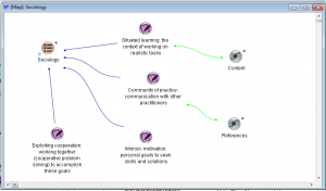
Two close-ups of the maps within (neither completed):

Map of Sociology of a learning experience

Fig. 2— Sociology
…general priorities and strategies unfold: coloured arrows illustrate relationships to and betweenthe ideas; each item can become a map of future brainstorming. Big questions asked here, “Have I planned for this?” “Who are my experts?” get deep answers at the next level…  (cont…)

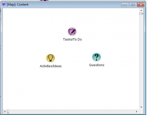
compendium mind map

Fig. 3—Content
…where you can be clear and specific about content, methods, and activities. Compendium and similar software let you add lists, links, video, documents, and to publish the results.

These maps list the parts of the framework. In Compendium you can draw additional items as you brainstorm and you can put terms “inside” other items, for example double-click the Content->Questions icon and find the actual questions stored inside. You can label the lines, change the directions of the arrowheads or put arrowheads on both ends. You can also export an interactive version in HTML [also here and here] and other formats.

Wikipedia has a list of free and proprietary mind-map and idea mapping software. I’d like to try it all at some point but thus far I looked at “VUE,” or Visual Understanding Environment, a project at Tufts University. I found it to be very intuitive, it has a large and versatile set of features, produces a result similar in many ways to that of Compendium, and it can be used as a unique and powerful presentation tool. Also like Compendium they have a user community and a gallery that will tell you far more than I possibly can.

Budd points out some very significant differences between the mind map and the traditional, linear outline and states these have powerful implications for learning:

…note that each branch is captured by a single key word, not a phrase or sentence. Using single words reduces ideas to their core. Important ideas are not obscured by extraneous words, and new associations are not limited by more specific phrases. …The central point in the Mind Map must always be an image because the brain is drawn to an image more …differences in the size of the branches and the associated words are used to reinforce associations and to add emphasis. …the use of color is important in creating Mind Maps. …many Mind Maps use one color for each major category to aid in organization. …These differences can make Mind Maps powerful tools. …Research on memory and learning emphasizes the importance of associations, and the radiant structure of a Mind Map with explicit branches promotes associations. The use of color for different categories can also make more powerful associations. The use of emphasis in a Mind Map, for example with thicker main branches and larger printing, can also help the recall of information. The focus on using single key words can foster more expansive connections, and confining the entire Mind Map to a single piece of paper allows one to see the entire picture at once and perhaps stimulate additional associations.
(Budd, 2004:37-8)

Student-produced Effects of Labor Unions

Budd (2004) fig. 3 Student-produced Effects of Labor Unions

I should note that John Budd’s article is accompanied by samples of hand-drawn maps that, in my opinion, also reveal how far technology still has to go to match humans’ capacity for expression. Neither Compendium, nor from what I’ve seen so far VUE, has the ability to vary the width of connecting arrows, let alone supply the “branches” of a map with bark [n.b. Since first writing that sentence I’ve seen many others that do thicknesses (still no bark). See “Vic’s list” at the end of this post]. Educators can do much to influence the design of software by engaging directly with software developers and designers on social networks like Twitter. You do not need software to use mind maps in lesson plans.

Mind Maps can be used to add active and collaborative learning to courses. Students are engaged in active learning as they wrestle with ideas, associations, and categories in creating a Mind Map-they are creating their own Mind Map, not simply looking at one created by the instructor. The exercise is collaborative because the Mind Maps are created as a small group effort. A collaborative relationship between the instructor and students can also be established as the instructor helps with the constructions of the Mind Maps, but as a “guide on the side” not as the “sage on the stage” (Budd, 2004:42).

Because of the reliance on hierarchies, says Budd, concepts or classroom exercises that do not fit traditional outline structure are probably not good candidates for the creation of a mind map. Even in early explorations of collaborative concept mapping software I’ve noticed, in forum discussions and newsletters, a common motif that points to another criticism: mappers often say things like “this works for me” while maybe the internal logic isn’t quite as apparent to everyone. I believe such criticism can be overcome by perseverance, collaboration and openness to feedback.

I’ve experimented using Compendium to take notes in meetings, for sorting research, choosing between possible software solutions, and for planning (Conole & Fill, 2005). I’m now very interested in presentations using VUE. When it comes to mind mapping software I now often find myself saying, “This works for me.”

SOFTWARE SITES, in their own words:

The Compendium Institute (Open University and others) is an open forum for the ongoing development and dissemination of the Compendium methodology and software tools. Compendium is about sharing ideas, creating artifacts, making things together, and breaking down the boundaries between dialogue, artifact, knowledge, and data. http://compendium.open.ac.uk/institute/

The Visual Understanding Environment (VUE) is an Open Source project based at Tufts University. The VUE project is focused on creating flexible tools for managing and integrating digital resources in support of teaching, learning and research. VUE provides a flexible visual environment for structuring, presenting, and sharing digital information. https://vue.tufts.edu/

What surely must be the definitive list, “Vic’s compendium of software that supports knowledge management and information organisation in graphical form. Includes mind mappers, concept mappers, outliners, hierarchical organisers, KM support and knowledge browsers, 2D and 3D.” http://www.mind-mapping.org/

§


Reference

Budd, John W., (2004) Mind Maps as Classroom Exercises, The Journal of Economic Education, Vol. 35, No. 1 (Winter, 2004), pp. 35-46. [Available on line but missing accompanying graphics
www.legacy-irc.csom.umn.edu/faculty/jbudd/mindmaps/mindmaps.pdf, retrieved 2012-12-10]

Cognexus.org, recorded meeting 2012-12-12, Compendium Developer meeting, http://www.cognexus.org/Compendium_Futures/2012-12-12_C_Developer_Meeting.wmv, retrieved 2012-12-16.

Collins, A., Brown, J.S., and Holum, Ann (1991), Cognitive Apprenticeship: Making Thinking Visible, American Educator, [1991 reprint available on line at http://elc.fhda.edu/transform/resources/collins_brown_holum_1991.pdf accessed 2012-09-17].

Conole, G. and Fill, K. (2005), A learning design toolkit to create pedagogically effective learning activities, Journal of Interactive Media in Education 2005(08). [jime.open.ac.uk/2005/08].

McLeod, S. A. (2010). Kolb, The Learning Style Inventory. Retrieved from http://www.simplypsychology.org/learning-kolb.html 2012-12-03

Multimedia Learning by Richard E. Mayer (2009)

Dec 09

Educators see Twitter at the hub

Twitter infographic

Authenticity in learning can be understood as the extent to which the learning is situated within a practising community of people who share some united interest in the knowledge being sought or produced, and a common idea of its meaning and value, “…who share a concern or a passion for something they do and learn how to do it better as they interact regularly” (Wenger, 2006) Sociology is an integral element of the authentic learning environment.

  On Twitter’s 140-character limit…

Several authors have argued that rather than this being a drawback, this characteristic offers benefits for learning. Educause (2007) suggests this helps develop skills “in thinking clearly and communicating effectively”. Rankin (2009a & 2009b) notes that this forces students to focus on a central point. Dunlap & Lowenthal (2009) argue that communicating in this style is a “professionally useful skill for students to develop”.
…However this aspect of Twitter, …has also been blamed by academics for contributing to declining English writing skills (Kelley 2010).

There is now plentiful evidence that a growing number of educators, and many more who think of themselves as stakeholders in education generally, are using social networks, and more than a few sites and software applications have emerged to compete for parents’, students’, teachers’ and administrators’ attention, everywhere, all at once. There are powerful new ways to create, manage, and share your own resources and an overwhelming number of great resources available from others. While a site like Pinterest may drive a great deal of traffic to blogs the micro-blogging tool Twitter’s unique feature set has helped establish its role at the hub.

3 Ways Social networking impacts and supports learning

Social networking platforms and tools are already impacting and supporting learning in at least three ways. First, social networking itself is a tool with a skill set for learning. Second, social networking can be used to deliver and enhance curriculum. And third, social networking can be utilized to create learning experiences in collaboration with others. Teachers find individual articles such as 30 Twitter Hashtags For Science Lovers and 50 Ways to Use Twitter in the Classroom immensely helpful, but if my own timeline is an indication, they do add up! Most of probably hundreds of such no-doubt wonderful ideas often get swept away in the “digital noise.” A classroom teacher’s bookmarks can include Edmodo, YouTube, and Facebook, Teachhub, PBL-Online and Edudemic, but it’s increasingly clear that Twitter is the choice to join these spokes at the centre.

New Twitter users commonly describe an experience curve that travels from scepticism, trial participation, conversion (getting it), dramatically increasing usage and connections (Levine 2007, Stevens 2008, Seimens 2008, Shepherd 2009) through to potential overload (Sierra 2007).

Teachers use Twitter to plan field trips, chat with industry professionals, connect classrooms, facilitate research, post supplementary materials, to engage students in the classroom, parents outside the school, and colleagues and administrators in networks they can design according to need and interest.

It’s not surprising to learn that “design of teaching strategies and practices related to virtual engagement and collaboration is instrumental to achieving positive educational outcomes,” but some early research suggests not all are equally ready, that students may need “…to improve their capacity to initiate self-directed, collaborative practices as a means to more effectively take ownership of their learning” through incorporating new technology. (Junco, Elavsky, and Heiberger, 2012). Similarly for teachers, learning to use Twitter to grow an effective Personal Learning Network (PLN, a.k.a. Community or PLC) is not the same as learning to use it as a tool in a learning situation, in or out of the classroom.

What you Tweet, when you Tweet it, the length of your Tweets, whom you retweet and who retweets you are all factors in getting established on Twitter. You can over-use hashtags or under-use them, and good use of images in tweets can make your tweets up to twice as engaging.

TweetStats is a service that reveals a great deal of information about how people actually use Twitter. One tab shows how many Tweets happened, when, in reply to whom, from what kind of device, and top retweets for a particular user. On another you can visualize the data as a word cloud1 (called a TweetCloud, naturally) of top mentions and topics, and once you’ve done so for an account you can track follow and unfollow stats from that point forward. If you have an idea of a rubric2 demonstrating engagement and on-task behaviour, or other standards you wish to establish, either for your personal learning community or a learning experience you design, TweetStats can already report some enlightening information. It seems to me this is a direction in which educators can push for development, or show initiative by launching their own open source projects.

As a stakeholder in on line education, what other sets of data would you like to see in statistical reports? Must diagnostic, formative and summative assessments be built in? How would you do that? What would it look like?

§


Notes

  1. From visual design, a word cloud is a form of weighted list, a visual representation for text data. Usually the importance of each tag, word or phrase being highlighted is represented by variations in font size or color.
  2. A rubric is a measuring tool that experience designers can use to assess participant learning and engagement. Using a set of criteria and standards directly tied to the stated learning outcomes, educators can assess each student’s actual performance. When a rubric is agreed-upon and communicated prior to the student’s work being completed, it serves as a model or exemplar, and makes the grading process clear and transparent.

Reference

Brown, J.S., Collins, A., and Duguid, P. (1989). “Situated Cognition and the Culture of Learning.” Educational Researcher, 18(l), 32-42.

Davis, Gordon B., Editor (1986) Understanding The Effectiveness of Computer Graphics for Decision Support-A Cumulative Experimental Approach, Communications of the ACM, Vol 29 (1) 40-47.

Dugan, Lauren (2012) How Frequently Should You Tweet? [STATS] posted October 30, 2012 on AllTwitter The Unofficial Twitter Resource http://www.mediabistro.com/alltwitter/how-frequently-should-you-tweet-stats_b30568.

Ferriter, William M. (2010), Why Teachers Should Try Twitter (Meeting Students Where They Are), Educational Leadership, 67(5) February 2010, pp 73-74;
[Available on line http://www.ascd.org/publications/educational-leadership/feb10/vol67/num05/Why-Teachers-Should-Try-Twitter.aspx, retrieved 2012-11-30].

Junco, Reynol; Elavsky, C. Michael; and Heiberger, Greg (2012), “Putting twitter to the test: Assessing outcomes for student collaboration, engagement and success” British Journal of Educational Technology [Early View, Article first published online: 1 MAR 2012 available from author’s site: http://reyjunco.com/wordpress/pdf/JuncoElavskyHeibergerTwitterCollaboration.pdf, retrived 2012-11-30]

Lave, Jean and Wenger, Etienne (1991). Situated Learning: Legitimate Peripheral Participation. Cambridge: Cambridge University Press.

Lave, Jean (1996). Teaching, as Learning, in Practice, Mind, Culture, and Activity (3:3) pp149-164.

Webducate [‘webducate.net’ website/blog] (2012), Twitter in learning and teaching – literature review http://webducate.net/2012/08/twitter-in-learning-and-teaching-literature-review/, retrieved 2012-12-03

Wenger, E. (2006) Communities of practice, a brief introduction, http://www.ewenger.com/theory/, HTML retrieved 2011-11-03 or http://wenger-trayner.com/wp-content/uploads/2012/01/06-Brief-introduction-to-communities-of-practice.pdf, PDF retrieved 2011-10-03.

Dec 02

Some best practices for posting infographics?

As often happens when we go searching the web for something, I ended up with something else, and learned something different than I started out to learn. I was searching for statistics about social media. I soon discovered how pervasive infographics have become, even compared to six months ago. When done well they are clearly very good at presenting data quickly and coherently. But there are some other things I expect when I go searching for data, and they seem to be as easily overlooked as they could be to include, if only we take the extra couple minutes to consider. I believe I’ve also seen some hints that with infographics it may even be easier to misrepresent and distort data than with such well-known devices as bar graphs, and well understood yet often repeated practices such as moving the origin to influence scale.Infographic

UPDATE: Accessible Image Maps (below, under Presentation)

From Wikipedia:
Information graphics
or infographics are graphic visual representations of information, data or knowledge intended to present complex information quickly and clearly.[1][2] They can improve cognition by utilizing graphics to enhance the human visual system’s ability to see patterns and trends.[3][4] The process of creating infographics can be referred to as data visualization, information design, or information architecture.[2]

Infographics aren’t new. The article above links their origin to cave paintings. I remember posters in my doctor’s office in the 60s that fit the description. Neither myself nor most of the adults in the waiting room would have been likely to pick up a peer-reviewed journal or seek out the study that uncovered the data being presented. There would likely be some fine print in the corner that indicated who prepared it, and you could track it down if you were interested. In the information age and on the World Wide Web that would be both lazy and unacceptable. For end users with sight, graphic presentation of data on the Web may be even more effective in some cases.
Whether graphs are actually superior to tables—in business decision-making, for example—has been a bone of contention for some time (e.g., Davis, 1986:46-7). I would suggest that on the World Wide Web the ability to select, copy and paste the text in a tabular display would in many cases be more satisfactory to many end users than an attractive display that was perhaps not as portable.

File Format

One “solution,” or perhaps just a happy accident, is that many infographics are posted as PDF files1. These can support embedded links, can be downloaded and printed maintaining the integrity of the original (and its copyright notices, etc.) and in many cases support copy/paste. PDF files can be made accessible; that becomes a process that must be included in the development cycle. As I’m writing this, it should be noted, only certain WebKit browsers—Chrome, Konqueror (Linux) and Safari  (Mac only)—display PDF files without additional software. Native and open formats like PNG are more universal. In my opinion SVG is the one to watch. It’s a “vector” graphic format, which means it maintains quality at any size. Most newer browsers will display SVG, and the spec contains some very exciting abilities of the “coming soon” variety, such as zooming, timecode and animation, that should greatly enhance our ability to organize and communicate the meaning of data. In either case you should put references, links, and anything else your visitor may want to know that isn’t in the data itself in plain text in a caption underneath. If you’re on WordPress there’s a caption box in its standard image upload form you can use. Regardless of platform this should be relatively easy and may go a long way to advance the usability and usefulness of your data.

Data Obfuscation

Infographics may contain mixtures of several types of data display, including graphs and tables. All of the abilities to distort and misrepresent data, whether intentionally or not, are therefor multiplied. A prime example is this infographic released by the US Republican Party to convince their constituency why they believed the Affordable Care Act was a bad idea. A combination of  illogical colour use, bad layout, poor choice of fonts and font-size, meaningless relative proportions and little white space make the system it claims to represent look overly complex, and to many perhaps, even ugly.

Republicans Party version of a graphic purported to represent ACA flowchartOn the site where this lives commenter Nick Dobbing, founder and principal designer at Wovenland Systems in Vancouver points out, “Notice all the bright primary colours in the chart, all the many different shapes, with no sense or order in the way they’re used. No help to anyone sincerely trying to comprehend the diagram… but boy howdy, it sure makes it look more complicated! And that’s all that this diagram is about.” When other designers redid the graphic with a commitment to display the information with integrity  it looks quite different.
Citizen designer Robert Palmer's graphic representing ACA flowchart

I encourage you to read Robert Palmer’s

Open letter to Speaker John Boehner from citizen designer Robert Palmer of California infosthetics.com

I’ve included only the portions relevant to my discussion.

  • I have removed the label referring to “federal website guidelines” as those are not a specific requirement of the Health and Human Services department. They are part of the U.S. Code. I should know: I have to follow them.
  • I have relabeled the “Veterans Administration” to the “Department of Veterans’ Affairs.” The name change took effect in 1989.
  • In the one change I made specifically for clarity, I omitted the line connecting the IRS and Health and Human Services department labeled “Individual Tax Return Information.”

Robert Palmer
Resident,
California 53rd District

Presentation

Many sets of data may form lovely graphics that are nonetheless too large and complex to fit a single browser window. In my experience a popular solution is to make the graphic longer, not wider. This is in keeping with a standard web mantra that vertical scrolling is okay, horizontal scrolling is bad. I’ve read recent reports that scrolling is less a big deal to those who’ve grown up on the mobile web, and it’s easy to find designers who agree. I’m a centrist in this case, I much prefer to get what I came for front and centre, but I’ll adapt and go with the flow—if it’s clearly a flow, not an eddy.

Accessible image maps are also worth considering. At minimum you must use ALT tag in the main image, and later in each hot spot. (Penn State, 2012)

The future

Designers are still discovering new abilities within HTML5. A feature with many yet-to-be-tapped applications is the new data attribute that can be applied to any element. Source code for a legacy tag that displays an infographic image might look like (press letter M to widen)
<img src="path/to/infographic.png" alt="Description of image">;
we call img the element, src and alt are its attributes. We can now add custom attributes that begin with data- and retrieve them easily with JavaScript (and even more easily with jQuery). For example,
<img id="myInfographicWithDataAttributes"
  data-mySource="Fouchaux (unpublished manuscript), Answer to the Ultimate Question of Life, The Universe, and Everything"
  data-mySourceURL="http://not-in-our-lifetime.com" src="path/to/infographic.png" alt="Description of image">

You can create a new object and retrieve the value
myData = $('#myInfographicWithDataAttributes').data();
What you called data-mySource and data-mySourceURL are now available as myData.mySource; and myData.mySourceURL


Conclusion

I think I’m getting some ideas about possible best practices for posting infographics. Please use the comment section to critique my suggestions and to offer your own.

  1. The most useful format when the graphic contains links, references end users may want to paste into a Google search, or the document is to be printed or downloaded is PDF1. However, currently only WebKit-based browsers: Chrome, Konqueror (Linux) and Safari for Macintosh can display PDF without additional plugins, PDF files can be large, and they require extra care to assure accessibility.
  2. Unless I absolutely need my audience to download and print I’d be inclined to post a PNG (all browsers) or SVG (all newest browsers) image and include links, references and citations in a plain text caption underneath.
  3. Mayer’s principles of multimedia design, especially concerning coherence and spatial contiguity, apply. Good use of whitespace, a sensible colour scheme are key, but these are indicators of good design in any medium. Illogical colour use, bad layout, poor choice of fonts and font-size, can obscure, distort, and render meaningless any set of data.
  4. I’m personally not a fan of long, skinny and scrolling. Unless the data demands otherwise I’d try to keep all the information visible at once. If scrolling is necessary there’s still general agreement that it should be vertical.

Further reading

The United Nations Statistics Division Knowledgebase on Economic Statistics offers these Making Data Meaningful guides that are “…intended as a practical tool to help managers, statisticians and media relations officers in statistical organizations use text, tables, charts, maps and other devices to bring statistics to life for non-statisticians. […] The first guide provides guidelines and examples on the use of effective writing techniques to make data meaningful. The second guide provides guidelines and examples on preparing effective tables, charts and maps, and using other forms of visualizations to make data meaningful. It also offers advice on how to avoid bad or misleading visual presentations. The third guide aims to help producers of statistics find the best way to get their message across and to communicate effectively with the media. It contains suggestions, guidelines and examples.”

PENN State’s Image Maps in HTML explains image maps and how to make them accessible.

§


Notes

  1. Note that PDF (in strictly speaking) is not an image format, but a scriptable rich text document format that can contain different types of multimedia content, including vector and bitmap graphics, audio, video, forms, intra- and inter-document hypertext links and a hierarchical contents listing. You should handle accessibility outside the web browser before attaching your PDF.

Reference

Davis, Gordon B., Editor (1986) Understanding The Effectiveness of Computer Graphics for Decision Support-A Cumulative Experimental Approach, Communications of the ACM, Vol 29 (1) 40-47. [PDF]
Dugan, Lauren (2012) How Frequently Should You Tweet? [STATS] posted October 30, 2012 on AllTwitter The Unofficial Twitter Resource http://www.mediabistro.com/alltwitter/how-frequently-should-you-tweet-stats_b30568

Penn State (2012) Image Maps in HTML, http://accessibility.psu.edu/imagemaps, accessed 2012-12-02

Educase Learning Initiative (2012) http://net.educause.edu/ir/library/pdf/ELI7052.pdf

Nov 04

Cognitive Apprenticeship and the 21st Century Web Application

In my previous post I (literally) talked about a long historical need to provide more information than a written document can physically hold. I pointed out how footnotes have accomplished this, how these and such familiar devices as front-page headlines and teasers have evolved, and continue to evolve in the modern web-browser. I’m doing this to demonstrate how Web browsers and the three main (and open) technologies—HTML, CSS and JavaScript—can support Cognitive Apprenticeship’s goal of “making thinking visible.” Ultimately I hope to encourage classroom teachers to leverage this generation’s immersion in technology in new ways that lead not only to their own empowerment but that of all who become involved in 21st century learning environments that can stretch past boundaries of space and time.

I began to show some actual code1 [to see my “footnotes,” press the number; to close them, click or press Esc] which creates a style that can be applied at the paragraph or section level to assign an icon signalling its content or relevance to the document. I used narration, in the form of recorded audio, with pictures timed to coincide with words—a concept that is the basis of almost all elearning software, TV advertising, documentary film, even political propaganda—to explain and demonstrate what I was thinking about the topic and the technology. If you’ve followed this Cognitive Apprenticeship from the beginning I hope you can start to see now how I’ve intentionally set out to contrast a traditional academic style with an increasingly Web-enhanced one.

In so doing I used technology to solve some problems—and predictably introduced several more, demonstrating another potential technology holds, one I suspect we all have experienced. Software often contains bugs; preparing a lesson plan using pen and paper, or presenting using a comfortable and familiar paradigm such as a slide show with handouts one often feels more in control. It’s often too easy for the technology to become the focus, and not in a good way. But while many classroom teachers tell me anecdotes that conclude with a student fixing something, far fewer tell me they’ve learned to embrace that as a strategy, and are willing to jump in the deep end head first, with ample faith that together they’ll tackle whatever obstacles arise. It’s my personal goal to foster that confidence and empower educators to create such environments. Indeed, I feel there’s a certain urgency, not just for individual teachers or the profession, but for the future of public education itself.

Ursula Franklin, in her famous 1989 Massey Series lecture, noted the changing role of technology and important ways it was changing the role of technologists, distribution of labour, and the balance of power, while in her view shrinking the public sphere.

The situation in the classroom at the interface between the biosphere and the bitsphere is but one facet of the situation in the workplace within the same realm. In fact, often even the designation of workplace is no longer appropriate. Not only do new technologies, new ways of doing things, eliminate specific tasks and workplaces… but the remaining work is frequently done asynchronously in terms of both time and space.
— Ursula Franklin (1992:172)

Her distinction between what she identified as prescriptive approaches2 versus holistic3 ones led to a concern that not working together in the same space causes “opportunities for social interactions, for social learning and community building [to] disappear.” (Franklin, 1992:172). A neoliberal market model of education is paired with a neoconservative social model that work together to “change people’s understanding of themselves as members of collective groups” (Apple, 2009), a course at odds with public education’s heritage of citizenship-, character-, and democracy-building. An aggressive and well-funded movement is under way that “supports marketisation through its clear preference for incentive systems in which people are motivated by personal, not collective, gain rather than by the encouragement of social altruism. Yet, the tradition of social altruism and collective sensibilities has roots just as deep in our nations, and its expression needs to be expanded, not contracted.” (Apple, 2004; Apple, 2009).

Neither of the above authors in the works cited alludes to what I believe can only be described as a new literacy for the 21st century: fluency in coding and code. At Occupy Wall St. the techies “[built] websites, put out messages, manage[d] the ebb and flow of information about the occupation on the Internet.” (Judd, 2011) A year later “TechOps,” as the New York contingent of web-developing occupiers call themselves, built and maintained the website for the Sept. 17 anniversary events. They put together a whole host of other underlying technical infrastructure… TechOps-built database software sits behind a system to match people who needed a place to stay during the demonstrations with people who had space to offer […and built…] what has become a broad suite of web tools built specifically for Occupy activists. Using their own flavor of WordPress’ multi-site functionality, TechOps can facilitate sites like S17NYC.org and allow individual movement groups to maintain their own web presences themselves.” Those who code may have a special understanding of the saying “free as in beer, but not free as in speech” (Judd, 2012).

Franklin, in 1989, was perhaps just a bit too early to fully anticipate the complex socio-politico-economic forces that would result in Twitter, a commercial start-up, empowering the Arab Spring. But Apple’s 2009 essay describes in full the motives and methods we see manifesting in high-stakes testing and redistribution of public resources to private concerns that are part of many ed “reform” efforts. I believe there’s a need for further research into the roles of social networking within emerging communities of practice, but also its influence on communities of practices’ emerging. In the meantime, code literacy is something that’s fun and beneficial to pursue, which you can leverage within many learning environments to help create the kinds of authentic, situated opportunities for discovery and knowledge construction project- and inquiry-based learning models are touted for. And while you probably don’t have the next Dimitri Gaskin in your class, you almost certainly have more expertise available than you’ve imagine or tapped.

All of the jQuery JavaScript scripts I’ve used so far are my own—and all of them contain flaws that were part of my learning process. Currently my Footnotes script works with this WordPress theme (or any theme that uses <article> elements for posts), I simply hit the HTML tab on my WordPress editor and create a <sup> element of class=”footnote” and down below a numbered (“organized”) list of class <ol class=”footnotes”></ol> and it automatically creates a rollover/keypress on the number. In this version I have to hard code the numbers in the <sup> tags… so if I move a list item or add one in between I have to manually renumber. One of the first tasks for a group could be to improve on that. If a classroom or school has a blog or web page, and they use it for student writing, and they encourage using such common conventions as footnotes, then it might be an intrinsically motivating project to design and implement something that facilitates and modernizes the process in a way students can own.

My footnotes script is part-way to becoming a jQuery plugin. You may or may not know what that is, but I’ll wager you know someone who does. It’s only part-way done because I’m  trying to think more like a programmer so I’m learning about design patterns and building in stages. The Smashing Magazine article in that link contains links to all the information one needs to finish it. In my next and hopefully final instalment I’ll talk about a project I have in mind that I think holds benefits for classroom teachers who are still tentative about technology and/or looking for creative ways to include it, one that demystifies programming and the coding culture, and hopefully creates space in the classroom for activities and knowledge that may already be taking place informally outside, extending access and creating new opportunities.

§


    Notes:

  1. For example, if you provide the path to a 36×36 pixel image representing a rubric or video:
    .bg-rubric {
    background: transparent url(“..path_to/rubric.png”) no-repeat 3px 3px; padding:3px 9px 3px 36px;
    }
    .bg-video {
    background: transparent url(“..path_to/video.png”) no-repeat 3px 3px; padding:3px 9px 3px 36px; }
  2. See for example, Harvard Business School’s aggressively disruptive, top down, market-model for education reform in Christensen et al., 2009
  3. See for example, Harvard Graduate School of Education’s “Beyond the Bake Sale: A Community- Based Relational Approach to Parent Engagement in Schools,” (Warren et al., 2009), PDF available from The Logan Square Neighborhood Association http://bit.ly/nYwbjK accessed 2012-11-03

References

Apple, Michael W. (2004). Ideology and curriculum (3rd ed.). New York: Routledge.

Apple, Michael W. (2006), Understanding and Interrupting Neoliberalism and Neoconservatism in Education, Pedagogies: An International
Journal
, 1:1, 21-26

Christensen, Clayton; Johnson, Curtis W.; Horn, Michael B. (2008), Disrupting Class: How disruptive innovation will change the way the world learns. New York: McGraw Hill, 288 pages.

Judd, Nick (2011). #OWS: Tech-Savvy Occupiers Hope to Open-Source a Movement, http://techpresident.com/blog-entry/ows-tech-savvy-occupiers-hope-open-source-movement, accessed 2012-11-03

Judd, Nick (2012). How Free Software Activists are Hacking Occupy’s Source Code, accessed at http://techpresident.com/news/22867/how-free-software-activists-are-hacking-occupys-source-code 2012-10-23

Osmani, Addy (2011). Essential jQuery Plugin Patterns, http://coding.smashingmagazine.com/2011/10/11/essential-jquery-plugin-patterns/, accessed 2012-11-03

Franklin, Ursula. (1992, rev ed. 1999) The Real World of Technology. (CBC Massey lectures series.) Concord, ON: House of Anansi Press Limited, 206 pages.

Kreiss, Daniel and Tufekci, Zeynep (2012). Occupying the Political: Occupy Wall Street, Collective Action, and the Rediscovery of Pragmatic Politics (September 17, 2012). Cultural Studies – Critical Methodologies, 13:3 (Forthcoming). Available at SSRN: http://ssrn.com/abstract=2147711

Warren, Mark R.; Hong, Soo; Rubin Leung, Carolyn; Uy, Phitsamay Sychitkokhong (2009). Beyond the Bake Sale: A Community- Based Relational Approach to Parent Engagement in Schools, Teachers College Record Volume 111, Number 9, September 2009, pp. 2209–2254

Nov 01

21st Century Cognitive Apprenticeship: 4 Ways We Make Thinking Visible

Back in 2005 Dorian Peters posted a summary of Mayer’s Principles for the design of Multimedia Learning I’ve visited frequently. I read it again today through the lens of cognitive apprenticeship and made some connections. Two essential components of apprenticeship models and multimedia design are narration and its timing, which is probably why software applications like Adobe Captivate, PowerPoint, or PowToons contain various ways to synchronize the appearance of objects with audio, visuals and text. The framework and principles can help form a checklist to improve the Who, What, When, Where, and How of choosing what to include in learning environments, all of which illuminate two distinct aspects of the Why — a given that someone wants to learn the stuff, and our ability to assess that including something in specific ways — or not — helps achieve that goal.

Mayer (2001, 2003, 2005) presented research-based principles for the design of multimedia messages. His fundamental principle is the multimedia principle itself: people learn better from words and pictures than from words alone. Peters has organized the principles into sets:

  • Principles for managing essential processing  more»
    • Segmenting principle: People learn better when a multimedia lesson is presented in learner-paced segments rather than as a continuous unit.
    • Pre-training principle: People learn better from a multimedia lesson when they know the names and characteristics of the main concepts.
    • Modality principle: People learn better from animation and narration than from animation and on-screen text.
  • Principles for reducing extraneous processing  more»
    • Coherence principle: People learn better when extraneous words, pictures, and sounds are excluded rather than included.
    • Redundancy principle: People learn better from animation and narration than from animation, narration, and on on-screen text.
    • Signaling principle: People learn better when the words include cues about the organization of the presentation.
    • Spatial contiguity principle: People learn better when corresponding words and pictures are presented near rather than far from each other on the page or screen.
    • Temporal contiguity principle: People learn better when corresponding words and pictures are presented simultaneously rather than successively.
  • Principles based on social cues  more»
    • Personalization principle: People learn better when the words are in conversational style rather than formal style.
    • Voice principle: People learn better when words are spoken in a standard-accented human voice than in a machine voice or foreign-accented human voice.
    • Image principle: People do not necessarily learn better from a multimedia lesson when the speaker’s image is added to the screen.
  • One last principle,” the Individual differences principle.  more»
    Design effects are stronger for low-knowledge learners than for high-knowledge learners. Design effects are stronger for high-spatial learners than for low-spatial learners.

More about these in a moment. These principles illustrate a point of mine: that what Collins, Brown, Duguid, Newman, Holum et al. (see my posts here and here) bring with their theory of cognitive apprenticeship is a practical framework by which to apply such good principles. Conversely, the principles can guide the how, when, who, where, and why of specific situations. Consider the statement that teachers (who may often be more generally deemed “designers” of learning experiences) should show the processes of the task and make them visible to students (Collins et al.., 1991:). The common root of processes and processing reveals the relationship. The set of essential processing principles informs the design and planning stages, with a strong nod to individualization. Extraneous processing are filters and fine-tuning strategies. Both sets speak to content, method and sequence in Collins’s language. The fourth member of that set in cognitive apprenticeship lingo is sociology, and Mayer offers guidance here as well.

I’m going to apply Mayer’s fundamental principle now and try to enhance this communication with narration and pictures. Maybe you’ve never thought of footnotes as technology before, but they are a highly developed device1, designed to make an author’s thinking visible.

I use this icon to exclaim or assert something. I assert that this is one way to make thinking visible. For a web site, it’s easy to use CSS to make a set of icons. available, as I’ve done for this one. Of course the meanings of the icons must be communicated throughout the community and a common understanding shared by those who use them. Press the letter N to open this “Note” showing my growing list. The letter U opens my Audio narration in which I discuss 4 simple things we’ve done within documents to make thinking visible, and how each can be enhanced with the 3 main Web technologies, HTML, CSS, and JavaScript.

Icons Used Here

  • Assertion 
  • Argument 
  • Audio 
  • Decision 
  • Web page 
  • Idea 
  • Issue 
  • List 
  • Idea Map 
  • Con 
  • Note 
  • + Pro 
  • Position 
  • Rubric 
  • Video 

This icon is not in the original Compendium set. I added it because I thought it filled a need.

Using icons is another thing on my list. It’s not a new idea, but applying it specifically when managing essential processing, thinking about segmenting and pre-training (prerequisite knowledge?) while imagining and planning authentic environments, or striving to reduce extraneous processing throughout demonstration and coaching phases. A consistent icon set provides coherence by signaling and providing cues about the content. For more ways, roll your mouse over the list icon, or press the L key to open my List. Press N to open a Note displaying the list. Press U to open my Audio narration for this content.

  • Icon sets
  • “More »” links  more»
    More links reduce extraneous information and communicate which points you think are important.
  • Footnotes2
  • Narration & animation

§


    Footnotes:
  1. Anthony Grafton, in The Footnote: A Curious History (1999) points to men like Pierre Bayle, who “…made the footnote a powerful tool in philosophical and historical polemics; and Edward Gibbon, who transformed it into a high form of literary artistry. Proceeding with the spirit of an intellectual mystery and peppered with intriguing and revealing remarks by those who “made” this history, The Footnote brings what is so often relegated to afterthought and marginalia to its rightful place in the center of the literary life of the mind…” (cover notes).
  2. With JavaScript the eye never has to leave the main text. It can count them for you, too!

References

Clark, R. C., & Mayer, R. E. (2003). E-learning and the Science of Instruction. San Francisco: Jossey-Bass. Mayer, R. E. (2001). Multimedia Learning New York: Cambridge University Press. Mayer, R. E. (Ed.). (2005). The Cambridge Hanbook of Multimedia Learning. New York: Cambridge University Press.

Grafton, Anthony (1999). The Footnote: A Curious History, Boston: Harvard University Press, 241 pages.

IDEO (2011). The Design Thinking Toolkit for Educators, http://www.designthinkingforeducators.com/, 94 pages.

Peters, Dorian (2005). Mayer’s Principles for the design of Multimedia Learning, blog http://designerelearning.blogspot.ca/2005/09/mayers-principles-for-design-of.html retrieved 2012-10-10.

Oct 14

Situating Cognitive Apprenticeship

“Experiential learning” “Authentic learning”  “multiple intelligences”  “learning styles” …

Schooling

The context in which cognitive apprenticeship itself is situated deserves consideration.
We can start by considering some of the contemporaneous nomenclature: the “edubabble” of the day. Some biggies of the era are still with us today, here are four examples.

…the great waste in school comes from his inability to utilize the experience he gets outside while on the other hand he is unable to apply in daily life what he is learning in school. That is the isolation of the school–its isolation from life.
—John Dewey, 1916
quoted in Mims, 2003

The term experiential is paired with learning since the 1970s or earlier (Keeton, 1976) (Weil and McGill, 1989). Mark Smith (2001) provides a very helpful summary of the literature and reports there are two general descriptions being applied: ‘direct encounter with the phenomena being studied…’ (e.g., Borzak 1981: 9 quoted in Brookfield 1983).  and  ‘…direct participation in the events of life’ (Smith , 2001 quoting Houle 1980: 221). Traditional apprenticeship certainly presents us with both opportunities, but does Collins et al.s’ cognitive? I think we’ll find it does when we design for it.

Frankly, if at first simply over semantics, I’ve never been fond of the term “authentic learning.” For starters, learning is not a noun1 (Silvers, 2011).  and I guess I’d just strive for higher precision where it’s the title of my philosophy of education. When Collins et al. use the word they refer to authentic contexts. This is not to dismiss the school of thought the name represents; practitioners who embrace the concepts and techniques seem to automatically transliterate it to enabling learning within authentic contexts., which I grant is fairly awkward. I believe it has the same meaning as situated learning, which is another term used with cognitive apprenticeship (Brown et al., 1989) (Collins et al., 1989) (Collins et al., 1991) (Lave, 1996).

In fact for many decades educators have observed a gap between life within and outside of schooling.  (Dewey, 1916; Dewey, 1933; Piaget, 1974; Gardner, 1992; Boud and Miller, 1997; Mims, 2003). While my familiarity with the literature is insufficient to judge the degree to which his point “b” is true, I share an antipathy towards uncritical use of the phrase “real world”  (and the advice of those who use it) with John Shindler, who warns, “…a) the real world is rarely defined by adages that include the phrase the “real world,” b) the use of the term the “real world” usually indicates a world-view that has been jaded and is fundamentally dysfunctional, and c) students are likely paying the price for it” (Shindler, 2009:Appendix J). I believe point “c” is a common destination, if by other paths, with at least one of Freire’s who, having said “…Knowledge emerges only through invention and re-invention, through the restless, impatient, continuing, hopeful inquiry human beings pursue in the world, with the world, and with each other” (Freire, 1970)  said elsewhere, “The educator with a democratic vision or posture cannot avoid in his teaching praxis insisting on the critical capacity, curiosity, and autonomy of the learner.” (Freire, 1998).

The ideas of multiple intelligences (Gardiner, 1983) and learning styles (Kolb and Fry, 1975) are related. While it’s impossible to ignore their effect on teaching over subsequent decades they have naturally both been criticized at very deep levels. Again, Smith (2001, drawing on Jarvis, 1987 and Tennant, 1997) summarizes those pertaining to Kolb very well, they centre around extravagant claims and lack of empirical evidence. The latter flaw is also claimed of Gardiner’s theory, along with disconnect from findings from the field of psychology (Wellingham, 2004) (Visser, Ashton and Vernon, 2006a) (Gardiner, 2006) (Visser, Ashton and Vernon, 2006b), yet the ideas persist and some practitioners attribute successes while passionately defending their use in the classroom2.

Social Anthropology’s view of Learning Communities

I strongly suspect treating cognitive apprenticeship as a framework for experience design sidesteps much of the conflict. Cognitive apprenticeship’s heritage, as the others’, traces back to activity theorists such as Vygotsky and Leontiev but charts its course via the social anthropology of Jean Lave and socially situated, community of practice-based learning she explored with Etienne Wenger (Brown, Collins, Didiuk, 1989:41 footnote 1) (Lave & Wenger, 1991) (Lave, 1996). Apprenticeship in general, and cognitive apprenticeship by design, attempts to make thinking visible, illustrated using exemplary case studies (Collins, Seely and Holum, 1991). Cognitive apprenticeship models reject models that value the results of traditionally formal learning (e.g., schooling) over informal ones (e.g., apprenticeship). From an apprenticeship perspective, the assumption that teaching necessarily precedes or is a precondition for learning, or that absence of teaching calls learning into question, is a false one (Lave, 1996:151).

Although my aim is to name specific technologies and methods for employing them that make learning visible, the perspective is that of the experience designer, the focus is on the process. The steps to enabling social interaction, placing suitable tools within reach and empowering participants to engage, according to the cognitive apprenticeship model, are quite clear.. The designer’s tasks (emphasis mine) are

  1. show the processes of the task and make them visible to students;
  2. situate abstract tasks in authentic contexts, so that students understand the relevance of the work;
  3. vary the diversity of situations and articulate the common aspects so that students can transfer what they learn.

If we look within the six stages of the method3Modelling, Coaching, Scaffolding, Articulation, Reflection, and Exploration—specifically for ways to diversify participant entry and engagement, and  we can turn technology on itself in effect by using polls or remote testing, for example, to question participants directly, gauge relevance on an ongoing basis, remain agile and reflexive, adjust, review, refine and revise the  implementation. It may in fact end up that for some participants none of our preliminary technology picks and strategies are suitable or engaging. When we design the situation to make thinking visible we must also build into the process the ability for all participants to see and report what they’re seeing, and to maintain access to the things they need to make the experience worthwhile. This brings to the foreground an important aspect of design I’d guess is still better understood by Web designers than by most instructional designers, the separation of content and presentation. This is a concept having implications for communication (Clark, 20084) I’ll elaborate in a later instalment, but you can see a good, concise discussion of the basics by designer Sarah Horton on her site.

Summary

In the preceding paragraphs I’ve looked at the origins of cognitive apprenticeship and started to employ and apply vocabulary from the Cognitive Apprenticeship Framework. I’ve situated this framework relative to some other modern theories of learning, and we begin to see how focusing on the well-defined environment it provides—the content taught, the pedagogical methods employed, the sequencing of learning activities, and the sociology of learning—allows us to expose, nurture and tap the diversity of talent found within every community of practice. Whether we are in the role of apprentice or expert we need tools and interactions that make the processes of constructing knowledge visible and enable a variety of communication styles and media to be used between participants. I hope I have exhausted the theoretical foundation without exhausting the reader!

Next

The next instalments will start to link this theory to practice. I’ll enter from the sociology side of the environment, using social networking, but I’ll use some technology from the start. My thinking is that to find out what is being said I want to go where the discussion is taking place. Twitter is one place to start, and I have learned over time that many educators use Twitter’s “hash tag” feature to find others talking about similar things, so I loaded 24 hours worth of Tweets that contain the hash tag #edchat into Firefox, and then used the Firebug extension to get the tweets from the timeline using a Web programmers’ technique known generically (by which I mean one can take different steps using different tools to achieve the same result) as scraping?. I then removed a set of words I know are outside the scope of my investigation, and from the rest create the following “Wordle.”

A graphic representation of the words culled from edchat on Twitter, larger or smaller by frequency

Words found on Twitter #edchat from a single 24 hr period sized in proportion to frequency (www.wordle.net/create)

In my next instalment I’ll demonstrate the steps involved in creating such an image and make suggestions for researchers who might want a more robust, reliable and comprehensive approach to getting such data based on similar techniques. In so doing one important result will be an example of a technology-enhanced learning environment …in the state of emerging. I’ll further show that many if not most tools we see today stay in such emergent states indefinitely, and that by applying a framework like the one proposed by Brown, Collins, Duguid, Holum we do much more to help them reach maturity.

Comments are open and encouraged!

 §


  1.  « Somewhere along the journey, as we became focused on making these models and standards more efficient and effective, “learning” went from being a verb to being a noun. If you actually think about what learning is and that it is intrinsic to the individual, how could it possibly be delivered? But that’s precisely how learning is perceived by those buying “learning” and, hence, influencing how it is designed, developed, and “delivered.” » —Aaron Silvers (2011). I recommend this article widely and often, probably in part because I felt it both vindicates some feelings I’d been having about ADDIE and offers viable ways forward.
  2. See, for example, the comments section of Daniel Willingham’s criticism of Gardiner’s theory posted on the EducationNext blog.
  3. I explained these methods in an earlier post.
  4. Because they “…create philosophical and cognitive dissonance for technical communicators trained to think of information as content that is inherently linked to presentation.” (Clark,2007:36)

References

Boud. D. and Miller, N. (eds.) (1997) Working with Experience: animating learning, London: Routledge.

Brown, J.S., Collins, A., and Duguid, P. (1989). “Situated Cognition and the Culture of Learning.” Educational Researcher, 18(l), 32-42.

Christensen CM, Marx M, Stevenson HH. (2006) The Tools of Cooperation and Change, Boston: Harvard Business School Online http://hbsp.harvard.edu/hbsp/hbr/articles/article.jsp?articleID=R061 retrieved 2009-12-19

Clark, Dave (2007): Content Management and the Separation of Presentation and Content, Technical Communication Quarterly, 17:1, 35-60

Collins, A., Brown, J.S., and Holum, Ann (1991), Cognitive Apprenticeship: Making Thinking Visible, American Educator, [1991 reprint available on line at http://elc.fhda.edu/transform/resources/collins_brown_holum_1991.pdf accessed 2012-09-17]

Dewey, J. (1916) Democracy and Education. An introduction to the philosophy of education (1966 edn.), New York: Free Press.
Dewey, J. (1933) How We Think. A restatement of the relation of reflective thinking to the educative process (Revised edn.), Boston: D. C. Heath.

Freire, Paulo (1998) Pedagogy of freedom : ethics, democracy, and civic courage, Lanham, Md. : Rowman & Littlefield, 144 pages.

Freire, Paulo (1970) Pedagogy of the oppressed. New York, Herder and Herder, 186 p.
Freire, Paulo (2000) Pedagogy of the oppressed, 30th anniversary ed., New York : Continuum, 184 pages.

Gardner, H. (1983). Frames of Mind: The theory of multiple intelligences. New York: Basic Books.
Gardner, H. (2006). On failing to grasp the core of MI theory- A response to Visser et al. Intelligence (34:5) 503–505

Gardner, Howard (1992) The unschooled mind: why even the best students in the best schools do not understand, [PDF]

Houle, C. (1980) Continuing Learning in the Professions, San Francisco: Jossey-Bass.

Keeton, M. T. (ed.) (1976) Experiential Learning, San Francisco: Jossey-Bass.

Kolb, D. A. (1984) Experiential Learning, Englewood Cliffs, NJ.: Prentice Hall. 256 pages.

Lave, Jean and Wenger, Etienne (1991). Situated Learning: Legitimate Peripheral Participation. Cambridge: Cambridge University Press.

Lave, Jean (1996). Teaching, as Learning, in Practice, Mind, Culture, and Activity (3:3) pp149-164.

Martin, Jane Roland (1982), Two Dogmas of Curriculum, Synthese, Vol. 51, No. 1, Questions in the Philosophy of Education (Apr., 1982), pp. 5-20

Mims, Clif (2003), Authentic Learning: A Practical Introduction & Guide for Implementation, Meridian: A Middle School Computer Technologies Journal, Volume 6, Issue 1, Winter 2003, Raleigh, NC: NC State University, http://www.ncsu.edu/meridian/win2003/authentic_learning/ retrieved 2012-10-10.

Piaget, J. (1974). To understand is to invent:  The future of education. New York: Grossman.

Shindler, John V. (2009), Appendix J: Examining The Use of the Term the “Real World” of School, College of Charter School of Education, web page associated with the book “Transformative Classroom Management,” Hoboken: Jossey-Bass, 384 pages.

Silvers, Aaron (2011) Fundamental Design of Learning Activities, blog post http://www.aaronsilvers.com/2011/02/fundamental-design-of-learning-activities/, retrieved 2011-08-10.

Smith, M. K. (2001). ‘David A. Kolb on experiential learning’, the encyclopedia of informal education. Retrieved [enter date] from http://www.infed.org/b-explrn.htm.

Visser, Ashton and Vernon, 2006a Beyond g: Putting multiple intelligences theory to the test, Intelligence (34:5) 487–502
Visser, Ashton and Vernon, 2006b g and the measurement of Multiple Intelligences: A response to Gardner, Intelligence (34:5) 507–510

Weil, S. Warner & McGill, I. (eds.) (1989) Making Sense of Experiential Learning. Diversity in theory and practice, Milton Keynes: Open University Press.

Willingham, Daniel T. (2004), Reframing the Mind: Howard Gardner and the theory of multiple intelligences, Education Next,  Vol. 4, No. 3 http://educationnext.org/reframing-the-mind/ retrieved 2012-10-10.
Oct 10

Cognitive Apprenticeship: an idea whose time has come (back)?

When someone is reading silently and then they ask you to define a word, do you ask them to read the entire sentence? This, said Brown, Collins and Duguid (1989), is because “Experienced readers implicitly understand that words are situated.” Building on Miller and Gildea’s (1987) work teaching vocabulary Brown et al. similarly rejected “the assumption that knowing and doing can be separated,” saying it “leads to a teaching method that ignores the way situations structure cognition.” They came to believe that all knowledge, like language, is intrinsically linked to the situations and activities that produce it—like Web sites, concepts are always under construction (p32). Collins and Brown, with Newman (1989) and Holum (1991) see this idea of “Situated Knowledge and Learning” within the traditional apprenticeship of ancient times—a master practitioner showing the apprentice how something is done and then helping them do it. Modern schooling, by contrast, has amassed great bodies of conceptual knowledge, yet at the same time hidden or removed the thinking behind it from the situation of would-be learners. These authors proposed a synthesis of schooling and apprenticeship they call cognitive apprenticeship. The fundamental goal of cognitive apprenticeship is to “make thinking visible.” (Brown et al., 1989) (Collins et al., 1989) (Collins et al., 1991) (Miller and Gildea, 1987).

Collins et al. define a learning environment as “the content taught, the pedagogical methods employed, the sequencing of learning activities, and the sociology of learning” (1991:1). It’s my assertion that modern technology has direct applications within each of these four elements. I further suggest that an updated1 understanding of the categories, strategies and insights Collins et al. put forth in the early nineties combine with technology and current practice to form a potent framework for instruction and learning.

Cognitive Apprenticeship (CA)

Let’s list the 4 elements, ordimensions, of every learning environment, and what they entail (1991:12-15):

  1. content: knowledge and strategies
    • Domain knowledge: concepts, facts, and procedures explicitly identified with a particular subject matter
    • Heuristic strategies: effective techniques for accomplishing tasks, e.g., “tricks of the trade”
    • Control strategies: how and when to select among possible problem-solving strategies
    • Learning strategies: for learning any of the above; learning how to learn.
  2. method: opportunities to observe, engage in, and invent or discover experts’ strategies in context
    • Modeling: expert performs a task (verbalizing/illustrating their knowledge and thinking)
    • Coaching: expert observes and facilitates
    • Scaffolding: expert provides supports
    • Articulation: expert encourages learners to verbalize/illustrate their knowledge and thinking
    • Reflection: expert enables learners to compare their performance with others
    • Exploration: expert invites learners to pose and solve their own problems
  3. sequence: tasks that structure learning yet preserve meaningfulness (i.e., “situate” the tasks)
  4. sociology: social characteristics of learning environments (i.e., “situate” the learner)
    • Situated learning: the context of working on realistic tasks
    • Community of practice: communication with other practitioners
    • Intrinsic motivation: personal goals to seek skills and solutions
    • Exploiting cooperation: working together (cooperative problem solving) to accomplish these goals

There are three important distinctions between traditional and cognitive apprenticeship: in traditional apprenticeship the process is easily observable; in traditional apprenticeship the tasks arise and emerge in the workplace; in traditional apprenticeship the skills to be learned are inherent in the task itself. To translate the model of traditional apprenticeship to cognitive apprenticeship, experts need to:

  • identify the processes of the task and make them visible to students;
  • situate abstract tasks in authentic contexts, so that students understand the relevance of the work;
  • vary the diversity of situations and articulate the common aspects so that students can transfer what they learn. (1991:3)

Above is a framework, not a formula (1991:17). Already people were exploring technology’s potential as a coaching and scaffolding strategy, for example “…an interactive video display can mobilize the natural ability of a child to learn from context” (Miller and Gildea, 1987:94).

Current practice

Today there is ample evidence and virtually unanimous agreement that, more often than not, traditional schooling fails to engage a majority of learners or to provide meaningful long term strategies for solving real world problems, and almost no consensus on what to do about it (Freire, 1975) (Christensen et al., 2008). Most intrinsic motivation in our society today revolves around the desire to generate very large amounts of money in very short amounts of time, and in education this has manifested in a reform movement that is often outright hostile to research (NZARE, 2012), negligent of neighbourhoods (Frankenberg et al., 2010), and partnering indiscriminately for expedience and personal gain (Jazzman, 2011), while remaining highly supportive of tools and models that appear to fit specific niches in the above framework. These often involve a “supply chain” model involving high-stakes testing and the textbook industry and are designed above all to be easily monetized (Christensen et al., 2008). Educationalists are expected to design and deliver compelling learning experiences regardless of such distractions and competing interests. I believe that, in the hands of designers and pedagogues firmly committed to the end user’s learning experience, this framework can contribute to modern technology’s effectiveness at keeping designers and participants on task and focused on learning.

Several of the cognitive apprenticeship framework strategies associated with sociology, method, and content can be easily identified in a technological innovation that was only in its embryonic stage when Brown, Collins et al. first conceived such a framework—social networks. Communities of Practice may consist of many Personal Learning Networks (PLNs) of just plain folks (JPFs (see Brown et al. 1989)) who are intrinsically motivated (or extrinsically, perhaps in response to issues discussed in the previous paragraph) to incorporate new tools and strategies. They may chat on Twitter, and blog on sites like Blogger. They are seeking out experts and collecting domain knowledge about heuristic strategies even as they share their expertise on other topics and hone their own control and learning strategies. Some have seen the potential of Facebook and refined it to Edmodo, or Twitter and evolved to Tappestry, which tracks formal and informal learning using the new TinCanAPI. They may use a tool like Adobe Captivate to sequence tasks, or a platform like Google Docs. They share strategies such as project-based-learning (which may already have much in common with CA) and the flipped classroom, both of which can be rich in applications of technology.

The notion of cognitive apprenticeship has by no measure slumbered since the early 1990s. Aziz Ghefaili (2003) in particular has made notable contributions to relating the theory to the use of computers. I’m very interested in such efforts, but my focus is praxis—moving theory to practice in ways that induce change (Freire, 1986)2. In the weeks ahead I’ll attempt to map all of the elements of the framework listed above to specific technologies, platforms, and strategies for using them. I welcome input at every stage… please use the comments section.

§


  1. I’ll elaborate further in the next installment, but the first “update” I wish to make to Collins et al.’s view, situated as it was in the 1980s and 90s, is what I see as a blurring line between teacher and student. [citations]. Collins, Brown and Holum (1991) themselves acknowledge this (p17) even though their language consistently presumes otherwise. Where the authors said “teacher” I have substituted “expert;” for “student” I have substituted “learner.” In some settings the terms “designer” and “participant” might be appropriate.
  2. See for example what is praxis? at infed, the encyclopaedia of informal education

References

Brown, J.S., Collins, A., and Duguid, P. (1989). “Situated Cognition and the Culture of Learning.” Educational Researcher, 18(l), 32-42.

Christensen, Clayton; Johnson, Curtis W.; Horn, Michael B. (2008), Disrupting Class: How disruptive innovation will change the way the world learns. New York: McGraw Hill, 288 pages.

Collins, A., Brown, J.S., and Newman, S.E. (1989). “Cognitive Apprenticeship: Teaching the Craft of Reading, Writing and Mathematics! In L.B. Resnick (ed.) Knowing, Learning, and Instruction: Essays in Honor of Robert Glaser Hillsdale, NJ: Erlbaum

Collins, A., Brown, J.S., and Holum, Ann (1991), Cognitive Apprenticeship: Making Thinking Visible, American Educator, [1991 reprint available on line at http://elc.fhda.edu/transform/resources/collins_brown_holum_1991.pdf accessed 2012-09-17]

Duncan et al. (2010) Evaluation of Evidence-Based Practices in Online Learning – A Meta-Analysis and Review of Online Learning Studies, U.S. Department of Education, Office of Planning, Evaluation, and Policy Development Policy and Program Studies Service, http://www2.ed.gov/rschstat/eval/tech/evidence-based-practices/finalreport.pdf retrieved 2011-11-10.

Frankenberg, E.; Siegel-Hawley, G.; Wang,J. (2010) Choice Without Equity: Charter School Segregation and the Need for Civil Rights Standards, The Civil Rights Project/Proyecto Derechos Civiles at UCLA, http://civilrightsproject.ucla.edu/news/press-releases/research/k-12-education/integration-and-diversity/choice-without-equity-2009-report retrieved 2012-10-07.

Freire, P. (1972) Cultural Action for Freedom, Harmondsworth: Penguin, 1975, 91 p.

Freire, P. (1986) Pedagogy of the Oppressed. New York: Continuum.

Ghefaili, Aziz (2003). Cognitive Apprenticeship, Technology, and the Contextualization of Learning Environments. Journal of Educational Computing, Design& Online Learning, Vol. 4, Fall, 2003. PDF at http://coe.ksu.edu/jecdol/Vol_4/Articles/pdfs/Aziz.pdf retrieved 2012-10-10

Jersey Jazzman (Saturday, August 20, 2011), Rupert Loves Rhee Loves Bradford blog post, http://jerseyjazzman.blogspot.ca/2011/08/rupert-loves-rhee-loves-bradford.html, retrieved 2012-10-08.

Miller, G. A., & Gildea, P. M. (1987). How children learn words. Scientific American, 257, (3), 94-99.

New Zealand Association for Research in Education (NZARE, 2012), Thursday, 2 August 2012, 11:03 am press release: New charter school model ignores findings of research, http://www.scoop.co.nz/stories/ED1208/S00011/new-charter-school-model-ignores-findings-of-research.htm retrieved 2012-09-21

Rittel, Horst and Melvin Webber (1973) “Dilemmas in a General Theory of Planning,” Policy Sciences 4, Elsevier Scientific Publishing, Amsterdam, pp. 155-159.

Säljö R (1979) “Learning in the Learner’s Perspective: 1: some commonplace misconceptions” Reports from the Institute of Education, University of Gothenburg, 76.