Feb 08

Scales of Justice — sprite animation in CrazyTalk Animator 3

I’m taking a lovely MOOC on FutureLearn, called Filmmaking and Animation in the Classroom. I’m going to show you how to animate a Scales of Justice using CrazyTalk Animator 3. Although I’ve chosen to demonstrate making Scales of Justice, this process is very similar to any other stop frame animation, and you can use any set of image sequences you choose.

‘Sprite’-based animation using a sequence of stills

With CrazyTalk 3 open in Stage Mode and your timeline at Frame 1, go to the create menu, and choose create media, props. Navigate to the folder that contains your static images. You can drag your mouse or press control + A to select all the images and then press Open.

Your new prop will appear in a red box, displaying only the last image in your set. These images are the new prop’s “sprites” and to choose between them we’ll use the Sprite Editor. To open the Sprite Editor use the icon on the toolbar, go to the animation menu and choose sprite editor, or press the letter S.

My Scales of Justice prop using sprite animation

“One-shot” video, What is ‘Primacy?’   For best results view Full Screen
The red box turns green to show we are editing the prop, and the editor displays all the prop’s sprites. The highlighted sprite is the one currently displaying, but the first image on the list, the one with a special icon in the lower right corner, is the default image. In my case I want to start my animation from the default image, so I will select that image now. It becomes highlighted and the display changes.

To animate our scales we’ll advance the frame and choose different images. Crazy talk also has an advanced timeline that keeps track of everything we can do to our prop, but we don’t really need it for simple sprite animation. My animation is running at 30 frames per second, so every three frames represents 1/10 of a second.

Now, I’ve numbered all my sprites to make it easier for me to keep track — the numbers beginning with zero tilt to the left, and the numbers counting by 10s tilt to the right. I’ll advance my frames by three and change the sprite image until I get to 04, then I’ll backtrack to 00 and go ahead with images 10 to 40, and finally backtrack once more 00.

Now I’ll rewind my animation and press play. We can open the timeline to see more clearly what we’ve done. The little diamonds represent “keyframes” corresponding to the image changes we’ve made, and you’ll notice they’re always three squares apart, representing three frames or 1/10 of a second. In real life a scale might move more slowly at the top and the bottom of its swing, swing a little less each time, and eventually settle in the middle.

We can drag these keyframes to new positions on the timeline, copy paste, and even delete ones we don’t want. The scale will move faster when the key frames are closer together, and slower when they’re further apart.

I experimented and ended up with this animation which is 180 frames, or 6 seconds of motion, followed by 2 seconds of nothing, so you can see that the scale has stopped. To save your animation go to the file menu and switch to composer mode, and then choose file, save prop. Your new prop will be found in the content Manager under the Custom Props tab.  

CrazyTalk Animator 3 also makes it easy to render your animation as an MP4.

§

Feb 02

Let’s play some Blues

In a repressed society, artists fulfil a sense of harking back to instant gratification, or immediate expression, by doing things that function on the edge of society, or outside of what is conventionally accepted.
―Bat for Lashes
Instant gratification is like instant coffee, only it won’t keep you up all night.
―Jarod Kintz

The importance of instant gratification must never be underestimated, even as we shun the pitfalls. As a guitar student, I know I “both impressed and vexed” my teacher by practicing, and to a fair degree learning material he thought a year or more down the road, instead of what he assigned me (he told me so in so many words). As a guitar teacher in a music store there was also an economically practical reason to get kids “playing something” as quickly as possible, namely to keep them coming back every week, and their parents smiling. This week’s ukulele lesson will apply some of the approaches I came up with way back then, while hitting today’s (Ontario, Canada’s) curriculum expectations for the age group. 

Today they’ll hear some Blues, play some Blues and with any luck begin to feel their own Blues… in 12 bar cycles of 4/4 time! 

Musical content

I’ll use technology—the ‘TuxUkulele’ track introduced last lesson [video]— to walk them through counting and time signature. They’re already good at the counting part and today I’ll teach a 4/4 conducting pattern, showing patterns of other time signatures in the process. 

Image, conducting patternImage, conducting patternImage, conducting pattern

Conducting Patterns
3:4     4:4     6:8

We don’t have computers with our ukes at present, and I won’t subject them to a lecture with a software demo. I’ll always start with a hello and a review and teaser, but then we’ll get the instruments out and begin strumming and playing notes. 

I’m walking back one step from last week. My goal for today is to do a blues “vamp” on the Bb chord, and a “lick” (also “riff” and yes, “motif”) with a triplet feel over top of it.

With ukes in hand…

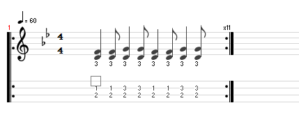
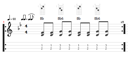
  1. [TuxGuitar (*.tg) file] Teach vamp… with and without “swing feel”
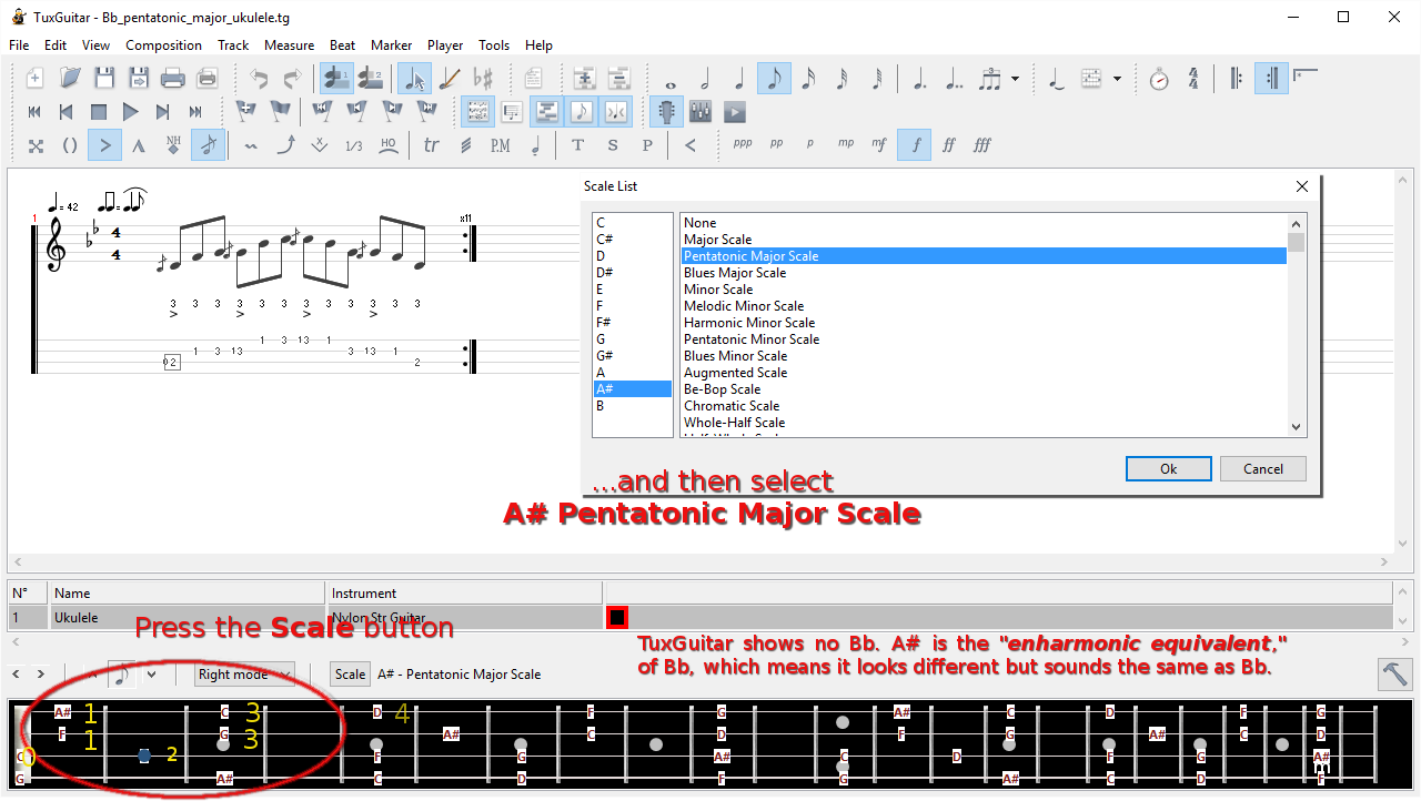
    image, notation and tab for lessonimage, notation and tab for lesson
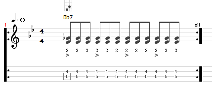
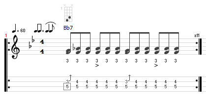
  2. Teach lick… Swing feel makes no difference. Why? Bends and slides cool, ambiguous major/minor 3rd
    image, notation and tab for lessonimage, notation and tab for lesson
  3. [TuxGuitar (*.tg) file] Teach scale and fingering…
    Hand position… keep thumb behind, hand cupped; hammer on
    “Blues Major” and “Pentatonic Major” are different… how?

    image, notation and tab for lesson
    Fingering

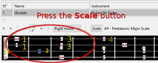
    image, notation and tab for lesson

  4. [TuxGuitar (*.tg) file] Teach scale and fingering…
    Hand position… keep thumb behind, hand cupped, pinky hovers over frets
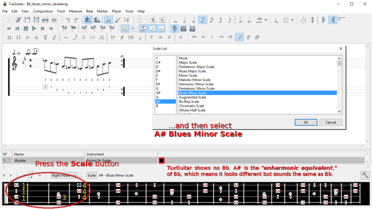
    “Blues Minor” and “Pentatonic Minor” are different… how?

    image, notation and tab for lesson
    Fingering

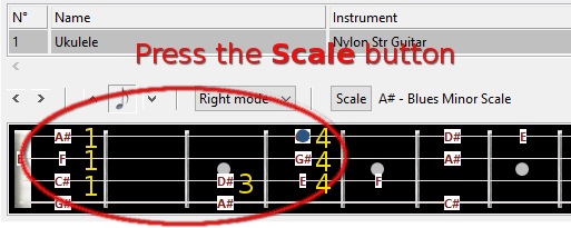
    image, notation and tab for lesson

Those are nearby, convenient Bb major and minor pentatonic scale patterns that form a perfect segue into ‘TuxUkulele.’

On the SMART board

(keep this short, unless everyone has a computer with TuxGuitar on it)

  1. Launch TuxGuitar, then open ukelele template
  2. Add swing; tempo <= 60; key Bb 
    • Opportunity to show conducting pattern  
  3. Show scale; play 1st position pattern (2 notes/string) for and with the learners 
  4. Show notes;
  5. Show chord symbols;
    • Opportunity to use conducting pattern  
  6. Repeat for lick (if time and engagement allow)

Back in the real world

  1. turn off software (or use purely as metronome)
  2. listening time
    • Robert Johnson Crossroad Blues [Show lyrics]
    • Charlie Patton 34 Blues [Show lyrics]
    • Howlin’ Wolf Killing Floor [Show lyrics] Is this still “swing feel?” (“straight 8ths”)
  3. Identify lyric pattern, 2+1 form
  4. play, student conductors, etc.
  5. Easy Tux Blues, (using tritone relationship) [TuxGuitar (*.tg) file]

§

Resources

How to read music – Tim Hansen [TEDEd Lesson]


Jan 28

Tools, Practices and Actions – From Information to Knowledge

Screenshot of CompendiumNG

CompendiumNG allows stakeholders to quickly create visual maps on a topic using nodes and links. In this example different ideas regarding a problem are collected for assessment. It is possible to adjust the appearance of links and node labels. Source: www.CompendiumNG.org

Prior to a recent workshop a question was circulated that looked as if it was tailored to get my response. I stumbled on some great answers to this question over the course of my master’s research into project-based learning design: “Compendium; Dialogue Mapping; Let’s Do It!” I said, and they asked for more information. I replied by pulling some key points from the best articles I have into the following message and sending it with the full articles to my colleagues who posed the question. Where will this lead?

Question, brainstorming on Effective Communication

What tools, practices, or actions could facilitate greater collaboration and cooperation between units?

To Whom It May Concern:

At the recent workshop I mentioned tools, practices and actions we can take right away to address communication issues raised in previous meetings and surveys. You asked me to send you more information. Thank you for this opportunity. Please see below:

Tool:
There are many resources on this tool on line. It’s open source and has been branched by various groups of educators. CompendiumLD is specifically for learning design, but CompendiumNG, aspires to be the Next Generation of Compendium. N.b.: The Compendium tool is suitable for mapping external “focus group” type dialogue involving many stakeholders, a small meeting, or anything in between. The object is to “…work together to build a shared picture with all the stakeholders that accurately represents what we “know,” what different people assert, what we can try and learn from, and what we currently think are the relevant options” (Seybold, 2013, pg. 5).

http://www.compendiumng.org/use-examples/

List of potential uses for CompendiumNG:

Continue:

Practice—Dialogue Mapping:

Dialogue Mapping “… has been used for over three decades to help the different stakeholders in large, complex projects achieve alignment, make decisions they can own, and move forward” (Seybold, 2013, pg. 1). It is related to other forms of argument mapping, for example the Toulmin Model of Argument (see for example, Intel, 2006), but uses an icon-based graphic organizer to denotes the parts of the argument, called Issue Based Information System (IBIS), “…a notation invented by Horst Rittel and Werner Kunz in the early 1970s. IBIS is best known for its use in dialogue mapping, a collaborative approach to tackling wicked problems (i.e. contentious issues) in organisations. “At the heart of IBIS’s power is the amazing capability of questions, when framed in an open and systematic way, to create new distinctions and new clarity out of the fog of social complexity and collapsed meanings,” says Patricia Seybold (2013, pg. 11). It has a range of other applications as well – capturing knowledge is a good example…” (Eight to Late, 2010). This article continues by quoting the first sentence of the abstract of Rittel & Kuntz (1970, pg. 1).

Issue—Based Information Systems (IBIS) are meant to support coordination and planning of political decision processes. IBIS guides the identification, structuring, and settling of issues raised by problem—solving groups, and provides information pertinent to the discourse.

IBIS was to be “…the type of information system meant to support the work of cooperatives like governmental or administrative agencies or committees, planning groups, etc., that are confronted with a problem complex in order to arrive at a plan for decision…” (pg. 1). It can be said, “From the start, then, IBIS was intended as a tool to facilitate a collaborative approach to solving …or better, managing a wicked problem by helping develop a shared perspective on it” (Eight to Late, 2010, pg. 2).

A Brief Introduction to IBIS (Source: Eight to Late, 2010)

The IBIS notation consists of the following three elements:

  1. Issues(or questions): these are issues that are being debated. Typically, issues are framed as questions on the lines of “What should we do about X?” where X is the issue that is of interest to a group. For example, in the case of a group of executives, X might be rapidly changing market condition whereas in the case of a group of IT people, X could be an ageing system that is hard to replace.
  2. Ideas(or positions): these are responses to questions. For example, one of the ideas of offered by the IT group above might be to replace the said system with a newer one. Typically the whole set of ideas that respond to an issue in a discussion represents the spectrum of participant perspectives on the issue.
  3. Arguments: these can be Pros (arguments for) or Cons (arguments against) an issue. The complete set of arguments that respond to an idea represents the multiplicity of viewpoints on it.

The Seven Question Types at the Heart of Issue Mapping (Source: Seybold, 2013, pg. 11):

  1. Deontic: What should we do?
  2. Instrumental: How should we do X?
  3. Criterial: What are the criteria for success?
  4. Factual: What is X?
  5. Conceptual: What does X mean?
  6. Explanatory: Why is X?
  7. Contextual: What is the background?

Issue Mapping can be used effectively for everyday business and personal decisions, but its potential is vast. Through the skillful use of questions, an issue map has unlimited capacity to represent and clarify diverse points of view, conflicting interpretations and goals, inconsistent information, and other forms of complexity…”
(Cognexus Institute website: www.cognexus.org/)

Compendium is a freeware tool that can be used to create IBIS maps… In Compendium, the IBIS elements described above are represented as nodes as shown in Figure 1: issues are represented by blue-green question marks; positions by yellow light bulbs; pros by green + signs and cons by red – signs. Compendium supports a few other node types, but these are not part of the core IBIS notation. Nodes can be linked only in ways specified by the IBIS grammar as I discuss next.

Figure 1: IBIS elements

The IBIS grammar can be summarized in three simple rules:

  1. Issues can be raised anew or can arise from other issues, positions or arguments. In other words, any IBIS element can be questioned. In Compendium notation: a question node can connect to any other IBIS node.
  2. Ideas can only respond to questions– i.e. in Compendium “light bulb” nodes can only link to question nodes. The arrow pointing from the idea to the question depicts the “responds to” relationship.
  3. Arguments can only be associated with ideas– i.e. in Compendium “+” and “–“ nodes can only link to “light bulb” nodes (with arrows pointing to the latter)

The “legal links” are summarized in Figure 2 below.


Figure 2: Legal links in IBIS

Yes, it’s as simple as that.

(pp. 2-3).

Facilitate Group Meetings Using Real-time Dialogue Mapping (Seybold, 2013, pg. 17-18).

The place that Dialogue Mapping really shines is in a face-to-face group design and/or strategic planning session. It’s a much richer tool to use than capturing ideas on flip charts. Don’t forget, however, that just displaying the flow of the conversation doesn’t really add a lot of value. Getting people to validate the ideas that are captured, to build on them, and to really own the map as an active part of their design process is where Dialogue Mapping really shines.

[…]

Continue to Evolve the Group Discussions/Maps Over Time

Today’s design activities are far from “one and done.” Usually you kick off a design project with a vague idea about the appropriate solution and, over time, through the shared dialogue, experimentation, and learning, you evolve your collective thinking and come up with better and better solutions through trial and error.

Asynchronous Mapping In Between Group Meetings. In between group meetings, participants can add to their section of a group map on their own time. They can add links and documents to the map as ammunition to bolster a pro or a con. They can add new ideas, along with sketches, text, or videos to provide really great examples for other team members to absorb at their own pace.

Capture Institutional Memory. One of the beauties of Dialogue Maps is that they can be time- and date-stamped and added to over time. You can then see a history of how your collective thinking evolved. Many of Jeff Conklin’s clients really value the institutional memory that these maps provide over a long period of time.

From Mapping project dialogues using IBIS – a case study and some reflections (Awati, 2011)

Abstract
Purpose
: This practice note describes the use of the IBIS (Issue-Based Information System) notation to map dialogues that occur in project meetings.

Design/methodology/approach: A case study is used to illustrate how the technique works. A discussion highlighting the key features, benefits and limitations of the method is also presented along with a comparison of IBIS to other, similar notations.

Findings: IBIS is seen to help groups focus on the issues at hand, bypassing or avoiding personal agendas, personality clashes and politics.

Practical Implications: The technique can help improve the quality of communication in projects meetings. The case study highlights how the notation can assist project teams in developing a consensus on contentious issues in a structured yet flexible way.

Originality / Value: IBIS has not been widely used in project management. This note illustrates its value in helping diverse stakeholders get to a shared understanding of the issues being discussed and a shared commitment to achieving them.

Action: Identify an interested working group to continue investigating applications of dialogue mapping [here at work].

Reference

Awati, Kailash (2011) “Mapping project dialogues using IBIS: a case study and some reflections”, International Journal of Managing Projects in Business, Vol. 4 Iss: 3, pp.498 – 511. [PDF]

Buckingham Shum, Simon; Selvin, A.M.; Sierhuis, Maarten; Conklin, Jeffrey; Haley, C.B. and Nuseibeh, Bashar (2006). Hypermedia support for argumentation-based rationale: 15 years on from gIBIS and QOC. In: Dutoit, A.; McCall, R.; Mistrik, I. and Paech, B. eds. Rationale Management in Software Engineering. Berlin: Springer-Verlag, pp. 111–132.

Eight to Late (WordPress blog: Archive for the ‘Issue Based Information System’ Category, (2010), https://eight2late.wordpress.com/category/issue-based-information-system/ .

Horst W. J. Rittel & Webber, Melvin M., Dilemmas in a General Theory of Planning (1973), Policy Sciences 4 (1973), 155-169.

Intel Corp. (2006) Teach To The Future, Showing Evidence Tool Resources, Appendices [PDF: www.schoolnet.org.za/twt/09/M9_argumentation.pdf]

Kunz, Werner and Rittel, Horst W. J., Issues As Elements Of Information Systems (1970) [PDF: www.cc.gatech.edu/~ellendo/rittel/rittel-issues.pdf].

Seybold, Patricia (2013), How to Address “Wicked Problems” Use Dialogue Mapping to Build a Shared Understanding and Evolve a Group’s Thinking, [PDF: http://dx.doi.org/10.1571/br05-23-13cc]

There are shortcomings in the notation and maps can get unwieldy. While it’s easy to get started, dialogue mapping requires considerable practice to perfect (Awati, 2011, pg. 14). These and some other factors have slowed adoption. Some of these factors certainly exist in my workplace. We’ll soon see if the apparent awakening to the existence of different strategies to build more effective communication gains enough momentum to catch on and spread.

§

Aug 04

Import 3D models into HitFilm Ultimate

Educators have been intrigued by the potential of 3D worlds to engage young learners almost since the idea of virtual worlds emerged on the internet wish lists of the early WWW. I first learned of “immersive 3d” and several projects based on the Open Cobalt platform in about 2008, and I investigated Sloodle, of which all that now remains is the Git repository. When the SMARTboard-friendly Open Cobalt flavour “EduSIM” announced you could import 3D objects from Google Earth I got very excited. I loved models as a kid, and the Google 3d Warehouse was an instant hit, even in its early days.

I soon found a model of the Kabul Museum, which some of you may know was destroyed by the Taliban but later rebuilt. I created a learning activity that was basically a scavenger hunt for images of other historical objects, which it was possible to retrieve from elsewhere in the virtual world and “hang” in rooms within the museum. Great fun and potentially educational—when it worked—but it flopped due to technical difficulties. Immersive 3D was intriguing, yes, but also time intensive, technologically challenging and, for teachers in the classroom, too much work: “…it is not clear that the investment in time in building and using the Virtual World is worth it” (Conole, 2014). Are there other ways to leverage the intrigue models, even virtual ones, hold for many people?

Film making as digital storytelling

Are aspiring filmmakers nearly as ubiquitous as the cellphone cameras they may be using to get their start? I’ve seen some evidence there are a lot of them, and it’s certainly arguable that multimedia communication is a literacy, maybe an entire set of literacies, important to develop in our digital era.

Are aspiring filmmakers nearly as ubiquitous as the cellphone cameras they may be using to get their start? I’ve seen some evidence there are a lot of them, and it’s certainly arguable that multimedia communication is a literacy, maybe an entire set of literacies, important to develop in our digital era. It may not be necessary or desirable to have everyone in the class “make a video,” but if you have an idea as to how a videographer or three could contribute to an emerging student-driven inquiry, seeking out local experts at the student level might be just the thing—maybe creating an opportunity for student and teacher to reverse roles.

Start with Google Sketchup

For Sketchup users, says Google, “…drawing is thinking. They draw to explore ideas, to figure things out, to show other people what they mean. They draw because they love it, and because nothing great was ever built that didn’t start with a great drawing.” Making thinking visible is what the best instructors do. They call Sketchup “The easiest way to draw in 3D, and from my limited experience that may well be true. The 3d Warehouse is a repository of models in many categories.

Sketchup can export 3D models as AutoCAD, Collada and several other popular 3D file formats, of which HitFilm Ultimate imports 3. I had the most success with 3-D Studio (*.3ds) files.

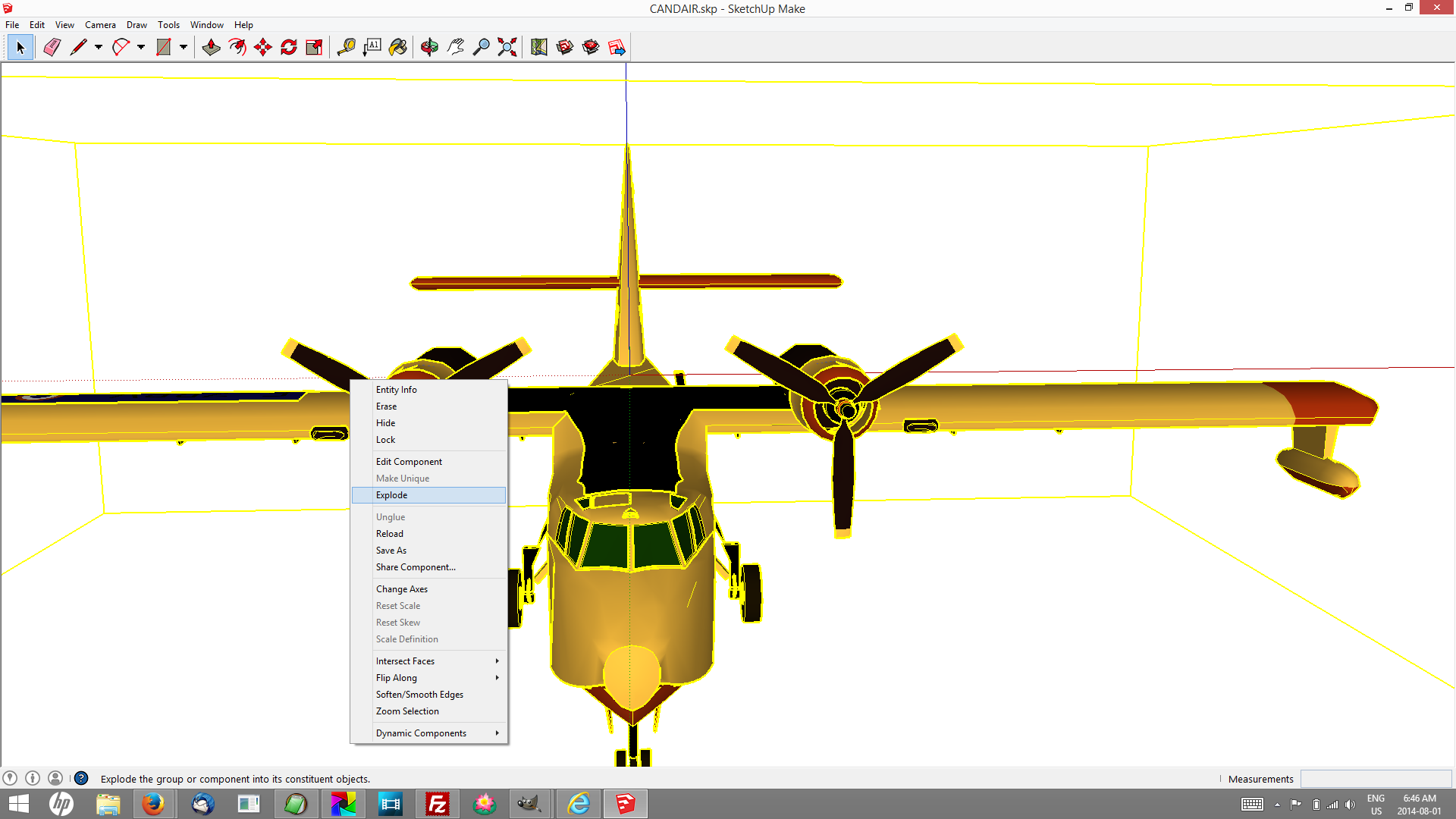
Step 1. Explode any groups you want to animate. Before I could select the propellor I needed to “explode” the entire model.

Screenshot Sketchup

Model: FRANCE CANDAIR by XALOC-SOLARIS selected… then Right-click → Explode

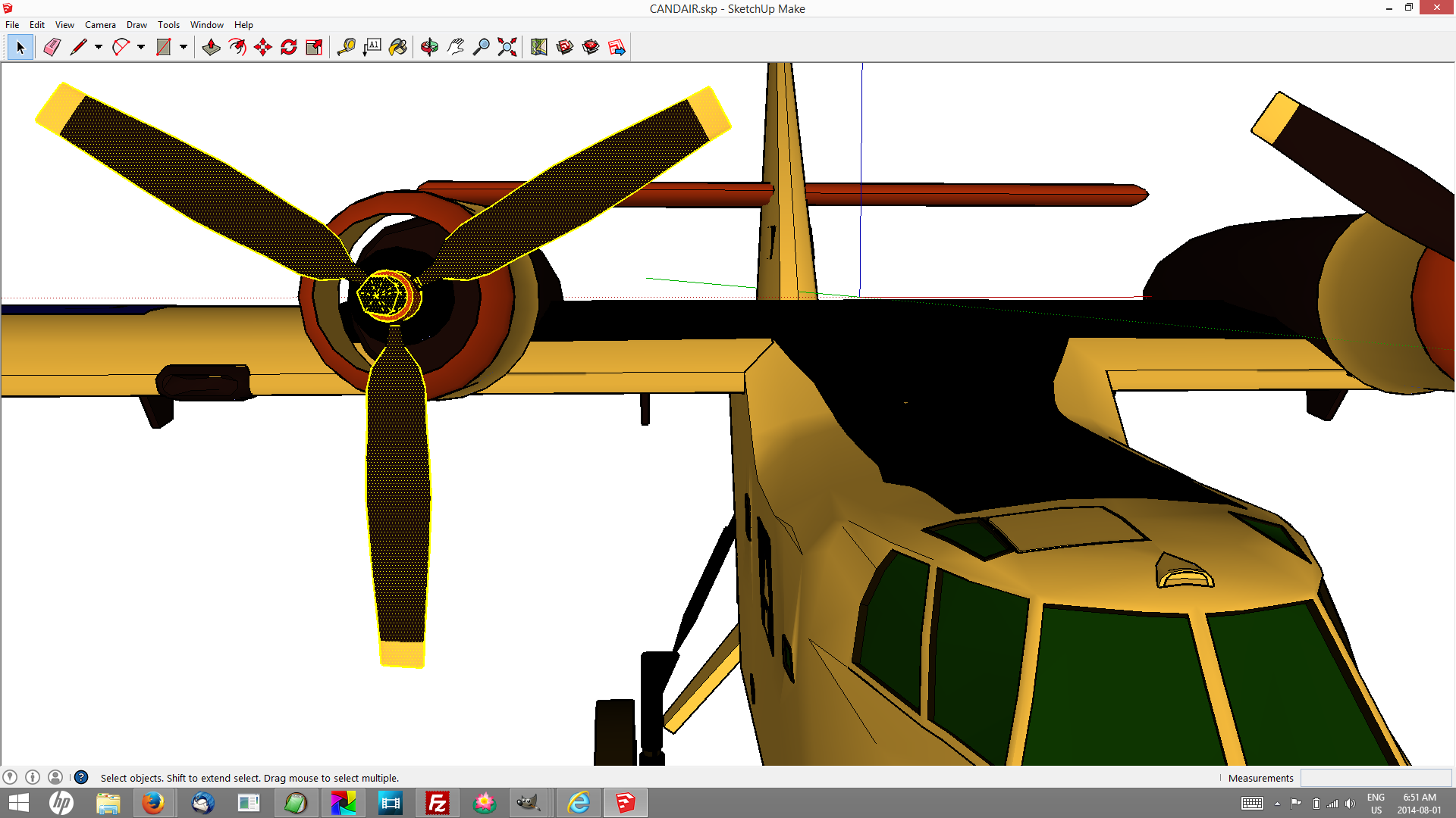
Step 2. Select the things you want to animate. Ctrl+DblClick to add entire objects (will make sense when you try it.)

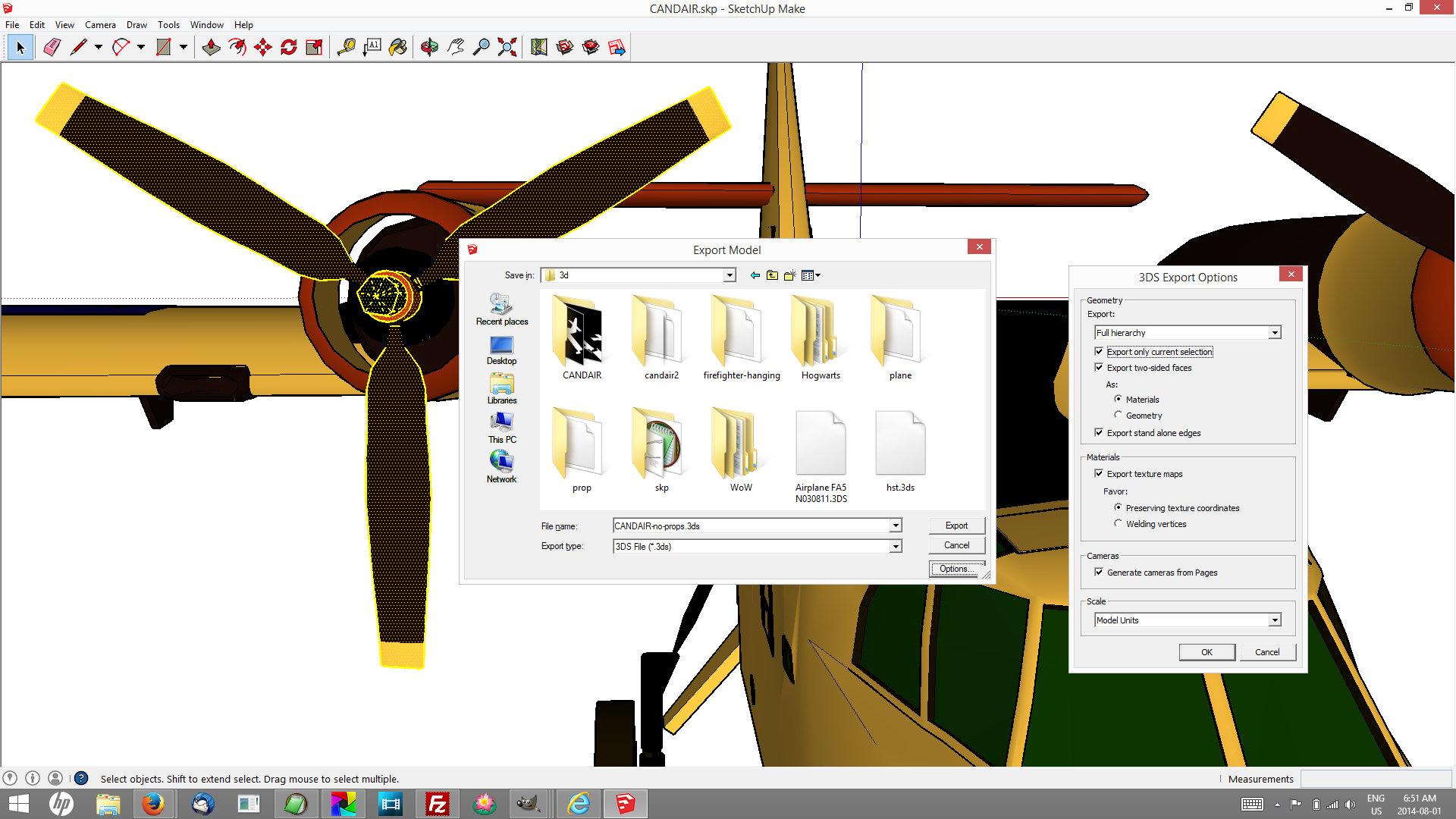
Step 3. Export in a useful format. I had best results with 3DS, but I soon learned to create a folder for every model I want to work with. Some of the other formats do this for you, because if your model is in the least bit complex it will generate many image files, and with 3d Studio files they all end up in the folder you save the master .3ds file. Press Options and check Export only current selection.

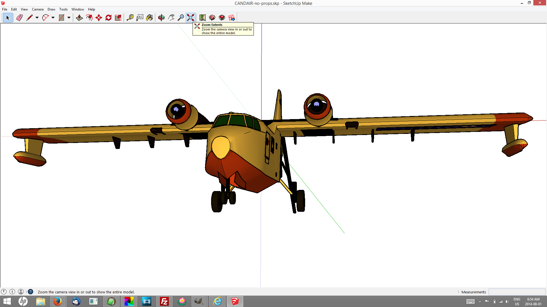
Step 4. Export other parts of the model.

HitFilm bundled with Sony MovieStudio

To import 3D models you need HitFilm Ultimate, which costs money. Sadly, in many places that creates a barrier. If that’s your situation don’t give up! Install Sketchup anyway, explore the 3D Warehouse and watch the tutorial entitled “Use Scenes to save important views” which is advertised from the splash screen when you start Sketchup. Read this, and turn kids loose, let them teach you how to use Sketchup to make animations and then use whatever editing software you may have access to (iMovie? Windows MovieMaker?) to put them together in meaningful sequences. You can still use green screens place themselves right in the action.

I was introduced first to HitFilm 2 Express, which does not do 3d, and came bundled with Sony MovieStudio Platinum, essentially buy-one-get-one-free. I found the $150 very reasonable considering what the two can do together, and within several months I was offered an upgrade deal too good to pass up — 70% off the full cost of Ultimate. The Sony is far and away the better editor and renders movies on average 3 times faster than HitFilm, but unless you can spring for top-of-the-line Vegas you’ll still need HitFilm’s compositing tools and effects, not to mention text styling and animation. If you use a green screen (and you will) you’ll especially need the masking tool.

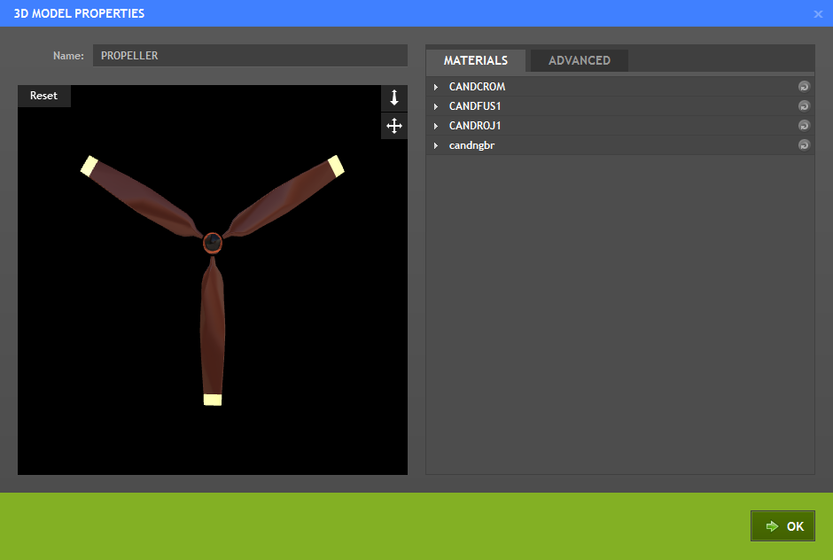
You’ll find [3D Model] on the media import dropdown menu. It analyses the model file and then displays what it found in a 3D Model Properties dialogue.

image of 3d import screen showing propeller

Propeller extracted from Model: FRANCE CANDAIR by XALOC-SOLARIS. HitFilm Ultimate offers an opportunity to tweak the “materials” of each piece of the 3d object.

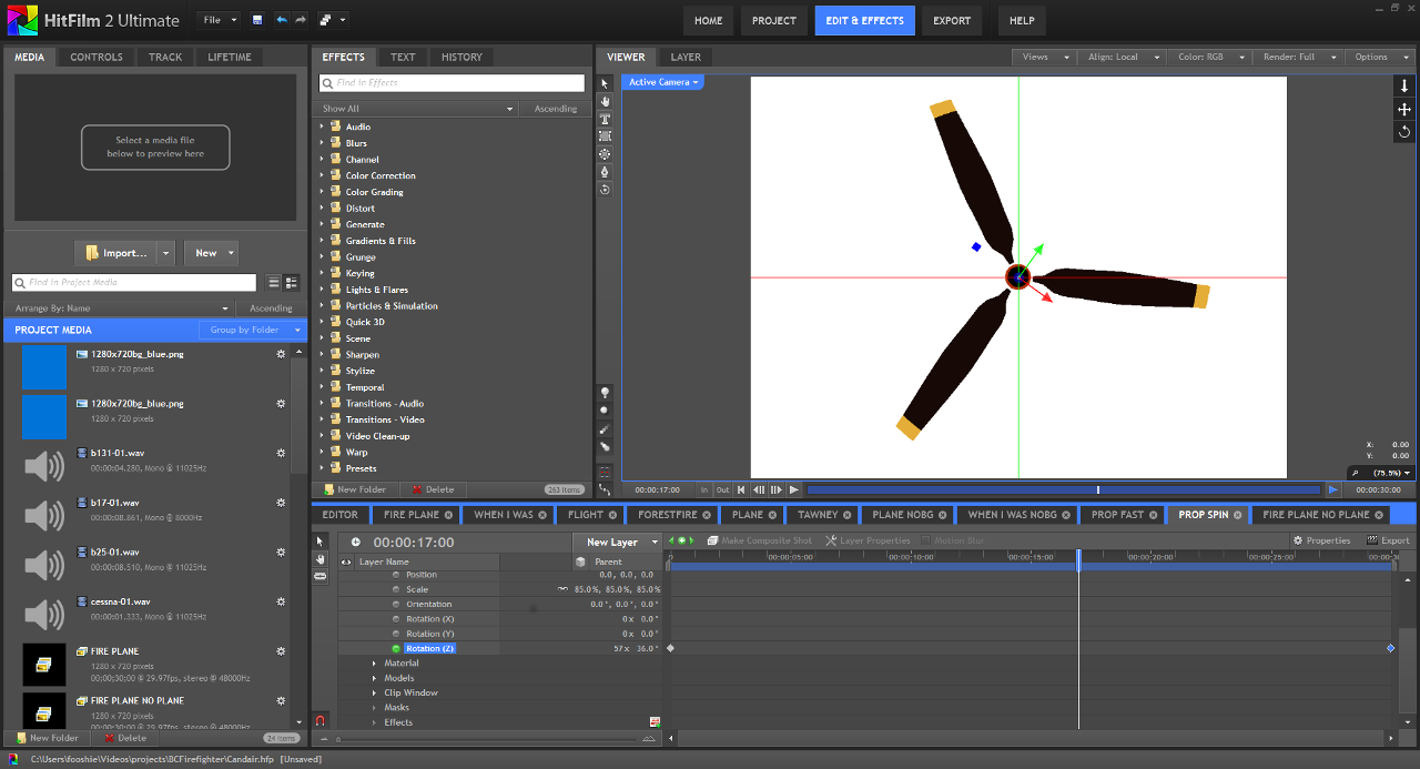
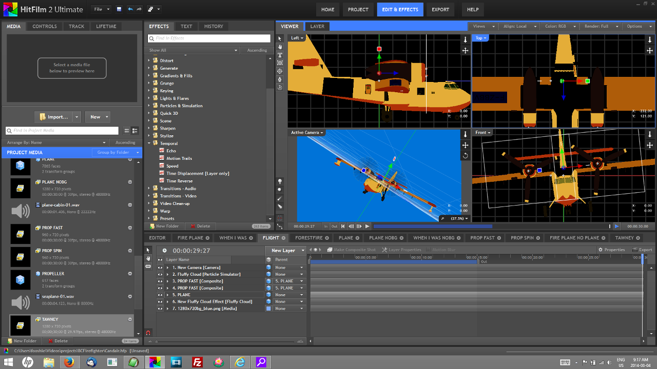
Animating literally dozens of available parameters is straightforward, designating a “parent” layer and attaching “child” layers only slightly more difficult (‘cartoonish’ is just fine with me for now!) Sticking to scale, position, orientation, transparency and zoom are probably more than enough to have some fun creating your own 3d worlds.

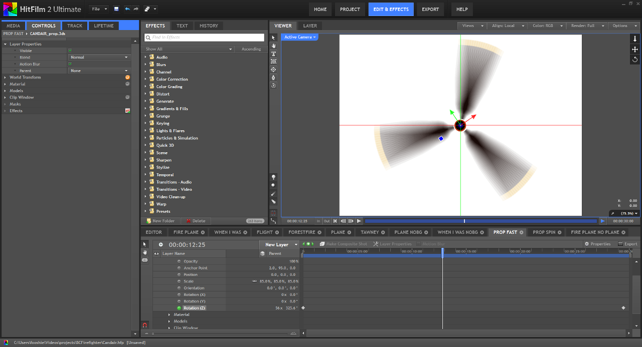
I duplicated the propeller composite and tried some other effects

Putting Humpty together again was a challenge at first, and in the end I think a reasonably good way to get started learning HitFilm’s layers, views and tools.

The way compositing works, this project isn’t necessarily a wrap when you render the day’s creativity. I can spend some time on the script, bring in actors and create variations on “the cargo bay scene,” and when I return to render the “fly by” it will have updated.

The airplane engine came from the repository at www.mediacollege.com.

§

Further reading

Talking Points: Immersive Education Initiative [PDF] from the Immersive Education Initiative

Mar 09

Movie Studio Platinum 13 with HitFilm gets an A

Of all the UI updates we’ve endured this year, I figured SONY Movie Studio Platinum 13 was …another one. But it was long overdue and they did a great job. You need the HitFilm 2 Express bundle to get the mask tools you’ll need for chroma key and green screen work, filters and some snazzy effects you probably didn’t expect to be this easy to achieve in this price range. Together they make a great starter package for young people and people who work with them.

Other than Jahshaka, a project I’ve seen at various times and places on the Internet promising to make a comeback since 2006, I haven’t seen any great open source video editing software. Skills are in high demand, and they should be. I recorded the screen video with CamStudio, and I did some stills with The Gimp.

Classroom technology and access to it aren’t anywhere near consistent, and there are reasons to be found on several levels. Economic ones are high on the list …even cellphones and webcams, software and lights and green screen set-ups in the $500 and slightly under range will still be out of reach for some. In some areas schools must use specific tools prescribed by others, and everywhere there’s inconsistent buy-in. YouTube viewership attests to the power and popularity of the medium, the ease with which one can now produce video with impact, and the pure fun make it an irresistible medium for educators.

By 2010, 19% of Americans had tried video calls, video chat or teleconferencing online and on cell phones. There are definitely equity issues apparent in video calling patterns, making calls on line is appealing to “upscale” users. “A third of internet users (34%) living in households earning $75,000 or above have participated in such calls or chats, compared with 18% of those earning less than $75,000. […] Urban internet users (27%) and suburban users (23%) are significantly more likely than rural users (12%) to have participated in video calls, chats, or teleconferences […] Cell-owning blacks are more likely than whites to participate in video calls, chats, or teleconferences (10% vs. 5%).” (Pew, 2010). But this says nothing about aspirations to tell stories using video.

The corporate take is that video storytelling is not quite ready for prime time. But it was the $10 transistor radio in the hands of teens in the 50s, who didn’t need audiophile fidelity as long as they could take their music with them, that disrupted the vacuum tube.

What’s been missing from video is interactivity. But now there are free mashup tools like Popcorn.js and Webmaker, HTML5 timeline tools that let you pause, mix, overlay your own ideas in text and imagery, or branch off in another direction based on a user input. And video is not something that’s easy to do alone. Can a project incorporating video in a classroom setting meet all the 4Cs, the so-called 21st Century Competencies—Critical Thinking, Communication, Collaboration, and Creativity?

With tools like MSP and HitFilm, or any of the products on this list young people aren’t likely to wait to hear the marketers at SXSW are finally catching up.

§

Jan 23

There’s still time to get edreform right in Canada, and there’s still interest in doing so

Canada’s campaign finance laws, relatively stronger unions, a slight majority of conservatives who understand the role of revenues, tradition of compassion and peace-making—I think these are some of the characteristics of a precariously perched public pride that keep, for now, an all-out US-style free-market frenzy from taking root. “Publick Spirit,” as they spelled it when the call was for 19th Century Competencies, was a virtue touted by Republicans, Federalists, Tories and Whigs throughout the shrinking Empire. @symphily, while being perhaps exceptionally articulate in his questioning, and meticulous in the quality and expression of his supporting arguments, asks immensely important questions that in my experience aren’t exceptionally uncommon amongst Canadian teacher candidates today. They are coining, learning and understanding terms such as “glocalization,” “cyber-colonialism,” “metamodal mastery.”

Just as musicianship is known to support mathematical learning, perhaps entrepreneurship might be responsibly and ethically understood in ways that support social capital, that enrich and nourish the public sphere. Practical action research, connecting theory and discourse in praxis, participatory research… these are respected techniques known for decades in Canadian faculties of education, whether or not they are associated with names like Freire, or Gramsci. Is that why Ontario teachers were able to resist and eventually overcome a neoliberal assault in ’97, to demand some semblance of evidence based assessment be included in the EQAO?

But universities will be given free SharePoint systems, corporate-stocked libraries on wheels will replace education resource centres with their specialist-enhanced collections, and venture capitalists will actively seek out in education what free-marketists call “areas of nonconsumption.” That is a turn of phrase First Nations peoples targeted by the anti-teacher, anti-public spin-off of the American for-profit venture “Teach for America” might want to critique—and might well question!
—moi

But universities will be given free SharePoint systems, corporate-stocked libraries on wheels will replace education resource centres with their specialist-enhanced collections, and venture capitalists will actively seek out what free-marketists might call “areas of nonconsumption in education” (see Christensen, Horn, and other Harvard Business School’s blogs and cookbooks). That is a turn of phrase First Nations peoples targeted by the anti-teacher, anti-public spin-off of the American for-profit venture “Teach for America” might want to critique—and might well question!

What Canada has to fear most is her tradition of complacency. What good is eschewing corporate and union capital in elections if you don’t get up and go to the polls yourselves?

I do agree with a great deal of what C21 has to say about 21st Century competencies and literacies. The SMART board is a truly engaging and open-ended tool, the kind that allows pedagogy to take wings. I think there are genuine educators at all levels of this organization, and I’ve seen them genuinely engaged. In my master’s research I was able to differentiate C21 from its American cousin P21, where a free-market feeding frenzy suggests the “p” might stand for “piranha.” But the line is all too thin and we may remind the enthusiastic Canadian publishers and education technology innovators here—you swim with sharks.

I see the words “student centred” often, and I trust that they’re written with sincere esteem. I yearn only for shared understanding of what student centred actually might look like. I think it says they get to be the ones to decide what kind of world they live in or, for a practical example, that if code is a 21st century literacy we teach kids to read and write code—not simply to buy other people’s code. The discourse and theory of disruptive innovation too can be disrupted — students and teachers adept at technology, collaboration and critical thinking will be quite capable of creating rich learning situations with or without their own choice of self-authored, open source and/or commercial products, chosen because they support the lesson—never because the lesson was designed to sell a product. Students assessed to identify strengths and weaknesses, to improve their next performance—not because there’s a contract with a far-away testing company whose CEO may expect an obscene bonus for creating numbers that will be used against them and their support systems.

With awareness, involvement and due vigilance—“jealousy” as they said when public had the extra “k”—and an understanding that democracy is a way of life, not the vote you cast every few years—genuine ITC *facilitators* of deep, thick learning, teaching excellence, and student achievement will gain favour and remain important contributors, while ITC *directors* who say they have all the answers, who employ the “power tools” of coercive disruption to push those they label “resistant to change” aside in the interest of profits and stockholder achievement, will fail and fade away.

Thank you Mr. Kierstead for your work in transforming education. Thank you Mr. Steeves for your vigilance and this essential restoration and re-framing of the critical underlying issues. Thank you also Mr. Cantor for your supporting evidence and the astute simile that inspired me to think back yet another hundred years.

Let’s protect Canadian schools and children from blind, uncritical, ideology-driven trust in innovation, and put into practice policy that rewards the genuine thickening of learning situation—differentiating informed ongoing assessment from deficit thinking and prejudice, critically evaluating whether a perceived anaemia is due to poverty, language acquisition, a learning disability, or something else—student-centred investment in students, actively learning. Investing in the supply chain that monetizes a child’s learning environment for quick gain is something that costs so very much more, and yields so very much less.


† Comment on C21Canada.org awaiting moderation. The post is a year old; I may eventually revise or elaborate the above as a new and independent post, if after some time approval is not forthcoming. -RCF

§

Further thought and reflection

Morbey and class (2014) EDUC 3610: Morbey, Franklin, and Friedman. Professor Mary Leigh Morbey’s Teacher Candidates at York University consider cyberethics, comparing Morbey, Ursula Franklin and Thomas Friedman and asking, “…in light of all three writers how do we begin to think about ethics, technology, and education?” [Prezi]

Jan 18

CompendiumLD for Learning Design

When the Open University funded the Learning Design Initiative in 2007 they asked about 4 specific aspects of the topic: efficiency & effectiveness of time spent designing learning; ways to represent innovative practice; access and availability of quality support for designers; the true nature of a quality design as it appears or presents in practice. With the continued support of Jisc they’ve produced a range of tools. When the OULDI picked an open source code base on which to build a collaboration-friendly tool to visually represent “a learning design” they “…considered various drawing packages, as well as more specialised mind mapping tools (such as Inspiration and MindManager).

Please note
Your browser can not display SVG so you will not see the interactive vmap that should be shown here.

To see the interactive map, please use a browser which displays SVG, e.g. Chrome, Firefox, Opera, Safari or Internet Explorer 9 and above.
Thank you.

In the end we choose to use Compendium, a visual representation tool, originally developed for enabling group argumentation…” (OU Website).

Compendium was already the Open University’s home-grown product. They set about adapting it specifically to the requirements of learning design, and they named it CompendiumLD. Learning Design is and evolution of traditional and established “instructional design” that provides a more holistic approach (Conole, 2014). Their tool truly does offer a “…range of flexible approaches to the design process,” the interactive SVG to the right, if you’re able to see and use it, is only one example, a “Sequence Map View.” Scalable Vector Graphics (SVG) is an XML-based vector image format for graphics that supports interactivity and animation (Wikipedia). If you’re getting JavaScript alert popup message when you mouse over blame them, not me!

Learning Design emerged “as a counter measure to Instructional Design. Driven primarily by researchers in Europe and Australia, Learning Design aimed to provide practitioners with guidance and support to inform their design process which is pedagogically effective and makes appropriate use of technologies. It is seen as a more encompassing term than Instructional Design, which operates primarily at the level of multimedia; in contrast Learning Design provides a holistic approach to the design process.
—Gráinne Colone, OULDI Project Lead (September 2008 – August 2011)

On the CompendiumLD corner of the Open University’s site you can also see a “Learning Outcomes View,” and a “Task Times View,” showing how you can use CompendiumLD to deliver timed assessments. For more advanced examples, see this Peer assessment using a wiki., or an example Modelling adaptations featuring open educational resources, “a design which shows how existing open educational resources can be included in an activity structure that caters for learners with different levels of skills and knowledge” created with a perhaps somewhat dated (<frameset>, <script Language="JavaScript1.2">) but nevertheless reliable and robust1 Web Export functionality that lets you share your designs with collaborators and other learners.

If there’s anything “wrong” with Compendium and CompendiumLD, you see it in these screen shots… is it perhaps a somewhat 90s, or turn-of-the-21st-century look to the icons? Never mind! Don’t let that distract you from what you can do with CompendiumLD. If it still bothers you, you can in fact change the images, icons and stencil sets, and it’s source is freely available — if you’d like to work on the interface the community will likely be grateful. Just look at CompendiumNG if you’ve any doubts there’s a next generation coming up in the Compendium family.

As part of the JISC Curriculum Design project (OULDI_JISC), four other [higher education] institutions (Brunel, Cambridge, London South Bank and Reading Universities) have been trialing and exploring the use of the OU learning design methodology. The purpose of these pilots is to determine the transferability of the OU methodology across a range of different HE organisations. In addition the pilots will provide the project with valuable feedback about the tools and resources developed as part of the OULDI-JISC project, and the approaches we have used to introduce and embed the methodologies institutionally (workshops, special interest groups and the toolbox etc). These Universities previously worked together as a cluster group for the HEA Pathfinder Project, on which Gráinne Conole was critical friend and it is expected that this work will build on, and extend on, that project.

I’ve had a strong sense of the value of these tools—and of the entire paradigm surrounding their development2 and use that seems to me so well-aligned with the long-established findings of cognitive apprenticeship—since they first came to my attention only a couple years ago. I’m truly excited to see their work expand and continue.

§

Further reading

Conole, Gráinne (2014) Reviewing the trajectories of e-learning, blogged chapter from forthcoming publication. Or start with my shorter overview

The Open University Learning Design Initiative “Our aim is to develop and implement a methodology for learning design composed of tools, practice and other innovation that both builds upon, and contributes to, existing academic and practitioner research. We have been working across several OU faculties and with 4 other universities to pilot curriculum design activities and relevant supporting tools and to contribute to the broader academic work in the subject.”

Jisc, “UK’s expert on digital technologies for education and research”

Fouchaux, Richard C. (2013), Thick learning situations: paths towards a framework for 21st-century learning design, project, paper and various web applications [HTML]
[…demonstrating, if not quite explaining, its own subthesis—the impending obsolescence of the traditional paper—and the work left to be done in utilizing new forms, and raising them to the status of other literacies! My MRP, the birth of this site. -rcf]
.


  1. By comparison, I discovered Visual Understanding Environment (VUE), a similar tool from Tufts University, has advanced as far as image maps enhanced with an early version of jQuery, but I found it very easy to break by putting HTML or the wrong text characters into the Node Notes.
  2. Back in 2011 I tried to say it in 10 seconds, but it took me 11, and maybe it’s not entirely clear I’m talking about the same issues. What do you think? [video]

§

Nov 24

JavaScript the least of (my) hurdles with MIDI.js

On #musedchat Monday Nov 18 I saw an opportunity to mention an open source Scoring/Engraving tool and was soon encouraged to send more links to open source resources. I’ve been collecting such links in the bookmarks of various browsers for years, and I’ve followed through on my initial interest to various degrees, so in some cases I found myself checking links along with my memory. In one case—MIDI.js—I said a big “Oh yeah! I was gonna try installing that, wasn’t I?”

How easy it is to try out any of the hundreds of thousands of interesting and potentially useful JavaScript offerings one can find on the Internet depends a lot on how much documentation the developer and interested community have provided and good examples of the code in (ahem) “authentic situations.” No matter how good it is, if you want it you’ll soon have to view source and dig in. The code behind MIDI.js looked to me daunting, but on closer inspection it turned out the biggest hurdle was recognizing the playlist of MIDI files is an array of Base64-encoded strings hard-coded in the file. If you know what that is, and if you can encode your MIDI file as a Base-64 string then copy/paste it over the ones in the original example—and if you set up the folder structure identically to the original (clone the Git repository straight into /xampp/htdocs if you work with a LAMP setup like mine)—it just works! But it looks just like the author’s.

The design is not responsive1 and doesn’t fit my blog or mobile device. The colours are very cool but I don’t need them. The note display has so many pedagogical applications my brain is exploding—but it doesn’t fit on my pages, same goes for the player and buttons. The JavaScript knowledge I need is “just enough” to identify where to safely slice and dice the code and recognize the very few places I might change something. It was more important I knew Base-64 encoding is something I’d likely find a web site to do. The highest-level skill needed here is actually CSS. I need to restyle the player so it fits my pages in the contexts I expect it to be viewed. And I want those notes to play along exactly as they do now, just in a completely different layout.

Here’s what it looks like today. (It’s not worth listening to in anything but Chrome).

An undefined error originally came from this line, but I haven’t found where MIDI.lang is supposed to be defined, and the sentence really doesn’t tell me anything I care to know if I define it as “English.” I made sure the page has a title and I even gave it a language attribute but no luck only by hard-coding it as shown below could I stop it so far. Will dig in [to the MIDI object, its properties and methods] later.

// I added...
// Quick suppression of undefined
MIDI.lang = MIDI.lang || 'en-ca';
/// above...
// this is the language we are running in
var title = document.getElementById("title");
title.innerHTML = "Sound being generated with &quot; + MIDI.lang + ".";
// I also added at line 108
pausePlayStop(true);  // Sorry Gasman. Autoplay is just wrong!
// Just above that I see <code>song[songid++%3]</code>, the '%3' implies something hard-coded that applied to the fact there used to be 3 midi files. To be continued... 
Sep 30

LilyPond with Frescobaldi: open source music engraving

LilyPond is open source music engraving software. LilyPond “…was designed to solve the problems we found in existing software and to create beautiful music that mimics the finest hand-engraved scores.” It produces some of the finest looking scores you can imagine, and almost any style of note or notation you can imagine. But it’s a scripting language—which for many people makes it very difficult to learn, and much too tedious to use. Enter Frescobaldi.

Frescobaldi is an open source editing tool for LilyPond. I won’t pretend there’s no learning curve, but if you want to print absolutely stunning music scores and enjoy learning technology it’s worth it, and I’ll help you get started. And if you’re a music educator I’ll make some suggestions about how I might use this in teaching, albeit at a high school level or higher, with students who have already learned the basics of reading. Thanks to Frescobaldi’s built-in MIDI player I see applications to ear training, as well as more obvious help with general notation problems. I’ve also screen-recorded some of my first explorations, and I intend to edit them down and add audio, and continue with a video tutorial, hopefully in just a few days.

Both programs run on Windows, Mac or Linux, but there’s no Mac or Linux installer for Frescobaldi, so if you’re not running Windows you may need some extra skills there. First, download and install both programs using the links below. You will not need to launch LilyPond. You’ll launch Frescobaldi, tell it where to find LilyPond and Frescobaldi will take it from there.

Software links

LilyPond is a music engraving program, devoted to producing the highest-quality sheet music possible. Download

Frescobaldi is a LilyPond sheet music text editor. It aims to be powerful, yet lightweight and easy to use. Download

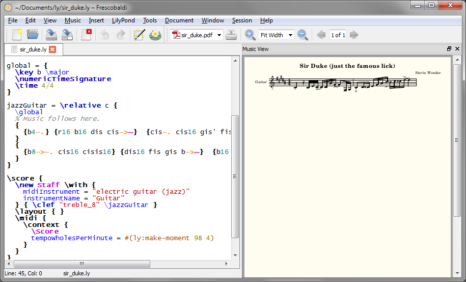
  1. On first launch Frescobaldi opens an empty document. You type and insert LilyPond code in the left Editor panel and then press the LilyPond icon ion the toolbar to render a gorgeous PDF in the right, or Music View panel. hide image Screen shot
  2. Choose EditPreferences… show image
  3. Set path to LilyPond show image
    Windows default: C:/Program Files (x86)/LilyPond/usr/bin/lilypond-windows.exe
  4. Choose ToolsPreferencesSetup New Score… (Ctrl+Shift+N) to open the Score Setup Wizard show image
     Other items on this list will be of great interest soon… I used the Quick Insert tool and the MIDI Player early in my very first score.

    The Score Setup Wizard lets you set the following up front—especially recommended your first time, as once you create the file you’ll need to get code snippets from the documentation, the other tools in the Tools menu, another file, or know what to type.
     You might even want to fill in all the fields and save a MasterSnippet.ly file for later reference. Frescobaldi also has its own built-in Snippets manager.

    1. Titles and Headers show
    2. Parts show
    3. Score Settings show
       Be sure to try the Preview button!

To get started I just picked 8 bars of a Stevie Wonder tune I happened to have loaded in iTunes. You can see the first 2 bars of the lick on the right of the screen shot below. The script on the left side, which you’d have to write from scratch without an editor, demonstrates rather aptly I think, why a tool like Frescobaldi can likely make LilyPond more useful to a much larger community. What will be much easier to demonstrate in a video tutorial is how I copy/pasted a snippet of code from the documentation into the editor and then tweaked it until I got what I wanted. The notes you see on the right are formed entirely by this part of the script on the left. 'is' as a sharp is not intuitive (unless you speak Dutch), but now that I’ve told you perhaps you can see the 4, 8 and 16 that sets note values, ‘r’ for rest, and the lower case note names, key of B Major. The tildes (~) create the ties, and I entered staccato and accents using the Quick Insert tool shown in the left panel of the final screen shot below.
 All your music goes immediately after the % Music follows here. and before the closing curly brace (}) that lines up flush left with the instrument name above it and the code \score below it (see both screen shots beneath the following code snippet).

// You can group and nest notes in curly braces for readability.
// Here I've grouped each beat within each measure on its own line.
{
{b4-.} {r16 b16 dis cis-&amp;gt;~}  {cis-. cis16 gis' fis-&amp;gt;~} {fis8-. fis,16 gis}
}
{
{b8-&amp;gt;-. cis16 cisis16} {dis16 fis gis b-&amp;gt;~}  {b16 cis16 cisis dis-&amp;gt;~} {dis4-.}
}

Screen shot

By the time I’d finished I’d opened the MIDI Player to check my work. You need to press the Engrave button to refresh the output on the right (there are further options under the LilyPond menu). Frescobaldi supplies the bar lines based on the time signature in the score settings, and plays audio—I feel those two facts have pedagogical implications. I slowed down my 8-bar passage using Audacity, played them side by side, and by refreshing the output was able to see and hear what I had right and wrong along the way.
Screen shot
I hope this is enough to pique your interest. There’s another LilyPond editor I plan to try soon too, Denemo, highlighted with even more on the LilyPond site. It looks quite sophisticated, but I can tell I’ve barely scratched the surface of Frescobaldi, which was intuitive enough out of the box to keep me intrigued and progressing—getting this far was fun! Please use the comments section and stay tuned for some video tutorials as I get in further.

§

Richard studied as a teenager with Trevor Payne at John Abbott College and attended Berklee College of Music in Boston. He has performed across Canada with full-time rock bands since the early 80s. He’s been a teacher of rock, jazz & classical guitar at the now defunct Toronto Percussion Centre, and at The Arts Music Store for many years. He holds the degrees of Bachelor of Fine Arts Music (Special Honours), Bachelor of Education, and Master of Education from York University, plays guitar and trombone, and taught grade 6-8 band at the Toronto District School Board and North York School Board.