Dec 08

Music Unit – Blues and Ukuleles

The ukulele is a surprisingly versatile instrument. For very little money you can get one that sounds good, stays in tune and is easy to play, and the Internet is full of learning resources for the classroom. I acquired one last week, downloaded a chord chart, and figured out the Blues in C, and how I’ll get a grade 7/8 classroom strumming it.

This week I aim to teach…

  • holding/strumming
  • fretting hand position,
  • 3 chords “I7 IV7 V7 in Key of C”
  • a well-known lick and
  • a strumming rhythm. 

The shuffle rhythm is precisely what drummer LaFrae Sci refers to as “The heartbeat of the blues,” so I’ll show her 8-minute video. We’ll do the interactions she suggests as a class, and then I’ll transfer the “heartbeat” rhythm to the strumming arm. (I also need to remember to find out how many lefties are in the group!)

I’m leaving tuning for later, although I’ll talk about it. I need to make sure the ukuleles start out in tune. I’m going to stress ear training every visit, but this week my first objective is to give them instant gratification, get them  “playing “something.” 

I’ll show the whole group each chord, count off into 3 groups, lead them through 12-bar Blues, swap groups and repeat.

TuxUkulele

To use TuxGuitar as a tab and notation editor for ukulele, choose Tracks→Properties and set up like the screenshot.

Screenshot, Tux Guitar app set a ukulele.

Nov 11

Music Unit—defining dignity, teaching empathy and the Blues

By the end of Grades 7 & 8, students will:

C1. Creating and Performing: apply the creative process (see pages 19–22) to create and perform music for a variety of purposes, using the elements and techniques of music;
C2. Reflecting, Responding, and Analysing: apply the critical analysis process (see pages 23–28) to communicate their feelings, ideas, and understandings in response to a variety of music and musical experiences;
C3. Exploring Forms and Cultural Contexts: demonstrate an understanding of a variety of musical genres and styles from the past and present, and their sociocultural and historical contexts.

In this unit students gain musical skills and language while learning to write and perform the Blues. It’s written by and for a guitarist with background in theory and performance, but in a way, I hope, that can be adopted by any instrumentalist, or even by the less musically inclined teacher with support from local musicians.

Musical outcomes:

  • Learners will encounter and engage with elements of music
    • duration, tempo markings
    • pitch
    • dynamics and other expressive controls
    • timbre
    • texture/harmony
    • form

The expectations encourage students to explore issues related to personal identity and community concerns as they interact with increasingly complex and/or challenging media; to critically analyse and evaluate perspectives in works of dance, drama, music, and visual art; to use inquiry and research skills to extend their interpretive and creative abilities; and to use the arts to explore and comment on topics of relevance that matter in their daily lives. Issues of social justice are often highly engaging for students at this age.

Exploration and communication of multiple perspectives and points of view should be emphasized. The arts curriculum for Grades 7 and 8 is designed to engage students in tasks that they see as meaningful and motivate them to learn about and create art works out of interest as well as to meet curriculum expectations. In addition to the materials provided for instruction, students should have access to a wide range of themes, materials, and activities that are relevant to their personal experiences and interests as creators, artists, and critically literate viewers.

— Ontario MoE (2009, pg 131)

Social justice outcomes:

  • Choose a topic based on a personal story involving fairness, equity and/or social justice
  • Write Blues lyrics
  • Compose and perform music in the Blues form

The introduction is based entirely on what I know. My own musical education was, for the most part, highly Eurocentric. Fortunately my musical upbringing was much less so. By the time I was 11 my parents had exposed me to music as diverse as Miriam Makeba, Ravi Shankar, Wendy Carlos’s Switched On Bach, and Charles Ives.

I take the learners through an admittedly superficial and brief history of the guitar and “standard” notation, what it might have been like to be a musician 400 years ago—Who did musicians work for? What kind of music did they write?—and I play some Western European music.

Cultural Relevance

To be culturally competent and relevant, based on the demographics of my design, I’ll include parallels to South Indian classical music, the Persian origin of the ‘tar’ in ‘guitar’ and influence of the instrument of the same name, the African roots and history of the Blues as a response of an oppressed people to slavery and subjugation.

I teach blues licks, and I teach that if you can say it, you can play it. This practice strategy has parallels in many African and Middle Eastern cultures and reaches the level of a science in South Indian (Carnatic) music’s solkattu and tala system. The Blues and Jazz contain many examples of “scat” singing, which I use in a couple ways to introduce and reinforce the practice.

Structure

Day 1

The unit starts with a small concert by me. I set up my nylon string and an electric, with my amp and array of effects pedals in plain view to arouse curiosity. One of my petals is a Roland loop station, which contains pre-recorded accompaniment I will use in my performance. I have a Smart board behind me and my laptop in reach for accompanying visuals. I’ll play short representative pieces from Baroque, Classical and contemporary periods. I’ll show slides of the music notation and the period and say something about each piece. The acoustic pieces—a chaconne, a minuet, some studies and a performance piece—are chosen to highlight a progression from a context of music purposed for religious services and dance, sponsored by the Church and aristocracy, to one of concerts and freelance performers expressing themselves and making statements.

I use Steve Howe’s Mood For a Day to segue into the modern era by asking the class to guess what century it’s from, and whether it’s another dance, study or a performance piece. The Roland Loop Station comes with pre-recorded demos that include a 12 bar blues. I’ll say a few words about the blues, its form, the blues scale and “licks” then jam to demo . I totally show off and shred some blues licks, but make a point of following the form and scale I described. 

I’ve customized the lesson by storing a backing track from a song I know for certain, having visited the classroom where I’ll be doing this, is something we all know — Under Pressure by Freddie Mercury and David Bowie. I prepared it using a MIDI file and a Roland Fantom-S keyboard too large to include in today’s setup.  It’s important not to run out of time before showing the ukulele blues video

The school has ukuleles. The goal of the first, introductory lesson is to situate the music they listen to in historical and cultural context and to inspire and motivate the class to want to learn to play Blues and compose some blues of their own. 

Day 2

Slavery, Dignity and The Blues: Use the Smart board and laptop to show some of Dana Gluckstein‘s photos showing the dignity of indigenous people, including Africans. Of each picture, ask the class if the subject has dignity, why do they think so, and what does dignity look like.

End this short segment by showing the picture of Robert Johnson. Remind the learners about the era and Jim Crow. Tell the Legend of the Crossroads. The purpose of this introduction is to plant seeds for the personal stories of fairness they’ll soon turn into Blues lyrics. 

Distribute pre-tuned ukuleles and demonstrate how to hold them. From this point on we begin to see wide differences in talent, experience and musical motivation emerge, which is a challenging piece of every group musical learning experience. Some kids can learn a I IV V pattern their first time with a ukulele, others may be struggling to curl their fingers and press a string behind a fret. 

With the 12 bar blues form displayed, I attempt to show the fingering for 3 chords and split the class into three groups, each one holding their fingers in place over one of them. As everyone counts I conduct, pointing at each group when it’s their turn to play. The V chord group is also known as the “turnaround” group. We can have some fun improvising turnaround rhythms, and begin using “say it then play it” strategies that they’ll use for as long as they remain involved in playing music.

Day 3 and beyond

We’ll watch Does it Swing? An Introduction to Swing Jazz for Young People part 1link, using points in the video to focus learning strategies to continue learning the ukulele and the Blues, for example, call & response, and I’ll use short activities to tie these directly to the musical elements (tempo markings, pitch, dynamics, timbre, texture, form, etc.) required by the curriculum. We continue exploring the social conditions that accompanied the rise of the Blues, it’s evolution through jazz and ongoing influence on every form of music, ever since.

Lesson Resources…

… are stored in a concept map found here. This map can actually be shared with students, who may wish to provide their own suggestions. If there’s interest and the situation permits we may want to use the cmap cloud (and/or provided/available collaboration support).

CMapTools for Learning Design

This map is organized as a concept map, reading top to bottom and left to right. I accept and promote a formal definition of “concept map” as a structured mind map, detailed here. I like the CMapTools software better than several other mapping tools I’ve used for this process because it looks and works identically in a browser, can be shared via a free cloud repository, and significantly: because I can attach many resources to a single node. 

Beyond learning the buttons, this is the first time I’ve actually used CMapTools. At the time of writing the introductory lesson is reasonably well laid out… I’ll play the pieces in order from left to right, and the things I want to show and tell about each, including direct links to things like the sheet music and images from the period, form sub-concept-like columns underneath. The power of CMapTools can be gleaned by looking at the outline dialog. You’ll also see how to develop concepts into propositions using linking words and phrases. Seeing the outline of my partially developed map not only helped me set up my activities more logically, it helped me better understand the rather powerful tool set this definition of concept map brings to the practice of mind mapping. (My linking phrases, especially near the top of the map, need some work!)

I’m comfortable with the delivery and familiar enough with the material that this kind of map, with the links to content, is all I need. But I think it would be easy to make very precise daily lesson plans from such a sketch. I’ll simply drag the nodes around each activity or resource into more clear-cut columns.

§

Reference:
Ministry of Education (2009), Ontario Curriculum 1-8 The Arts [PDF]
Blues Kids of America
Nov 09

Who’s directing whom?

Photo. The cart is placed before the horse, who also looks confused.I’d like to tell you about the first time I taught children how to make webpages, which was in 1993, while a “teacher candidate” in the province of Ontario, Canada. There was an Education Resource Centre with a computer lab, an odd collection of Mac II, Mac Classics, and the last working Commodore 64s I saw for many years, and a few early Windows computers. I caught on quickly and soon landed 10-15 hours of gainful student employment each week. I was then, and remain today, an educator first and a technologist only so far as it supports the learners’ objectives.

Placed in a classroom within the (now defunct) Etobicoke Board, I needed the help of the school’s IT director to make sure each computer in the ambitious early 90s computer lab had access to the software they need during an in between my weekly lessons.

In their 2014 report, People for Education find that fewer than 1% of Ontario schools lack technology but it wasn’t the case in the early 90s.

Pause here to picture such a lab, and remember (as you can read on fact sheet 5 of the Census 2001 Highlights Immigration to Ontario Internet site) the Toronto census metropolitan area (CMA) had one of the highest proportions of foreign-born residents of all major urban centers in the world. Ontario’s public schools always reflect the faces of the immigration realities of the moment1.

My host school in 1993 had something else that was very new in those days—it had an IT Director. As it turned out, the relationship we developed revealed a conundrum that persists in organizations of many kinds to this day.

Naturally my lesson was being evaluated, and my course directors and adjunct professor expected the learning design to reflect my ideas and interpretations of such things as the anti-racist philosophy of education the Faculty espoused—and that I’d be the one directing the learning. So it was, in my very first adventures in electronically enhance learning design I quickly discovered that I wasn’t looking for an IT director — what I needed was a “facilitator,” and all the support and deference in executing my ideas the subtle distinction implies.

The third vision is a progressive one. The personal computer is used to amplify human potential. It is an intellectual laboratory and vehicle for self-expression that allows each child to not only learn what we’ve always taught, perhaps with greater efficacy, efficiency or comprehension. The computer makes it possible for students to learn and do in ways unimaginable just a few years ago. This vision of computing democratizes educational opportunity and supports what Papert and Turkle call epistemological pluralism. The learner is at the center of the educational experience and learns in their own way.
—Gary S. Stager, Ph.D.

Among his first questions to me was, why would I want to teach “these children” to write webpages? Maybe he mistook the early 90s fish-eye monitors for crystal balls, because he looked into the third graders’ future and told me they were mostly destined to be “end-users.”

As time passed, under further scrutiny he revealed that he considered his knowledge a territorial matter, requiring security, restricted access, and various other protections. So in my earliest attempt at widening the spread of code literacy I quickly learned that the control of information technology would become a powerful definer of access and privilege.

Quite clearly these attitudes are manifestations of deficit thinking. The relationship that unfolded and the conundrum were as follows: I could not accomplish my goals without him, yet I most emphatically could not let him direct.

More importantly, my grade 3 students could not afford to let him decide their computer science futures, or label them “end-users” with a derogatory connotation.

In the intervening years I’ve seen universities barter and leverage software, educational discounts and lab access in contexts ranging from educational to purely political, from departmental restructuring to instructional design. Technology is not neutral. Technology is political. It is a freedom issue, and an issue of democracy.

…leadership for equity needs to incorporate inclusive procedures such as discussion, transparency, and community involvement as well as an honest treatment of substantive issues that matter (e.g. racism and sexism) […] If we really believe in the ideal of leadership for equity in education, then we need to be aware of the nature of the deficit mentality, its pervasiveness and its dangers. (Portelli , Shields & Vibert, 2007; Portelli & Campbell-Stephens, 2009)

Educators do not need to be programmers to empower programmers. Just as technology support staff must facilitate and help implement the ideas of educational leaders, those leaders must discern and facilitate the educational aspirations of the learners in their charge.

§

    Notes:

  1. At 16%, China, including Hong Kong and Macau, was the leading country of birth among people who immigrated to Ontario in the 1990s. It was followed by India with 9%, the Philippines with 6%, Sri Lanka at 5.2% and Pakistan at 4.5%. At the time, European immigrants to Ontario were mostly from Poland, Yugoslavia and Russia. Jamaica was the leading country of birth among the Americas. Somalia was the leading birth country in Africa. (StatsCan)

References

Polgar, Jan Miller (2010), The Myth of Neutral Technology
in M.M.K. Oishi et al. (eds.), Design and Use of Assistive Technology: Social, 17 Technical, Ethical, and Economic Challenges [pdf]

Portelli, John P., Shields, Carolyn M. & Vibert, Ann B. (2007). Toward an Equitable Education: Poverty, Diversity, and Students at Risk. Toronto, ON: Centre for Leadership and Diversity, OISE, University of Toronto.

Portelli, John P. & Campbell-Stephens, R. (2009). Leading for Equity: The Investing in Diversity Approach. Toronto, ON: Edphil Books.

Stager, Gary (2013), Technology is not Neutral – educational computing requires a clear and consistent stance blog post

Aug 31

Case Method — classroom catalysts, from story to discourse and back again

Dis′ • course
1. spoken or written language, including literary works; the four traditionally classified modes of discourse are description, exposition, narration, and persuasion.
2. a form of discourse analysis, focusing on power relationships in society as expressed through language and practices.

One of the more interesting graduate courses I ever took, by way of both content and teaching style, was Current Policy Issues in Ontario Schooling. It was designed by the late R. Patrick Solomon but due to his tragic and untimely demise from cancer it was taught by his Brave New Teachers co-author John P. Portelli, at York University in the winter of 2010. Every class began using another of John’s books, What To Do? Case Studies for Educators 3d. Edition. It’s a collection of true stories from the classroom, either with an unknown outcome, or maybe a controversial but open ended one. Our job was to place ourselves in the classroom and reflect on what we might do in the same situation. Each “study” comes with 2 discussion questions at the end. We had no problem contributing additional ones of our own, and there are appendices containing further reading and resources for critical inquiry.

Case method

…curriculum reform focused on the effective negotiation of learning experiences between students and teachers and centred on the former’s concerns affords the opportunity for students to reengage in a creative, meaningful education where they are co-constructors of knowledge with their teachers in a genuine learning organisation.
O’Grady, O’ Reilly, Portelli, and Beal (2014)

Image of the book cover
Case method is the use of case studies as catalysts for conversation. The case poses a dilemma or problem, and the group must collaborate finding solutions. There’s ample evidence they work in many different areas, for many different age groups. With the right preparation and delivery they can “serve as springboards” that “engage students and faculty in collaborative problem posing, problem solving, and persuasion.” In other words, discourse.

“Case method teaching brings together three components: an appropriate case, students who are prepared to engage with the case material in a discussion, and an instructor who knows the case, has a plan for the discussion and is ready to deal with the unexpected.” (more). There are two well known approaches (Desiraju and Gopinath, 2001), the traditional Harvard Case Model (HCM) and an alternative proposed in the early 70s in response to criticism of HCM, the  McAleer Interactive Case Analysis (MICA) method (quoting McAleer, 1976; McAleer & Hale, 1992; Siciliano & McAleer, 1997). Desiraju and Gopinath conclude, “…students in the MICA method section reported better preparation and participation benefits as compared with students in the HCM method. In addition, students in the MICA class were better able to identify the main focus of the cases discussed, showing that they were able to better recall the content issues involved in the case discussion. Thus, on both counts of content and process, the MICA method appears superior” (2001, p. 406), influencing my current proposal, which follows.

I’ve written earlier about literal and extended meanings of discourse, and at how it can be at once a tool or model that describes, defines, and delineates narrative, and the narrative itself (see Foucault, or Derrida, for example). As we’ve heard, “…students develop skills, abilities, knowledge, and approaches, as well practice and discipline in becoming more reflective and creative. Most of the major theories of learning developed over the years all point toward effective learning being rooted in experience through the use of collaborative inquiry, discovery, reflection, and critique” (Booth, Bowie, Jordan & Rippin, 2000).

Children and Issues of Fairness

Our lives are “a series of unrelenting power struggles” (Buckmire, 2014, p. 0). Shaw, DeScioli, and Olson (2012) expose an “…inherent tension between favoritism and fairness” leading to “two related questions about children’s developing social behavior. First, how do children make allocation decisions when favoritism and fairness conflict? Second, how do children judge other people’s decisions about tradeoffs between favoritism and fairness” (p. 737)? I propose that cases relating to favoritism and fairness be used within a case method framing to instigate classroom discussion.

“There are few discussions of case teaching in the context of increasing student diversity or numbers, or of the use of the method on undergraduate programmes generally,” say Booth, Bowie, Jordan & Rippin (2000, p. 64), and probably fewer still that study its use with children and adolescents. This presents opportunities for field work and projects that blend other exciting developments, such as Maker Education (“…a unique combination of artistry, circuitry, and old-fashioned craftsmanship…”), to situate learners in collaborative inquiry and project-based settings that may develop and challenge their critical thinking in truly transformative ways. 

Where to obtain content

If your interest is fairness and you’re looking for stories to spark conversations there are undoubtedly many sources, and I hope you’ll add your own suggestions in the comments. In the meantime, I invite you to take a look at the Ontario Human Rights Commission’s Teaching Human Rights in Ontario: A Guide for Ontario Schools, and the case studies available within. As it’s a public document, provided by the Government of Ontario, you’re free to do with it as you please, as long as you credit the source and you don’t remove the Queen’s Printer’s copyright.

These are actual cases, that set the precedent, that made the laws, that inform the Ontario Human Rights Code. The Commission says “The case studies in the Students’ handouts section can be approached in two ways.” Really? …only two? It’s clear Ontario’s students can imagine at least 3 general categories of 21st Century multi-modal literacy students themselves identify as meaningful: games, apps, and video.

All of these can take many forms, and if we educators lack the imagination or experience to think in so many forms, students certainly don’t. Take a look at what students put together with Mozilla Webmaker and the Canada Privacy Commission last year.

I’m volunteering to help

In the coming weeks I’ll provide tentative lesson plans for a few of my own ideas. I’ll work with any teacher anywhere (via the comments section) to customize the plan(s) for your own learning situation. They include…

  1. #HourOfCode (or 2 or 3) building a web app, with teacher and class versions so you can learn together
  2. More web app stuff using online resources from THRiO (Human Rights Temperature and Glossary)
  3. Digital Storytelling using green screen and 3d techniques (this video goes with OHRC Case Study #9, “Tawney” the BC Firefighter… do you have a student that might be called “too short?” Do you think the person is invalid, or the standard?).
  4. More digital storytelling and games using such digital literacy supporting as Twine, Vine and ;

I’m ramping up to share these ideas and techniques in detail. Please watch this space!

§

Reference, further reading

Boehrer, John and Marty Linsky, “Teaching with Cases: Learning to Question,” in M.D. Svinicki (ed.), The Changing Face of College Teaching, New Directions for Teaching and Learning, no. 42 (San Francisco, CA: Jossey-Bass, 1990), p. 42.

Booth, Charles; Bowie, Stuart; Jordan, Judith; Rippin, Ann (2000), The Use of the Case Method in Large and Diverse Undergraduate Business Programmes: Problems and Issues, The International Journal of Management Education

Buckmire, Mark J. (2014), Human Fairness: An Evolutionary Approach,

Crone, E. A. (2013), Considerations of Fairness in the Adolescent Brain. Child Development Perspectives, 7: 97–103.

Desiraju, Ramarao and Gopinath, C. (2001), Encouraging Participation in Case Discussions: A Comparison of the Mica and the Harvard Case Methods, Journal of Management Education 2001 25: 394, pp. 394-408.

Foucault, M. (1990) The History of Sexuality Vol. 1: An Introduction New York: Vintage.

Minks, Larry C. (1998), The Comprehensive Case Study Method: Insights Into The Course Journey,

McAleer, G. (1976). Listening as away to teach marketing policy. In H. Nash & D. Robin, (Eds. ), Proceedings: Southern marketing association 1976 conference (pp. 106-108). Atlanta, GA: Southern Marketing Association and Mississippi State University.

McAleer, G. M. , & Hale, J. R. (1992, October). Want to increase student participation in marketing case courses? Try the MICA method. Paper presented at the American Marketing Association Annual Meeting, Chicago, IL.

O’Grady, Emmanuel; O’ Reilly, John; Portelli, John P.; Beal, Candy (2014) Putting the Learner into the Curriculum, not the Curriculum into the Learner: A Case for Negotiated Integrated Curriculum, International Journal of Pedagogical Innovations, 2, No. 2 (July 2014) [Read online]

Shaw, Alex; DeScioli, Peter; and Olson, Kristina R. (2012), Fairness versus favoritism in children, Evolution and Human Behavior 33 (2012) 736–745.

Siciliano, J. , & McAleer, G. M. (1997). Increasing student participation in case discussions: Using the MICA method in strategic management courses. Journal of Management Education, 21(2), 209-220.

Recommended

How the Maker Movement Is Moving Into Classrooms – Vicki Davis, July 18, 2014 [Blog post]

Government of Ontario, Ministry of Education (2007-2015), Capacity Building Series

Government of Ontario, Ontario Human Rights Commission (2013), Teaching Human Rights in Ontario: A Guide for Ontario Schools also available as PDF

Student Voice in Ontario Schools SpeakUp Video

  1. Full disclosure: I work there. Neither this idea, nor any activity that may result from it, has anything to do with my position or duties, and this is not sanctioned or promoted by the organization, and I do not stand to benefit financially as a result of outside interest. I will benefit in self satisfaction, and perhaps in other ways no one can predict.
Mar 10

No need for -nocookie

The ability to transact and communicate privately and anonymously online, through the use of encryption software and other tools, is a necessary requirement for the full realization of the rights to freedom of expression and privacy, particularly when speech may be socially taboo or critical of those in positions of power.

—Human Rights Watch

For several months, intermittently, I’ve been seeing 404 errors in my Firebug console that have to do with ‘youtube-nocookie.com.’ That was a special format YouTube used to use for encrypted HTTPS protocol that was meant to give visitors better privacy. In my case it was legacy code I knew was ineffective, as it was https embedded within an http iframe—an example of “mixed protocols” that undoes at least one layer of privacy by exposing a referring IP address. 

My guess, and it’s only a guess, is that YouTube is following the trend towards HTTPS everywhere. Many others noticed -nocookie URLs broken, and I learned today that YouTube URLs work better in all browsers if you keep the https:// but lose the -nocookie.

In summary, if it isn’t needed take it out. We can now assume native mp4/m4v support exists by default in most browsers. Sites that serve the public are adopting “privacy by design” and public facing websites are adopting https for everything. 

Encryption in the surveillance age

Today encryption isn’t simply a technical issue—to many it’s a human rights issue. Freedom House says,

The ability to transact and communicate privately and anonymously online, through the use of encryption software and other tools, is a necessary requirement for the full realization of the rights to freedom of expression and privacy, particularly when speech may be socially taboo or critical of those in positions of power. [PDF]

In their Comments Submitted to the UN Special Rapporteur, 2015, Human Rights  Watch said,

In the digital age, strong encryption is essential for the enjoyment of the right to communicate anonymously and privately. Online communications flow over Internet networks that are inherently vulnerable to covert and unwanted monitoring by state and non-state actors. […] …unlike our many private, face-to-face conversations, a conversation on the Internet is at high risk of collection and monitoring by both government and private agents if it is conducted unencrypted. This is not a theoretical but an actual risk, as we now know following the cascading revelations of the extent of state signals intelligence efforts. Strong encryption is essential to safeguarding privacy online. … Privacy online in the twenty-first century hinges entirely on strong encryption. 

§

Learn more

Wong (2015) The human rights case for encryption

YouTube HTML5 ready for primetime blog post

Human Rights Watch (2015), Comments Submitted to the UN Special Rapporteur on the Protection and Promotion of the Right to Freedom of Opinion and Expression On the Use of Encryption and Anonymity in Digital Communications
[PDF]

Let’s encrypt

Privacy by Design Privacy by Design (PbD) is an approach to protecting privacy by embedding it into the design specs of a site or application.

My Major Research Project

Aside

I came across the slide notes from a presentation that I was supposed to give, back in February 2013, about my major research project in grad school. The presentation—using designVUE as a presentation tool—didn’t go off as planned from the start, and with 2015 hindsight I see how parts of the script I found might only have made things worse!

The update below follows the same plot line, but retells the story in a way I think is more clear, and better showcases the major points I think should be up for peer-review and further debate.

About my MRP

My final “Major Research Project” (MRP) started out to be an HTML5 Media Player in a jQuery plugin, and ended up being about the ascendancy of divergent thinking, and the deprecation/impending obsolescence of the paper document and its technological metaphors (eg MSWord print layout, Notepad…). I said “documents” would have to be deeper and “thicker,” having followed Jean Lave’s ethnographic method back to Clifford Geertz. You have to be able to get a lot of meaning into a small amount of visual or perceptual real estate—multimedia and DOM/Ajax manipulation of interfaces on the Internet do that. I also proved that in 2010-13 there was already enough information on the Internet for an informal, self-guided learner to create accessible audio/visual synchronizations that run in a modern web browser.

I said the new metaphor already exists, it’s “applications.” These likely require different kinds of literacies beyond pencil/paper writing—code literacy, video literacy, design/user experience literacies… for examples.

So, MRP, take two—I designed a project where kids code stuff. At the time jQuery Mobile was pretty advanced but I got some kids (alas, a bit older than my J/I target group) to copy/paste code from the jQueryMobile demo site and make stuff that ‘looks really cool on my cell phone’ (now I know some kids doing node.js and angular.js, and they make way better stuff; they still either know or ‘totally get’ jQuery). But I didn’t have access to a classroom and the activity to this day has never received a thoroughly authentic test.

Take 3. The MRP morphed a third time. I mixed in social media. I used a mind map to link stakeholders in education and their interests. I proposed multi-aged, multi sector collaboration centered in schools. There’s a direct line from the Xerox-funded ‘cognitive apprenticeship’ school of the 80s to 2015 ‘design thinking,’ but today the recording and editing tools are becoming ubiquitous and everyday people are becoming ‘literate’ in their use.

The evidence is strongly in favor of ‘blended learning,’ which means face-to-face instruction and coaching (“scaffolding”) supported by technology. In today’s classrooms—21st Century by definition, as arguably should be understood by default—the Apprenticeship Model is emerging, renewed and refreshed by new, refreshing technology, and fresh new ways of leveraging it. “Instructional Design” of ‘modules’ gives way to holistic “Learning Design” that mixes human chemistry and plans for serendipity.

The Public Sphere is endangered; schools as community centers and education policies and practices derived from educators’ 50-year + head start in research-based and evidence-based pedagogy offer viable paths towards a democratic society of engaged citizens.

Jan 28

WCAG 2.0 in a nutshell, and a problem that illustrates its use

The “Web Content Accessibility Guidelines” (WCAG) 2.0 are the accessibility standard most new websites in Ontario and many other places around the world have to meet nowadays. Here’s a front end accessibility lesson that can show us a few things about applying WCAG 2.0, at a couple different levels. I’ll demonstrate a JavaScript solution to a specific problem, I’ll sort of ‘reverse engineer’ from that problem to locate where it sits within the framework of the four principles—that content must be Perceivable, Operable, Understandable, and Robust—and I’ll show how I use the WCAG 2.0 site to understand any accessibility issue—whom it affects, how, how to fix it, and how to know that I’ve done so successfully. As a bonus, I’ll pop over to the jQuery API site and look at the selector reference. I think the WordPress “hack” I show for adding this to your blog is out of date—the “Admired” theme I’m using now has a way better built-in method—so you’ll need to adapt it. No clue at all what I’m talking about? I didn’t learn this in school either… sometimes you just have to dig in and figure it out.

Understanding WCAG 2.0

Understanding… WCAG 2.0 means understanding that the work began as a collaborative effort to define the 4 Principles of an accessible internet site, which after a decade of ongoing consultation with an ever-growing international community are now guidelines—not exactly the same as “rules”—and a list of criteria—things front-end developers must, should, and can do—to succeed at removing the barriers some groups will otherwise face when accessing and using the internet. [It…] is not prescriptive, but offers options…

Understanding how to use the huge body of work we call WCAG 2.0 means understanding that the work began as a collaborative effort to define the 4 Principles of an accessible internet site, which after a decade of ongoing consultation with an ever-growing international community are now guidelines—not exactly the same as “rules”—and a list of criteria—things front-end developers must, should, and can do—to succeed at removing the barriers some groups will otherwise face when accessing and using the internet. Because the list is not prescriptive, but offers options, it seems of the utmost importance to first know your audience, and next, to understand as the Web Consortium’s Accessibility Group sets out in WCAG 2.0, the best way your organization can guarantee your audience access to your content.

David Berman said in his workshop, and I think it makes perfect sense, that the differences between accessibility and usability are, for all intents and purposes, purely semantic. Providing access for people with varying abilities, simply makes things more usable for everyone.

The specific problems I’ll address are, ‘opening too many new windows’ and ‘changing things without telling me.’ In order to keep site visitors from leaving a site, Web developers often open links in new windows, usually by using the target attribute, and by assigning it a value of "_blank":


<a href="http://SOME_LINK" target="_blank">Linked text</a>

WCAG 2.0 in a nutshell

As I said earlier, there are 4 Principles. Websites must be 1) perceivable, 2) operable, 3) understandable, and 4) robust. If you like acronyms: POUR some accessibility sugar on me (use <abbr title="Spelled Out">SO</abbr> to create tool tips screen readers can use)! Each principal has “guidelines, “…which are further categorized into levels. Level A must be done, or some group will not be able to access the content. Level AA should be done, or some group will have difficulty accessing the content. Level AAA can be done to improve usability or enhance accessibility further. Too many windows causes problems in understanding, which is principle #3. This can be especially challenging for those with disabilities related to vision or cognition.

The Understanding WCAG 2.0 site provides information by which to understand each guideline, and provides “success criteria” so you know when you’ve achieved each level, and examples of techniques you can use to get there. “Success criteria” are written as statements that are recognizably/measurably false until one meets the guidelines. The problems that prevent the statement from being true are your challenges to overcome.

Know your organization, your audience, and your content. Use valid HTML wherever you write code. If most of your site visitors are knowledgeable about technology it may not be necessary to open new windows, as they will use their familiar browsing setup to choose when and how to open them, and if your code is valid it will work as they expect. There’s no WCAG 2.0 guideline that says not to open new windows, but we must think more carefully about how doing so may create barriers to ease of access and use.

Guideline 3.2 says: make webpages appear and operate in predictable ways. Opening pop-up windows could be problematic for screen readers. If they don’t know the window is opening they can get lost. This guideline also covers many situations, such as focus or context changes, and page reloads—anything a user can potentially do that changes the content. WCAG 2.0 by no means prohibit pop-up windows, but we must prevent them from becoming barriers or annoyances. We should minimize the number of new windows, stop using target=”_blank”, and let users request a new window or otherwise inform them it’s about to open. If we look further in the Table of Contents we find a discussion about pop-ups under 3.2.5, with suggestions…

Situation C: If the Web page uses pop-up windows:

Including pop-up windows using one of the following techniques:

H83: Using the target attribute to open a new window on user request and indicating this in link text (HTML)

SCR24: Using progressive enhancement to open new windows on user request (Scripting)

3.2.5 also has an “Advisory” about additional techniques.

Additional Techniques (Advisory) for 3.2.5

Although not required for conformance, the following additional techniques should be considered in order to make content more accessible. Not all techniques can be used or would be effective in all situations.

Opening new windows by providing normal hyperlinks without the target attribute (future link), because many user agents allow users to open links in another window or tab.

G200: Opening new windows and tabs from a link only when necessary

Understanding the problem, we now make a plan

Objective

I don’t want folk leaving my pages abruptly or permanently, and I don’t think all my visitors know everything about their browser’s and other equipment’s context-sensitive help menus, access key options, etc., so I’ve elected to automatically open some content in new windows. I’ve decided I can sensibly limit the number of windows that open from any of my blog pages to a maximum of 2 by applying a simple self-enforced rule. I’ll still use the target attribute, but instead to create one “named window” for links to other areas of my site (rcfWin), and one “named window” for links to external sites (extWin). I’ll open all external links in their own window, which means I can easily design something that will apply retroactively to all such links. Go to the API selectors page and scroll down to Attribute Starts With Selector [name^="value"] to get the syntax. I want to select all the links (a) with an href attribute whose value begins with http:// (or https://). We can get away with [href^="http"].

I have to weigh all the advice to find the best way to handle my internal links. If you’ve linked text in the middle of one article to another article there’s a distinct chance the user will click it and start reading. If you don’t want that, the most sensible choice is usually to lose the link—link only at the end of the information and only to the next logical jump in a sequence. But if you feel you must have the option, to keep it as an available option you can create a CSS class name and tell jQuery to look for that. You’ll still have to add it manually to any links, past present or future, you want to behave that way. Or you could do it the other way around and use your class to prevent opening in another window or tab.


<a class="open-in-rcfWin" href="/MY_INTERNAL_LINK" target="rcfWin">Linked text</a>
<a href="http://SOME_EXTERNAL_LINK" target="extWin">Linked text</a>

* Aside: I’ve already manually removed the http://www.rcfouchaux.ca from internal links because of its effect on WordPress “pingback links,” which I’ve got going on here. I’ll have to explain those later, but it comes in handy that I’ve done this, as you’ll soon see.

Problem

This blog just turned 3, and I’ve got a lot of blog pages. I have to find some way to automate at least some of this. I might have used target="_blank" sometimes, and not others. I might have already used target="extWin".

jQuery to the rescue!

jQuery library—write less, do more

jQuery is a “library” of code that makes standard JavaScript easier to use by preparing commonly used patterns and tasks and giving them logical, easier-to-remember names. jQuery selectors let’s us find and select specific elements and groups of elements on a web page and then manipulate them in pretty astonishing ways. If your site is WordPress like this one you’ll have to find out if jQuery is already included in your theme, or if it can be added easily (or if you have admin access to your web root and know how you can add it to any web site). Due to historical reasons I combine methods. I let the Admired Theme supply the jQuery and I keep extras in my own file. To make it use the scripts in my file I need admin-level server access to edit my theme’s header.php, which is found in wp-content/themes/YOUR_THEME/. Find wp_head(); alone on its own line and add a line of code after it wp_enqueue_script( ALIAS, PATHTOFILENAME );. The path to the file has to be complete, should be a ‘relative’ path, and depends on your server. I always make the alias the first part of the filename.

<?php
	/* JavaScript for threaded comments.
	 ----------------------------------*/
	if ( is_singular() && get_option( 'thread_comments' ) )
		wp_enqueue_script( 'comment-reply' );

	/* wp_head() before closing </head> tag.
	---------------------------------------*/
	wp_head();
	
	/* Include own script(s) AFTER wp_head() tag.
	---------------------------------------*/
wp_enqueue_script( 'MY_CUSTOM_SCRIPT', '../[actual_path_to]/MY_CUSTOM_SCRIPT.js' );
 
/* etc... */

Thereafter you make changes to that file and then replace it on the server. Keep in mind that header.php will be over-written if and when you update your theme, so keep backups of any code you add.

Adding the behaviors we want to the elements we want

The jQuery magic starts when you wrap the selector in $('SELECTOR');. I’ll be creating a set of extWinLinks $('[href^="http"]'); and rcfWinLinks $('.open-in-rcfWin');

There are nearly always more than one way to solve a problem with jQuery. My general approach will be to create a function as the page loads, and call it when the page is ready. I’ll supply more details in the code comments!

To recap: we’ll take all http links and assign target=”extWin” regardless if they’ve got a target attribute set or what it might be set to. We’ll also create a class name to apply to internal links we think should open their own window, but never the same window an external link may already be open in. Bonus: We’ll add the sentence ” … Opens in a new tab or window.” to every link that does that. Because this last bit of code will be repeated in both the previous functions we’ll write it as a standalone function in its own right, and call it from the other two when needed (those jQuery.each(); loops that repeat in each function are good candidates for the same treatment, but I left it so you can better compare what’s happening in each case).


        /*
         * Window openers
         * Require jQuery
         *
         */
          
          // Declare variables in a single statement at the top of the script.
          // Select external links and store in a variable named extWinLinks
          // Select internal links and store in a variable named rcfWinLinks
          // Create two functions to set the targets on the two sets of elements. 
          var
             extWinLinks = $('a[href^="http"]').not( 'a[href~=".rcfouchaux.ca/"]' ), // use a comma if you have more
             rcfWinLinks = $('.open-in-rcfWin'),
             do_extWinLinks = function() {
                 // Set the target attribute to 'extWin'
                 extWinLinks.attr({ target:'extWin' });
                 
                 // Go through each item and get its title if it has one, or set it to an empty string.
                 extWinLinks.each( function( el,i ) {
                     var my = $(this), myTitle = my.attr('title') || '' ;
                         my.attr({ title : appendNotice( myTitle ) });
                 });
             },
             do_rcfWinLinks = function() {          
                 // Set the target attribute to 'extWin'
                 rcfWinLinks.attr({ target:'rcfWin' });
                 
                 // Go through each item and get its title if it has one, or set it to an empty string.
                 rcfWinLinks.each( function( el,i ) {
                     var my = $(this), myTitle = my.attr('title') || '' ;
                         my.attr({ title : appendNotice( myTitle ) });
                 });
             },
             appendNotice = function( title ) {
                 // Store the notice as a variable
                 var
                     notice = ' … Opens in a new tab or window.'
                 ;
                 
                 // return the appended notice (but don't add a leading space)
                 // This syntax, if what's left of ? is true returns left of :, otherwise right of :
                 return ( title.length > 0 ) ? title + ' ' + notice : notice ;
             }
          ; // I make the final semicolon obvious so I can find it later
          
          // Call the functions. 
          do_extWinLinks(); 
          do_rcfWinLinks();  
  

To summarize

Know your organization, your audience, and your content. Use valid HTML wherever you write code. If most of your site visitors are knowledgeable about technology it may not be necessary to open new windows, as they will use their familiar browsing setup to choose when and how to open them, and if your code is valid it will work as they expect. There’s no WCAG 2.0 guideline that says not to open new windows, but we must think more carefully about how doing so may create barriers to ease of access and use. We might consider limiting their number—by using a named window, not the well-known keyword _blank—and warn our users it will open in a way that screen readers will discover and convey to any users who may be using one. This discussion follows a line of thinking you can adapt to meeting other WCAG 2.0 success criteria. This JavaScript shows only one way to reduce the number of windows your site opens, and to inform users in advance in a way their technology can understand.

I’ve coded all the external links in this post differently, but they should all open in the same tab or window. Hover your mouse over any links on this page to see if the ” … Opens in a new tab or window” notice worked. Here’s a class="open-in-rcfWin" internal link and here’s another one. The next one has no class set, so it will replace the content of this page with the home page: ciao for now!

§

Understanding WCAG 2.0 Latest version: www.w3.org/TR/UNDERSTANDING-WCAG20/

How to Meet WCAG 2.0 – Quick Reference: www.w3.org/WAI/WCAG20/quickref/

Jan 28

Tools, Practices and Actions – From Information to Knowledge

Screenshot of CompendiumNG

CompendiumNG allows stakeholders to quickly create visual maps on a topic using nodes and links. In this example different ideas regarding a problem are collected for assessment. It is possible to adjust the appearance of links and node labels. Source: www.CompendiumNG.org

Prior to a recent workshop a question was circulated that looked as if it was tailored to get my response. I stumbled on some great answers to this question over the course of my master’s research into project-based learning design: “Compendium; Dialogue Mapping; Let’s Do It!” I said, and they asked for more information. I replied by pulling some key points from the best articles I have into the following message and sending it with the full articles to my colleagues who posed the question. Where will this lead?

Question, brainstorming on Effective Communication

What tools, practices, or actions could facilitate greater collaboration and cooperation between units?

To Whom It May Concern:

At the recent workshop I mentioned tools, practices and actions we can take right away to address communication issues raised in previous meetings and surveys. You asked me to send you more information. Thank you for this opportunity. Please see below:

Tool:
There are many resources on this tool on line. It’s open source and has been branched by various groups of educators. CompendiumLD is specifically for learning design, but CompendiumNG, aspires to be the Next Generation of Compendium. N.b.: The Compendium tool is suitable for mapping external “focus group” type dialogue involving many stakeholders, a small meeting, or anything in between. The object is to “…work together to build a shared picture with all the stakeholders that accurately represents what we “know,” what different people assert, what we can try and learn from, and what we currently think are the relevant options” (Seybold, 2013, pg. 5).

http://www.compendiumng.org/use-examples/

List of potential uses for CompendiumNG:

Continue:

Practice—Dialogue Mapping:

Dialogue Mapping “… has been used for over three decades to help the different stakeholders in large, complex projects achieve alignment, make decisions they can own, and move forward” (Seybold, 2013, pg. 1). It is related to other forms of argument mapping, for example the Toulmin Model of Argument (see for example, Intel, 2006), but uses an icon-based graphic organizer to denotes the parts of the argument, called Issue Based Information System (IBIS), “…a notation invented by Horst Rittel and Werner Kunz in the early 1970s. IBIS is best known for its use in dialogue mapping, a collaborative approach to tackling wicked problems (i.e. contentious issues) in organisations. “At the heart of IBIS’s power is the amazing capability of questions, when framed in an open and systematic way, to create new distinctions and new clarity out of the fog of social complexity and collapsed meanings,” says Patricia Seybold (2013, pg. 11). It has a range of other applications as well – capturing knowledge is a good example…” (Eight to Late, 2010). This article continues by quoting the first sentence of the abstract of Rittel & Kuntz (1970, pg. 1).

Issue—Based Information Systems (IBIS) are meant to support coordination and planning of political decision processes. IBIS guides the identification, structuring, and settling of issues raised by problem—solving groups, and provides information pertinent to the discourse.

IBIS was to be “…the type of information system meant to support the work of cooperatives like governmental or administrative agencies or committees, planning groups, etc., that are confronted with a problem complex in order to arrive at a plan for decision…” (pg. 1). It can be said, “From the start, then, IBIS was intended as a tool to facilitate a collaborative approach to solving …or better, managing a wicked problem by helping develop a shared perspective on it” (Eight to Late, 2010, pg. 2).

A Brief Introduction to IBIS (Source: Eight to Late, 2010)

The IBIS notation consists of the following three elements:

  1. Issues(or questions): these are issues that are being debated. Typically, issues are framed as questions on the lines of “What should we do about X?” where X is the issue that is of interest to a group. For example, in the case of a group of executives, X might be rapidly changing market condition whereas in the case of a group of IT people, X could be an ageing system that is hard to replace.
  2. Ideas(or positions): these are responses to questions. For example, one of the ideas of offered by the IT group above might be to replace the said system with a newer one. Typically the whole set of ideas that respond to an issue in a discussion represents the spectrum of participant perspectives on the issue.
  3. Arguments: these can be Pros (arguments for) or Cons (arguments against) an issue. The complete set of arguments that respond to an idea represents the multiplicity of viewpoints on it.

The Seven Question Types at the Heart of Issue Mapping (Source: Seybold, 2013, pg. 11):

  1. Deontic: What should we do?
  2. Instrumental: How should we do X?
  3. Criterial: What are the criteria for success?
  4. Factual: What is X?
  5. Conceptual: What does X mean?
  6. Explanatory: Why is X?
  7. Contextual: What is the background?

Issue Mapping can be used effectively for everyday business and personal decisions, but its potential is vast. Through the skillful use of questions, an issue map has unlimited capacity to represent and clarify diverse points of view, conflicting interpretations and goals, inconsistent information, and other forms of complexity…”
(Cognexus Institute website: www.cognexus.org/)

Compendium is a freeware tool that can be used to create IBIS maps… In Compendium, the IBIS elements described above are represented as nodes as shown in Figure 1: issues are represented by blue-green question marks; positions by yellow light bulbs; pros by green + signs and cons by red – signs. Compendium supports a few other node types, but these are not part of the core IBIS notation. Nodes can be linked only in ways specified by the IBIS grammar as I discuss next.

Figure 1: IBIS elements

The IBIS grammar can be summarized in three simple rules:

  1. Issues can be raised anew or can arise from other issues, positions or arguments. In other words, any IBIS element can be questioned. In Compendium notation: a question node can connect to any other IBIS node.
  2. Ideas can only respond to questions– i.e. in Compendium “light bulb” nodes can only link to question nodes. The arrow pointing from the idea to the question depicts the “responds to” relationship.
  3. Arguments can only be associated with ideas– i.e. in Compendium “+” and “–“ nodes can only link to “light bulb” nodes (with arrows pointing to the latter)

The “legal links” are summarized in Figure 2 below.


Figure 2: Legal links in IBIS

Yes, it’s as simple as that.

(pp. 2-3).

Facilitate Group Meetings Using Real-time Dialogue Mapping (Seybold, 2013, pg. 17-18).

The place that Dialogue Mapping really shines is in a face-to-face group design and/or strategic planning session. It’s a much richer tool to use than capturing ideas on flip charts. Don’t forget, however, that just displaying the flow of the conversation doesn’t really add a lot of value. Getting people to validate the ideas that are captured, to build on them, and to really own the map as an active part of their design process is where Dialogue Mapping really shines.

[…]

Continue to Evolve the Group Discussions/Maps Over Time

Today’s design activities are far from “one and done.” Usually you kick off a design project with a vague idea about the appropriate solution and, over time, through the shared dialogue, experimentation, and learning, you evolve your collective thinking and come up with better and better solutions through trial and error.

Asynchronous Mapping In Between Group Meetings. In between group meetings, participants can add to their section of a group map on their own time. They can add links and documents to the map as ammunition to bolster a pro or a con. They can add new ideas, along with sketches, text, or videos to provide really great examples for other team members to absorb at their own pace.

Capture Institutional Memory. One of the beauties of Dialogue Maps is that they can be time- and date-stamped and added to over time. You can then see a history of how your collective thinking evolved. Many of Jeff Conklin’s clients really value the institutional memory that these maps provide over a long period of time.

From Mapping project dialogues using IBIS – a case study and some reflections (Awati, 2011)

Abstract
Purpose
: This practice note describes the use of the IBIS (Issue-Based Information System) notation to map dialogues that occur in project meetings.

Design/methodology/approach: A case study is used to illustrate how the technique works. A discussion highlighting the key features, benefits and limitations of the method is also presented along with a comparison of IBIS to other, similar notations.

Findings: IBIS is seen to help groups focus on the issues at hand, bypassing or avoiding personal agendas, personality clashes and politics.

Practical Implications: The technique can help improve the quality of communication in projects meetings. The case study highlights how the notation can assist project teams in developing a consensus on contentious issues in a structured yet flexible way.

Originality / Value: IBIS has not been widely used in project management. This note illustrates its value in helping diverse stakeholders get to a shared understanding of the issues being discussed and a shared commitment to achieving them.

Action: Identify an interested working group to continue investigating applications of dialogue mapping [here at work].

Reference

Awati, Kailash (2011) “Mapping project dialogues using IBIS: a case study and some reflections”, International Journal of Managing Projects in Business, Vol. 4 Iss: 3, pp.498 – 511. [PDF]

Buckingham Shum, Simon; Selvin, A.M.; Sierhuis, Maarten; Conklin, Jeffrey; Haley, C.B. and Nuseibeh, Bashar (2006). Hypermedia support for argumentation-based rationale: 15 years on from gIBIS and QOC. In: Dutoit, A.; McCall, R.; Mistrik, I. and Paech, B. eds. Rationale Management in Software Engineering. Berlin: Springer-Verlag, pp. 111–132.

Eight to Late (WordPress blog: Archive for the ‘Issue Based Information System’ Category, (2010), https://eight2late.wordpress.com/category/issue-based-information-system/ .

Horst W. J. Rittel & Webber, Melvin M., Dilemmas in a General Theory of Planning (1973), Policy Sciences 4 (1973), 155-169.

Intel Corp. (2006) Teach To The Future, Showing Evidence Tool Resources, Appendices [PDF: www.schoolnet.org.za/twt/09/M9_argumentation.pdf]

Kunz, Werner and Rittel, Horst W. J., Issues As Elements Of Information Systems (1970) [PDF: www.cc.gatech.edu/~ellendo/rittel/rittel-issues.pdf].

Seybold, Patricia (2013), How to Address “Wicked Problems” Use Dialogue Mapping to Build a Shared Understanding and Evolve a Group’s Thinking, [PDF: http://dx.doi.org/10.1571/br05-23-13cc]

There are shortcomings in the notation and maps can get unwieldy. While it’s easy to get started, dialogue mapping requires considerable practice to perfect (Awati, 2011, pg. 14). These and some other factors have slowed adoption. Some of these factors certainly exist in my workplace. We’ll soon see if the apparent awakening to the existence of different strategies to build more effective communication gains enough momentum to catch on and spread.

§

Jan 23

What is a “thick learning situation?”

In order to approach learning situations as problems to be solved, rather than topics to be discussed, I’d like to start by defining what, in my view, makes a learning situation “thick.” I’m appropriating the word and concept from Clifford Geertz and the discipline of ethnography, and I’ll attempt to apply it as a lens or framing for teaching and learning, which are, as we know, always socially situated.

From Instruction to Learning

For her chapter entitled Reviewing the trajectories of e-learning [which I summarized on this blog, tweeted, shared on social media, and shared again in my workplace] Gráinne Conole chose the word “trajectory” — a clear link to rocket travel! In keeping with her metaphor, by all indications eLearning has achieved escape velocity and settled into orbit. It certainly shows no signs of falling back to earth any time soon.

…when educators consider the people, places, ideas, and things that might empower the learner or enhance delivery and retention of the content. What technology will I make available to my learners? What have others already prepared that can assist me in explaining things better? Where can I take my learners, both physically and via the web? Can we build something together, plan for synchronicity and serendipity—consider the human chemistry that we are about to incubate? Which experts will I invite to participate? How can we draw out the expertise that may already exist amongst participants we’ve yet to meet?

Conole highlighted what she seems to see as an evolutionary development that’s taking place, from “instructional design” to “learning design.” One concrete way I see this taking shape happens when educators consider the people, places, ideas, and things that might empower the learner or enhance delivery and retention of the content. What technology will I make available to my learners? What have others already prepared that can assist me in explaining things better? Where can I take my learners, both physically and via the web? Can we build something together, plan for synchronicity and serendipity—consider the human chemistry that we are about to incubate? Which experts will I invite to participate? How can we draw out the expertise that may already exist amongst participants we’ve yet to meet?

Storytelling: a catalytic convertor for learning situations

It is becoming increasingly clear that personal and other illustrative stories, dilemmas, scenarios, etc. can act as a “catalyst” that motivates learners to relate to the content. In the language (affectionately?) known as edubabble it might sound like, “foster intrinsic motivation…, enable learner agency…,” or “to construct meaningful knowledge.” I surmise that this might be an added benefit if the educator aspires to create a situation that is memorable and transformational, rather than simply informational.

A situation leading to an inquiry

Supposing you were teaching middle school children civics, and how legislation is created. You might want to talk about “precedent,” and how laws are made or changed—laws we all have to obey. What if you took a piece of case law on a subject you feel your learners may find relevant, and that a legal expert available to your classroom community has told you helped set precedent? What if you engaged those experts and others to present the case to this class as a story, framed in language of fairness and conflict resolution?

Add thickener

So far we’ve not done much out of the ordinary. We could just give a quiz and call it a day. But I believe, and I’ll bet you do too, that that would be a very superficial assessment of some very superficial learning. Instead, what if we ask, “Has anything like this ever happened to you? Do you agree with the outcomes? Who benefits from this law? How?”

I’m interested in hearing from teachers, counselors, and educators of all sorts whether they have tried such an approach, would be willing to try such an approach, or even whether it’s a good idea. Would you care to leave a comment?

§

More links

Schwartz, Susan and Bone, Maxine (1995), Retelling, Relating, Reflecting — Beyond the 3 Rs, a book that does critical thinking with kids exceptionally well.
Digital Storytelling Toronto
Stories for Change
Knowledge-building community model

The Good Project
Project Zero

Aug 04

Import 3D models into HitFilm Ultimate

Educators have been intrigued by the potential of 3D worlds to engage young learners almost since the idea of virtual worlds emerged on the internet wish lists of the early WWW. I first learned of “immersive 3d” and several projects based on the Open Cobalt platform in about 2008, and I investigated Sloodle, of which all that now remains is the Git repository. When the SMARTboard-friendly Open Cobalt flavour “EduSIM” announced you could import 3D objects from Google Earth I got very excited. I loved models as a kid, and the Google 3d Warehouse was an instant hit, even in its early days.

I soon found a model of the Kabul Museum, which some of you may know was destroyed by the Taliban but later rebuilt. I created a learning activity that was basically a scavenger hunt for images of other historical objects, which it was possible to retrieve from elsewhere in the virtual world and “hang” in rooms within the museum. Great fun and potentially educational—when it worked—but it flopped due to technical difficulties. Immersive 3D was intriguing, yes, but also time intensive, technologically challenging and, for teachers in the classroom, too much work: “…it is not clear that the investment in time in building and using the Virtual World is worth it” (Conole, 2014). Are there other ways to leverage the intrigue models, even virtual ones, hold for many people?

Film making as digital storytelling

Are aspiring filmmakers nearly as ubiquitous as the cellphone cameras they may be using to get their start? I’ve seen some evidence there are a lot of them, and it’s certainly arguable that multimedia communication is a literacy, maybe an entire set of literacies, important to develop in our digital era.

Are aspiring filmmakers nearly as ubiquitous as the cellphone cameras they may be using to get their start? I’ve seen some evidence there are a lot of them, and it’s certainly arguable that multimedia communication is a literacy, maybe an entire set of literacies, important to develop in our digital era. It may not be necessary or desirable to have everyone in the class “make a video,” but if you have an idea as to how a videographer or three could contribute to an emerging student-driven inquiry, seeking out local experts at the student level might be just the thing—maybe creating an opportunity for student and teacher to reverse roles.

Start with Google Sketchup

For Sketchup users, says Google, “…drawing is thinking. They draw to explore ideas, to figure things out, to show other people what they mean. They draw because they love it, and because nothing great was ever built that didn’t start with a great drawing.” Making thinking visible is what the best instructors do. They call Sketchup “The easiest way to draw in 3D, and from my limited experience that may well be true. The 3d Warehouse is a repository of models in many categories.

Sketchup can export 3D models as AutoCAD, Collada and several other popular 3D file formats, of which HitFilm Ultimate imports 3. I had the most success with 3-D Studio (*.3ds) files.

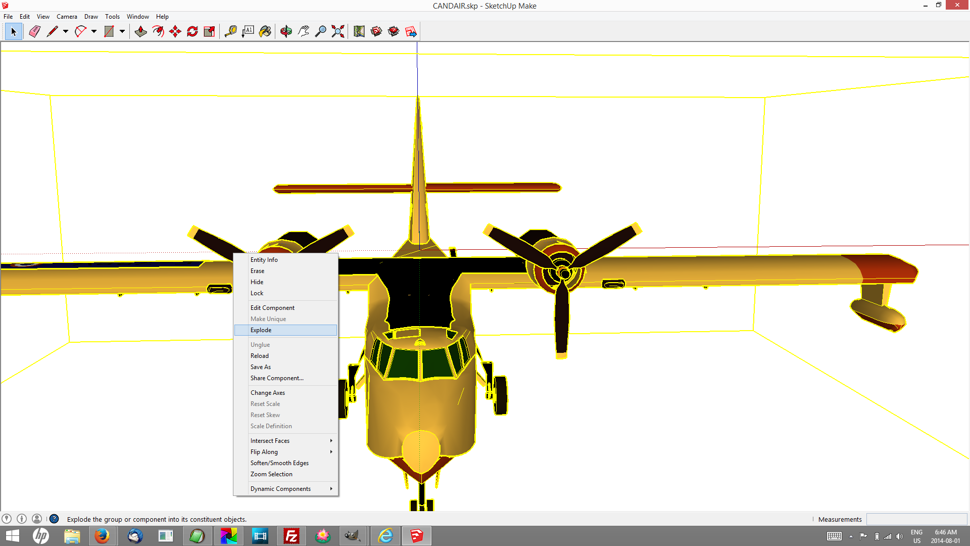
Step 1. Explode any groups you want to animate. Before I could select the propellor I needed to “explode” the entire model.

Screenshot Sketchup

Model: FRANCE CANDAIR by XALOC-SOLARIS selected… then Right-click → Explode

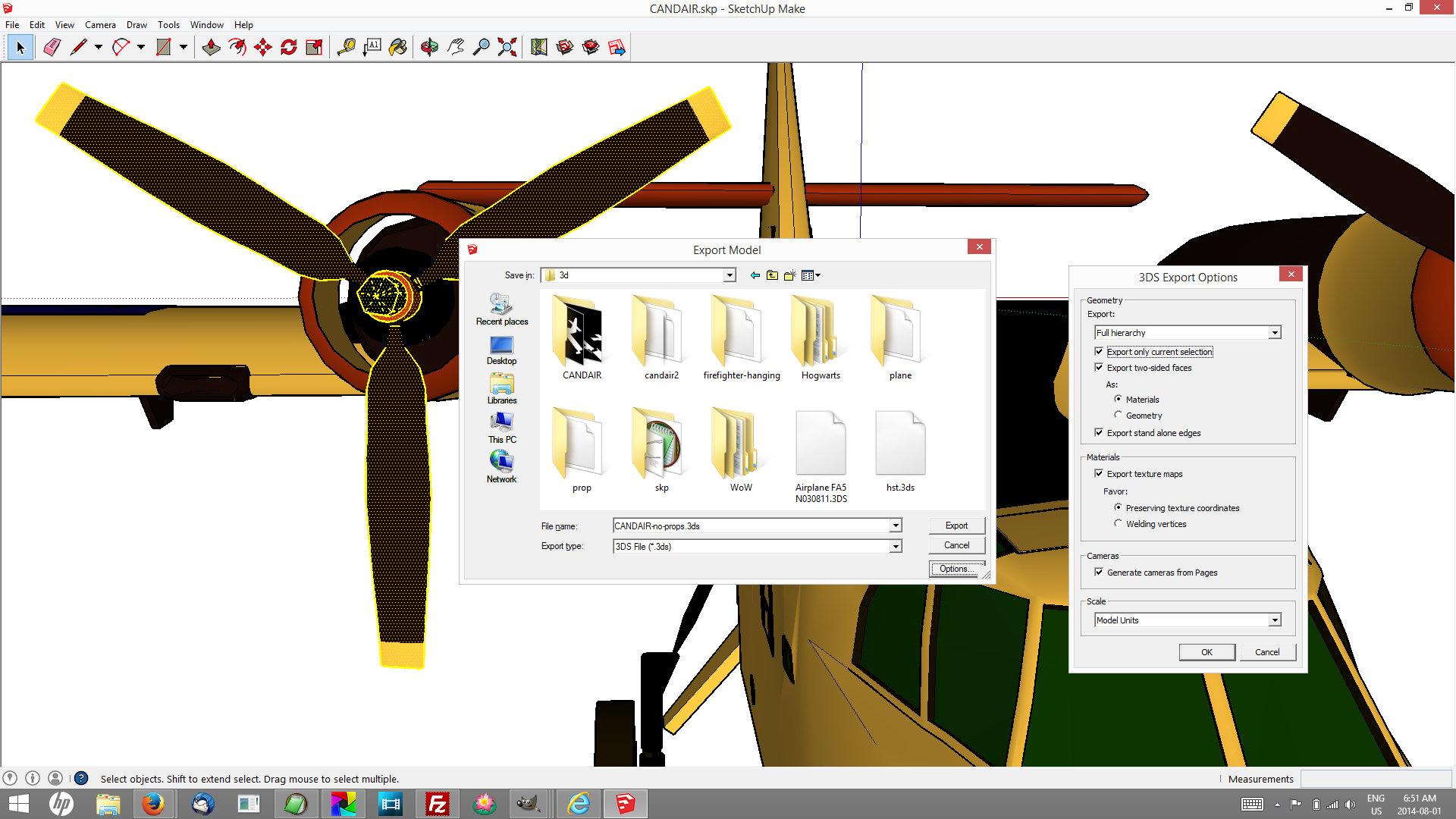
Step 2. Select the things you want to animate. Ctrl+DblClick to add entire objects (will make sense when you try it.)

Step 3. Export in a useful format. I had best results with 3DS, but I soon learned to create a folder for every model I want to work with. Some of the other formats do this for you, because if your model is in the least bit complex it will generate many image files, and with 3d Studio files they all end up in the folder you save the master .3ds file. Press Options and check Export only current selection.

Step 4. Export other parts of the model.

HitFilm bundled with Sony MovieStudio

To import 3D models you need HitFilm Ultimate, which costs money. Sadly, in many places that creates a barrier. If that’s your situation don’t give up! Install Sketchup anyway, explore the 3D Warehouse and watch the tutorial entitled “Use Scenes to save important views” which is advertised from the splash screen when you start Sketchup. Read this, and turn kids loose, let them teach you how to use Sketchup to make animations and then use whatever editing software you may have access to (iMovie? Windows MovieMaker?) to put them together in meaningful sequences. You can still use green screens place themselves right in the action.

I was introduced first to HitFilm 2 Express, which does not do 3d, and came bundled with Sony MovieStudio Platinum, essentially buy-one-get-one-free. I found the $150 very reasonable considering what the two can do together, and within several months I was offered an upgrade deal too good to pass up — 70% off the full cost of Ultimate. The Sony is far and away the better editor and renders movies on average 3 times faster than HitFilm, but unless you can spring for top-of-the-line Vegas you’ll still need HitFilm’s compositing tools and effects, not to mention text styling and animation. If you use a green screen (and you will) you’ll especially need the masking tool.

You’ll find [3D Model] on the media import dropdown menu. It analyses the model file and then displays what it found in a 3D Model Properties dialogue.

image of 3d import screen showing propeller

Propeller extracted from Model: FRANCE CANDAIR by XALOC-SOLARIS. HitFilm Ultimate offers an opportunity to tweak the “materials” of each piece of the 3d object.

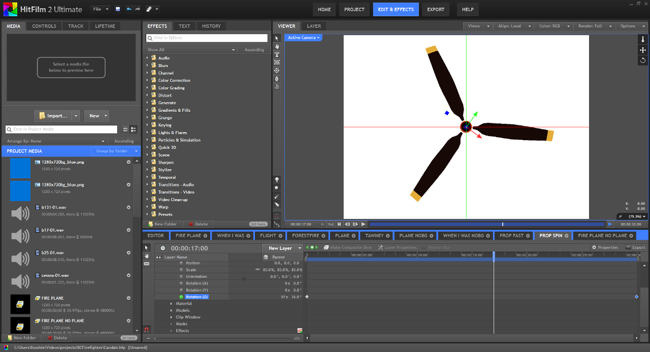
Animating literally dozens of available parameters is straightforward, designating a “parent” layer and attaching “child” layers only slightly more difficult (‘cartoonish’ is just fine with me for now!) Sticking to scale, position, orientation, transparency and zoom are probably more than enough to have some fun creating your own 3d worlds.

I duplicated the propeller composite and tried some other effects

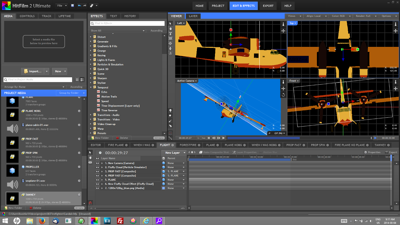
Putting Humpty together again was a challenge at first, and in the end I think a reasonably good way to get started learning HitFilm’s layers, views and tools.

The way compositing works, this project isn’t necessarily a wrap when you render the day’s creativity. I can spend some time on the script, bring in actors and create variations on “the cargo bay scene,” and when I return to render the “fly by” it will have updated.

The airplane engine came from the repository at www.mediacollege.com.

§

Further reading

Talking Points: Immersive Education Initiative [PDF] from the Immersive Education Initiative