About Richard

Son of two teacher/world-travellers: high school in Ethiopia, Canada since late 70s, Berklee College, 15 years as a full-time travelling guitar player, 5 years in teaching/teacher education, 12 years webmaster/conferencing/collaboration admin now "Electronic Education Specialist" designing and implementing learning "situations."
Apr 10

Quality captioning in Storyline 360 — Part 2

A Definition of Captioning
Captioning is the key to opening up a world of information for persons with hearing loss or literacy needs. There are more than 30 million Americans1 with some type of hearing loss. Millions of others are illiterate2, learning to read, or use English as a second language… Captions not only display words as the textual equivalent of spoken dialogue or narration, but they also include speaker identification, sound effects, and music description. Captioning is critical for students who are deaf or hard of hearing, but it also aids the reading and literacy skills development of many others.
—The Described and Captioned Media Program
  1. Around 466 million people worldwide have disabling hearing loss, and 34 million of these are children (World Health Organization).
  2. While… only 14% of the world population, in 2016, remained illiterate… the poorest countries in the world, where basic education is most likely to be a binding constraint for development, still have very large segments of the population who are illiterate (Our World in Data).

In Part 1 I introduced the
DCMP Captioning Key and some evidence-based principles they have developed that are especially suited to learning tools.

In this part I’ll show you how the DCMP guidelines informed my implementation in the well known eLearning tool we’ve adopted where I work, in part because of our ability to add this customization, Articulate Storyline 360. I’ll share a custom “style” that’s nothing more than a snippet of CSS code. I’ll show you how I make the custom style work in the AS360 desktop app Preview and persist from one publication to the next. Then, in a final Part 3 I’ll introduce a free, open source tool I’ve been using for several years and show you how I use it to assure the quality of my closed captions, and finally import those captions into AS360. I see two distinct pieces to this endeavour: the presentation—where it will appear and what it will look like—and the composition of the captions themselves, which includes where to break lines, how they’re formatted and how to get them into Storyline 360.

What level of quality can we achieve with Storyline?

The DCMP acknowledges, “It should be noted that the best practices detailed in this guide are not always possible to follow due to technical limitations.” So the first question is, “where do we set the bar for our particular software?”… Storyline 360, published as HTML5-only, in the case we’re considering today. This means whatever we decide will be governed by Cascading Styles Sheets (CSS). If you don’t know a thing about CSS don’t fret—I’ll show you a way to practice that won’t break your system. One of the reasons I like AS360, and recommend it highly for organizations and individuals who have a budget permitting the use of proprietary tools, is the discovery that all the CSS code for the captions is included in a single style statement:

.caption p {
  display:inline-block;pointer-events:none;padding:10px;
  text-shadow:-1px 0px black, 0px 1px black, 1px 0px black, 0px -1px black;
  color:#ffffff;border-radius:4px;background:#31373a;
  margin:0 0 10px 0;padding:10px;text-align:center;line-height:1.5
}

This snippet creates a style named caption that affects every paragraph (p) within an area (“division”, denoted div) assigned that style. It’s built of properties, such as display and pointer-events, separated from their qualities, e.g., inline-block or none by a colon, and from each other by semicolons. We don’t want to change anything we don’t understand, so we’ll be careful to choose only complete pairs of stylistic items for which there are guidelines in the DCMP Captioning Key—presentation look. These are separate and distinct from temporal elements such as presentation rate that influence caption duration. We can eliminate the spatial element location; this is a technical limitation of AS360 we can’t easily overcome at present, so the guidelines for Caption Placement, the preferred method of speaker identification, will have to wait. (We’ll mention a suitable alternative we can implement with Subtitle Edit in Part 3.) Storyline places all captions on the bottom two lines only, so we’ll also have to accept that ours might at times obscure some content. We’ll use transparency to deal with that.

The Captioning Key considers all of the following “guidelines” elements of the Text.

“Look” we can work with

  • Font (typeface) characteristics must be consistent throughout the media
    • “…medium weight, …sans serif… proportionally spaced… with descenders that drop below the baseline…”
      The Open Sans and the PT Sans font families are popular suitable choices known for high readability1.
    • colour: “The use of white characters is preferred.”
    • size: (about) 24pt equal 32px (pixel values (px) is a good static, OS-independent, cross-browser choice… )
    • and style.
      …have a drop or rim shadow… should be left aligned when technically possible
  • …The use of a translucent box is preferred so that the text will be clearer, especially on light backgrounds.

Those are all things we can easily set without interfering with the rest of the default Storyline code. The defaults already provide white text with a shadow, but the font is small and the box is opaque. Text is centre-aligned, which is okay, but we can easily meet the guideline; we can choose open Sans in the Player settings, but I’ll set it here too so no one can change it.

Font size is easy to set, but likely the most subjective on the list. The Captioning Key itself doesn’t specify 24 points in the sections I’ve linked to, but it’s found elsewhere and the examples there support a similar number. Technically, browsers and monitors do their own thing with it regardless, so the pixel unit is considered a good choice—but even that’s relative to the user’s own preference settings. The standard conversion of 24pt to 32px was too large for my liking, so I’ve settled on 28px, but that’s still too large for mobile (often causing 2 lines to become 3). 21px looks good on my iOS devices. Articulate recently included a separate mobile style sheet, so it’s easy to make that happen.

Following are the settings I’ve chosen, which remain somewhat flexible.

  • background:rgba(72,72,72,0.81); That’s actually a translucent grey. You can experiment; the first three numbers should always be the same and the last is opacity, from 0.0 (fully transparent) to 1.0 (fully opaque).
  • font-family:"Open Sans",Arial,Helvetica,sans-serif; The browser will choose Open Sans if it’s on the computer or on your server as a webfont. Otherwise offer Windows and Mac standards, or the first sans-serif font the browser can find
  • font-size:28px; for desktop, font-size:21px; for mobile
  • line-height:1.18; This seems quite adequate.
  • text-align:left !important; The ‘ !important’ is a CSS trick that’s necessary here (it’s about that word ‘cascading’ in Cascading Style Sheets)
  • text-shadow:black 0 0 3px; I centred the shadow and made it 2 pixels larger.

The complete revision, what we’ve changed and what we haven’t looks like this:

.caption p {
  background:rgba(72,72,72,0.81);
  border-radius:4px;margin:0 0 10px 0;
  color:white;
  display:inline-block;
  font-family:"Open Sans",Calibri,Arial,Helvetica,sans-serif;
  font-size:28px;
  line-height:1.18;
  padding:10px;
  pointer-events:none;
  text-align:left !important;
  text-decoration:none;
  text-shadow:black 0 0 3px;
}

We don’t add CSS to a live server fully expanded like that, however. I’ll provide you with “minimized” versions you can use further down.

Putting it back together

On a Windows system Storyline stores this information in three template files it writes from for Preview and Publishing. I use a free text editor called Notepad++ to open these, search for the default code I showed above in its minimized form, and replace it with the minimized code below.

Code to Find in all three files that follow:

.caption p{display:inline-block;pointer-events:none;padding:10px;text-shadow:-1px 0px black, 0px 1px black, 1px 0px black, 0px -1px black;color:#ffffff;border-radius:4px;background:#31373a;margin:0 0 10px 0;padding:10px;text-align:center;line-height:1.5}
  1. C:\Program Files (x86)\Articulate\360\Storyline\Content\dark-spider\unified\html5\lib\stylesheets\main.min.css
  2. C:\Program Files (x86)\Articulate\360\Storyline\player\unified\html5\lib\stylesheets\desktop.min.css
  3. C:\Program Files (x86)\Articulate\360\Storyline\player\unified\html5\lib\stylesheets\mobile.min.css

Code to Replace it with in files 1 & 2:

.captionp{background:rgba(72,72,72,0.81);border-radius:4px;margin:0 0 10px 0;color:white;display:inline-block;font-family:"OpenSans",Arial,Helvetica,sans-serif;font-size:28px;line-height:1.18;padding:10px;pointer-events:none;text-align:left !important;text-decoration:none;text-shadow:black 0 0 3px;}

Code to Replace it with in file 3:

.captionp{background:rgba(72,72,72,0.81);border-radius:4px;margin:0 0 10px 0;color:white;display:inline-block;font-family:"OpenSans",Arial,Helvetica,sans-serif;font-size:21px;line-height:1.18;padding:10px;pointer-events:none;text-align:left !important;text-decoration:none;text-shadow:black 0 0 3px;}

I choose Notepad++ for this because it keeps these files open, notifies me whenever they’re change after a Storyline update, and automatically relaunches itself with Administrator privileges if I forget to open it that way and try to save any of these to Program Files(x86).
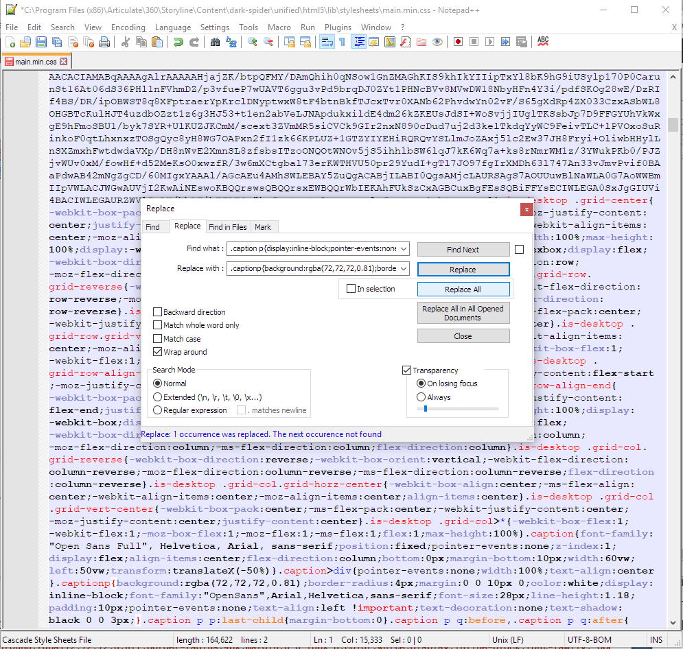
One of the minimized CSS files, modified with Notepad++

If you’re nervous about testing this process out in the program templates, you can try it on a published module first. Depending on how recent your AS360 version is you’ll find main.min.css and/or desktop.min.css and mobile.min.css in
module-name - Storyline output\html5\lib\stylesheets

Summary of Part 2 and segue to Part 3

In Part 2 we explored the rationale for customizing the stock Storyline code, identified what’s possible with this particular software, revised the stock code, and saw where to place it so it’s in our previewed and published output.

Part 3 will look at Subtitle Edit, and how to set it up to speed up the process of creating quality closed captions for our learning modules. The DCMP site provides many examples of right and wrong choices for splitting lines other aspects of captioning and we won’t be able to discuss them all, but I’ll leave you with the basics and enough to take it forward from there. In the end you’ll be able to caption with Subtitle Edit, save the file in a suitable format, and import it into Storyline 360 using the relatively new Media Library.

Part 3 to follow soon. Thanks for reading!

§

Reference

1. Golombisky, Kim and Hagen, Rebecca (2017). White space is not your enemy : a beginner’s guide to communicating visually through graphic, web & multimedia design. Amsterdam ; Boston :Focal Press/Elsevier, 312pp.

Apr 10

Quality captioning in Storyline 360 — Part 1

Captions are for everyone

Captioning is the process of converting the audio content of a television broadcast, webcast, film, video, CD-ROM, DVD, live event, or other production into text and displaying the text on a screen or monitor. Captions not only display words as the textual equivalent of spoken dialogue or narration, but they also include speaker identification, sound effects, and music description. Captioning is critical for students who are deaf or hard of hearing, but it also aids the reading and literacy skills development of many others
The Described and Captioned Media Program

I work at an organization that advocates for inclusive design in all areas of society. It’s important to lead by example and so I strive for maximum accessibility in all our learning tools. I’ve led us to adopting high standards for closed captions, based mainly on the Described Media and Captioning Program (DCMP) captioning key, with some variations suggested by the Canadian Hearing Society’s Barrier Free Education Initiative and The Canadian Association of Broadcasters CC Standards and Protocol… August 2012 (PDF).

This post will be in three parts. Part 1 provides background. Part 2 will provide CSS code that approximates DCMP presentation guidelines for use in Articulate Storyline 360, and I’ll show you where you to put that code in AS360’s program templates folder so your quality captions appear automatically when you preview or publish a learning module using the AS360 desktop application, and Part 3 will present a tutorial on creating quality captions tuned to the DCMP’s guidelines using the free, open source editor Subtitle Edit,

A basic principle of inclusive design is designing for outliers. The Inclusive Design Research Centre says, “…Inclusive design should trigger a virtuous cycle of inclusion, leverage the ‘curb-cut effect’, and recognize the interconnectedness of users and systems.” The ‘curb-cut effect’ refers to the sloped cuts in the curb at intersections that were originally put in place for people in wheelchairs and that probably all of us sooner or later come to value.

And so it can be with closed captions — designed for the hearing impaired, they’re useful to anyone in a setting where for any reason it’s too hard to hear or, conversely, one wishes to enjoy video content but not to be heard. Presented also as “subtitles”, captioning is often vital to language learners and all those wishing to expand markets or impact diverse demographics.

The DCMP has studied this topic for over 20 years and more than anyone I can think of understands how the ‘curb-cut effect’ applies in this context. Perhaps the outliers among outliers are those with cognitive disabilities. To meet the needs of everyone quality captions contain each of the following elements. Quality captions are accurate—word-for-word, except in very specific circumstances I’ll discuss later—consistent, i.e., uniform in style and presentation, clear, representing the audio completely, identifying speakers and non-speech information, to provide clarity. They must be readable: displayed with enough time to be read completely, in sync with the audio, and neither obscured by nor obscuring the visual content. Equal access considers learners’ cognitive diversity, requiring that the meaning and intention of the material are completely preserved, not only in ways that benefit the hearing impaired.

Nonetheless, as with all forms of communication, one must always consider the audience. As an infamous (and fictitious) pirate of the Caribbean once said about a much different code, the finer details of quality captioning remain “…more what you’d call ‘guidelines‘ than actual rules” (Captain Jack Sparrow). In Part 2 I’ll summarize some key points I try to maintain in every case, discuss some instances where I might consider bending the rules, and describe some situations where one clearly must improvise. I’ll translate all that into a snippet of CSS code that works with the elearning software I use, Articulate Storyline 360 (AS360), and show you one way to make it work in AS360 so it’s applied in both previewed and published slides and persists between publications.

See you soon.

Part 2–>

§

Mar 04

My pixilation videos

Pixilation is a fun type of frame-by-frame animation where live actors pose repeatedly like individual drawings, stop motion puppets, or clay models in animations I was more familiar with before taking the MOOC Explore Animation, offered on the UK’s FutureLearn by the National Film and Television School. A moving and rather stunning example is the short film Stanley Pickle, created in 2010 by then NFTS student Vicky Mather, now the recipient of many awards.

My first exploration of the technique won’t win any awards, but I learned some valuable lessons doing it. Perhaps the most important one is that my 6-year-old actor had a blast making it, even on a cold day in Toronto, and remained engaged throughout, including the editing. She chose and set up the extraterrestrial colour correction filters! She even has her own ideas about how she’d like to do more of it, and to what end. I think this bodes well for the classroom.

Beyond that, I learned that in general one must either place the camera in a stationary spot from the beginning of the scene to the end, or follow the subject, carefully framing the shot to keep them centred. Otherwise each move of the camera takes on the suggestion of a new scene. I used the first technique in the second video, which features the earlier subject’s mother.

I shot this on an iPhone 5 in landscape orientation, using a cheap tripod and a bracket obtained from Dollarama, which probably explains the odd vertical distortion that accompanies each press of the shutter button. I dumped the photos onto my laptop and dropped them into Magix Vegas Pro 14, and stretched them to 5 frames each (1/6 of a second @ 30fps, so 60 photos for 10 seconds; more, and fewer frames between, for a smoother flow). The soundtracks are royalty-free clips that came with some software or other I bought in the past, but I’ve forgotten which or when. If you want an exceptional editor that’s free, you can easily do all of this with HitFilm Express.

I believe development of multimodal, multimedia literacies is important to personal empowerment in the 21st century. I’ve been continuing my self-education in animation and my focus on applying it to hands-on, student-centred engagement in learning through other FutureLearn courses, most recently Filmmaking and Animation in the Classroom, offered by Into Film, “a UK-wide film and education charity, which puts film at the heart of children and young people’s learning, contributing to their cultural, creative and personal development.”

§

Feb 08

Scales of Justice — sprite animation in CrazyTalk Animator 3

I’m taking a lovely MOOC on FutureLearn, called Filmmaking and Animation in the Classroom. I’m going to show you how to animate a Scales of Justice using CrazyTalk Animator 3. Although I’ve chosen to demonstrate making Scales of Justice, this process is very similar to any other stop frame animation, and you can use any set of image sequences you choose.

‘Sprite’-based animation using a sequence of stills

With CrazyTalk 3 open in Stage Mode and your timeline at Frame 1, go to the create menu, and choose create media, props. Navigate to the folder that contains your static images. You can drag your mouse or press control + A to select all the images and then press Open.

Your new prop will appear in a red box, displaying only the last image in your set. These images are the new prop’s “sprites” and to choose between them we’ll use the Sprite Editor. To open the Sprite Editor use the icon on the toolbar, go to the animation menu and choose sprite editor, or press the letter S.

My Scales of Justice prop using sprite animation

“One-shot” video, What is ‘Primacy?’   For best results view Full Screen
The red box turns green to show we are editing the prop, and the editor displays all the prop’s sprites. The highlighted sprite is the one currently displaying, but the first image on the list, the one with a special icon in the lower right corner, is the default image. In my case I want to start my animation from the default image, so I will select that image now. It becomes highlighted and the display changes.

To animate our scales we’ll advance the frame and choose different images. Crazy talk also has an advanced timeline that keeps track of everything we can do to our prop, but we don’t really need it for simple sprite animation. My animation is running at 30 frames per second, so every three frames represents 1/10 of a second.

Now, I’ve numbered all my sprites to make it easier for me to keep track — the numbers beginning with zero tilt to the left, and the numbers counting by 10s tilt to the right. I’ll advance my frames by three and change the sprite image until I get to 04, then I’ll backtrack to 00 and go ahead with images 10 to 40, and finally backtrack once more 00.

Now I’ll rewind my animation and press play. We can open the timeline to see more clearly what we’ve done. The little diamonds represent “keyframes” corresponding to the image changes we’ve made, and you’ll notice they’re always three squares apart, representing three frames or 1/10 of a second. In real life a scale might move more slowly at the top and the bottom of its swing, swing a little less each time, and eventually settle in the middle.

We can drag these keyframes to new positions on the timeline, copy paste, and even delete ones we don’t want. The scale will move faster when the key frames are closer together, and slower when they’re further apart.

I experimented and ended up with this animation which is 180 frames, or 6 seconds of motion, followed by 2 seconds of nothing, so you can see that the scale has stopped. To save your animation go to the file menu and switch to composer mode, and then choose file, save prop. Your new prop will be found in the content Manager under the Custom Props tab.  

CrazyTalk Animator 3 also makes it easy to render your animation as an MP4.

§

Jul 16

Teaching Dignity and Empathy 2.0

photo of the whiteboard showing revised version of kids' first song.Last Wednesday at Singing For Love I taught a revised version of this lesson. It differed from the first iteration in technical layout, in the better use of questions to direct the inquiry, and the use of better questions. 

The lesson uses photos from Dana Gluckstein’s Dignity: Tribes in Transition series. First, I ask what “dignity” means. Definitions tend to be fuzzy, but I give no hints. Instead I propose that maybe we can figure out what dignity looks like. The kids look at the indigenous faces and I ask questions that make them think about those people’s lives and attitudes. 

Technically, I did one small thing that made a big difference. Using OpenOffice Impress, I made the photos slide backgrounds, not just photos inserted on the slide. Although doing this distorts some of the photos, it removes the borders, making fullscreen truly fullscreen. I’m sure it made for greater impact than the one and only previous time I situated this lesson. 

This time around, I focused on only two main questions. Is this dignity? Is this person happy? Then I just let the kids tell me, and each other as it turned out, as much as they could think up. Why is she happy? What do you think they were doing before this picture was taken, and after this picture was taken? They asked some of their own. 

And then I wrote some of it down as key concepts and asked them to bring the current energy level along with them to the chord changes, and let’s see if we can bring these concepts into the lyrics. The semi-final result is up above. How’d they do? 

We all lost track and worked 15 minutes past our normal break time. Everyone agreed it was a good session. 

Update: I wrote about it here as well.

§

Jun 25

Quick fix for poor screen reader support of title attribute

As someone who remembers when ARIA was just an idea, I’ve spent a fair amount of time adding title="something descriptive" to many of the links, images, and possibly other elements on web pages I’ve authored and edited. But as developers began relying on authentic users of assistive technology to test their work, and those with differing abilities brought their knowledge and experience into the discussion and onto the Web, we learned we were wrong. Some of us knew that early on, or part of it anyway, and in the paralysis that may sometimes grip those unsure what to do, I stopped using title for anchor tags (i.e. links; <a>) altogether.

ARIA’s all grown up now

ARIA grew up and became the specification. The bulk of screen readers put their support there, and aria-label="making this meaningful" has supplanted the title attribute, freeing it to be what it is.

There’s enough explanation about this on the Internet already, so I’m going to keep this one very short. There are a lot of links in my pages that are in various states that reflected my limited understanding at the time, and maybe in yours too—live and learn! As I’m mostly working with WordPress sites these days, and WordPress has built-in jQuery, I’m sharing this snippet of code that takes text from existing “titles” and places it in an aria-label, or takes the linked text displayed to the visitor and makes it a bit more friendly and conversational than the typical screen reader default: “Link text. Link”

Most of my WordPress sites have a js folder in the theme I’ve chosen’s main folder at …wp-content/themes/theme-name/js, and in it a file called functions.js. Below is a standalone jQuery closure that should work in any site that has jQuery installed. In practice I took the indented part, between the first and last lines, and pasted it below the existing scripts in the existing closure. In Drupal you might put it in …/sites/all/themes/theme-name/js (and load it with a preprocess.inc). If you’re not using a CMS you probably need to wrap it in <script></script> tags, and make sure you place it below the prerequisite jQuery include.

For the blog you’re reading now, which didn’t already have a functions.js file in place, rather than stuff it into another I placed the following line below wp_head(); in header.php, found in the WordPress root folder.

wp_enqueue_script( 'my-custom-functions', get_template_directory_uri() .'/js/functions.js' );

This quick fix should probably be considered a temporary one, but it sure makes my pages sound better with ChromeVox, so I’ll carry on and wait for experts like Geoff Collis and others to tell me what to do next.

(function($) {
  // If there's a title attribute, make sure it's copied to aria-label (for screenreaders)
  // If there's no title, elaborate on the linked text.
      var
        links = $('a')
      ;
      links.each(function(i){
      	if (this.title){
      		$(this).attr({'aria-label':this.title});
      	} else {
      		this.title="Go to " + $(this).text() + ".";
      		$(this).attr({'aria-label':this.title});
      	}
      });


})(jQuery);


Jun 18

Setting up WordPress for Online Learning (Part 1)

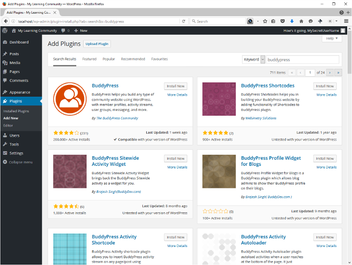
Screenshot of WordPress plugin search results for BuddyPress.There are many good reasons busy educators subscribe to blog sites, well-funded web-based platforms, and learn to become “Google educators” etc. Some are practical, some financial, and no doubt some are institutional. I still think there are many good reasons to do it yourself. I think they’re for the most part soundly pedagogical, and hardly ever mutually exclusive from any or all of the above. For me it’s all part of digital literacy for the 21st-century.
Digital literacy for the 21st-century

I’m going to share how I’ve set up SingingForLove, an “art-educational workshop” pilot I’m undertaking this summer with recognized Mexican women’s rights advocate, counselor, recording artist and performer Rosy Cervantes, Counterpoint Counselling & Educational Cooperative Inc., and the help of the Toronto Arts Council.

This site needs to be a safe space for minors who may be victimized and stigmatized by various forms of domestic violence. They need privacy and empowerment. I’m setting this up with the same open philosophy by which I once ran an inclusive, 5000+ user collaboration system for students, faculty, staff, and many other stakeholders at the Faculty of Education at York University for almost 10 years. They will have the power to make mistakes; the biggest mistakes they can make can not result in consequences that extend beyond our community. No one external will see them, or anything they do. Internally, this land is their land. Only the name or nickname they already use in weekly group will appear here, unless they choose otherwise. Rosy and I supply followup and extension of weekly group sessions, support and encouragement. They can exchange messages, create buddy lists and forums, and post whatever they wish.

The critical path of this exercise is as follows.

  1. If you want other people to see your site, purchase web hosting.
    • it’s possible to use the test site we’re about to set up in a classroom without Internet, but I’m not going to discuss that today.
    • it’s not absolutely necessary to acquire hosting first but, as we’ll see shortly, it can help… and you won’t be able to complete the last step until you do, or get full rights to a folder on someone else’s server.
    • it’s absolutely necessary to pay extra for SSL (and therefor a “dedicated IP address”) if you want to provide your community privacy and security—and there’s every reason you should: encryption is a human rights issue, not least because governments have locked people up for accessing certain sites, among other things. Encryption makes snooping more difficult and expensive. SingingForLove will move shortly to its own domain, where it will be https-only.
  2. Set up a test site
  3. Install and set up WordPress
  4. Add and configure the right plug-ins
  5. Move it to your live web host

Set up a test site

The fastest cheapest easiest test site can be had by downloading and installing a so-called AMP stack. this is a preconfigured web developer meant environment that will run from a folder on your hard drive or a USB. You might find a WAMP, MAMP, or LAMP, for Windows, Mac and Linux respectively, but the one I use is called XAMPP, which has cross browser (“x-browser”) support, not to mention another P, for Perl.
Download XAMPP now.
Got it? Good. Open the compressed folder you downloaded and then extract the xampp folder you see there to your hard drive (C:\ maybe) or external drive (I’ve used both USB and flash drives successfully).
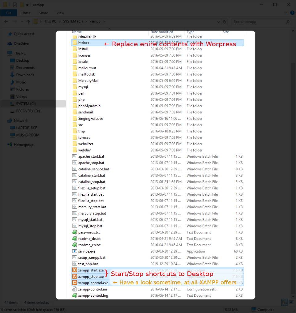
Open the xampp folder you just extracted, and have a quick look. The file that launches XAMPP is different for each supported operating system. Identify the ones for your operating system with file names that begin xampp_start and xampp_stop. You might want to create shortcuts to these two files, and place them on your desktop.

Now find the folder htdocs. This is where all the files for your website will go. If you’re the curious type, you can start XAMPP now, browse to localhost and see what these files are all about, but if you want to get on with setting up a learning environment with word press you can just empty it.

Install and set up WordPress

Download and extract WordPress

You get WordPress here. When it finishes downloading, open the file you downloaded and put everything in it into the htdocs folder you emptied in the previous step.

Launch PHPMyAdmin to create your database

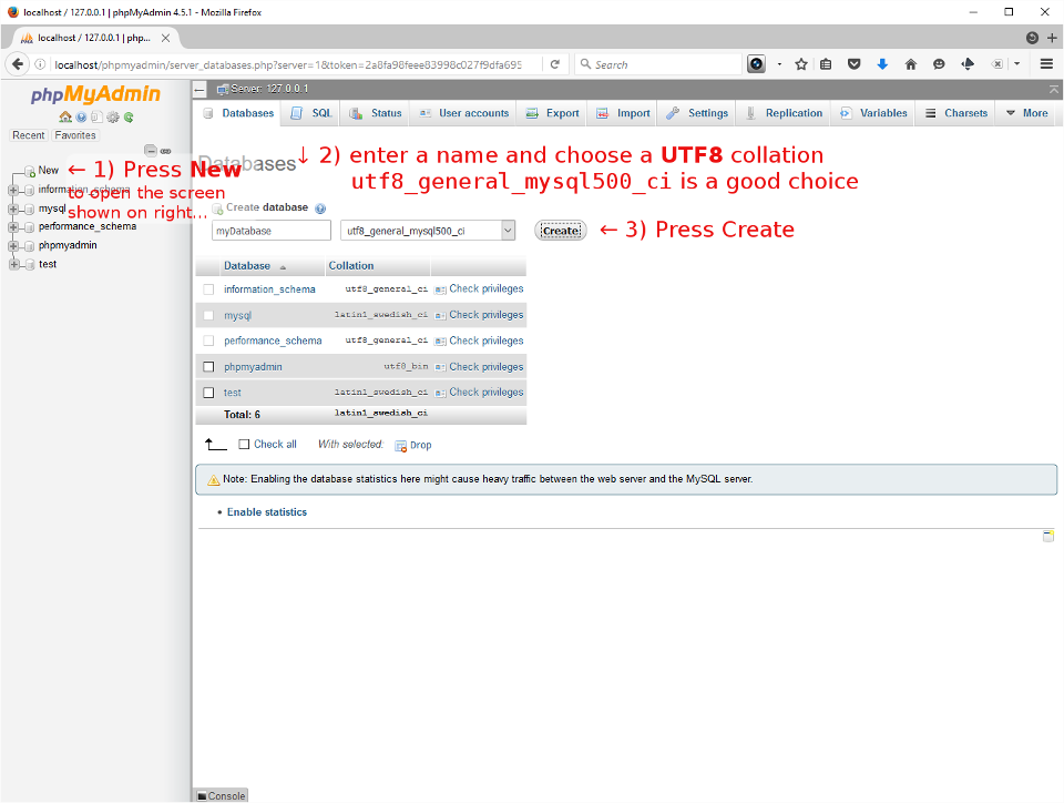
This is the only tricky part for me. If you’ve bought web hosting, it’s a huge advantage to name the database you’re creating now the same as it is, or will be on your hosting server. almost every web host gives you a secret ID, and prefixes it to whatever name you type in, usually based on your project or business. You’ll probably end up with something like secretid_MyWordPressDB
Point your web browser to http://localhost/phpmyadmin/ (if you’ve launched XAMPP you can click that link to open it now in another tab or window).

Create your database
  1. Press New in the left side panel to open the Databases tab.
  2. First choice is to give it the same name it has, or will have, on your live server.
  3. Choose a UTF8 collation. utf8_general_ci and utf8_general_mysql500_ci are both good choices.
Create a user to control the database
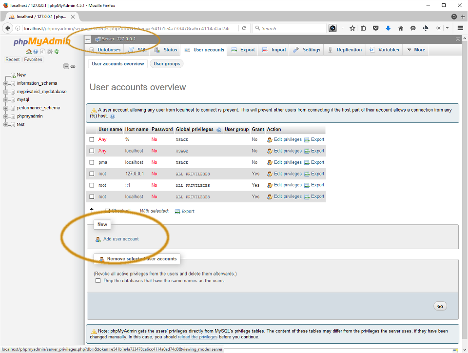
  1. Click the PHPMyAdmin logo to return to the database server home page (breadcrumb menu says 127.0.0.1), and then choose the User Accounts tab. Find the New section and press Add user account.
  2. Enter Login information.
    1. Choose a User name noone’s likely to guess,
    2. set the Host name to local [localhost],
    3. use the Generate button to get a strong password, and write all this information down.
  3. Scroll to very bottom of the Add user account form and press Go to create the user. Do not create a(nother) database, do not assign privileges (yet).
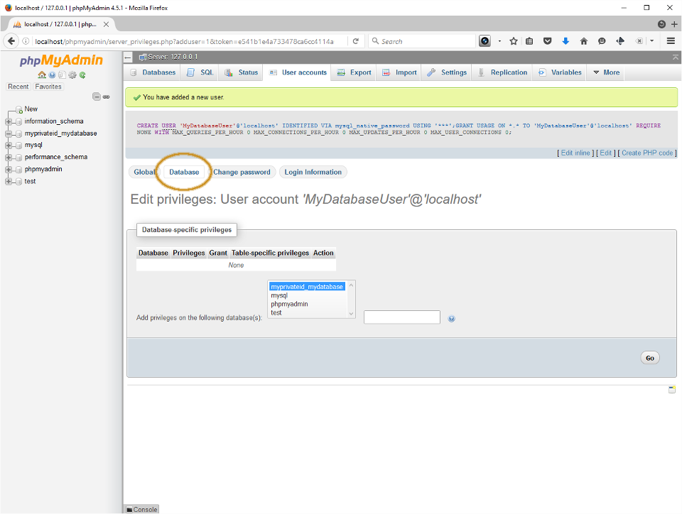
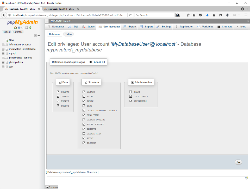
  4. The screen that appears should tell you you’ve added a new user. Open the Database tab, find the Database-specific privileges section and select your new database from the list.
  5. With your database selected as shown, press Go. This will open the Edit privileges tab. The WordPress user requires all permissions except Grant. I normally check Check All and then uncheck Grant under the Administration section.
  6. You should expect to see the form reload with a new notice, “You have updated the privileges for ‘MyDatabaseUser’@’localhost’,” where MyDatabaseUser is the name you actually used.
  7. Equipped with an empty database, a database user name and password you’re ready to finish installing WordPress.
Place this information in wp-config.php

Have no fear. If you’ve done everything just as I said you’re about 6 clicks away from launching your new WordPress site on your own test server. You do all of this…

… From the install page

    A note about updates.

    It’s rare that there aren’t WordPress updates available from the moment you first log in. Updates often provide security fixes, and should be run promptly when offered. You need to update plugins, themes and translations. When you choose a theme for your site it’s a good idea to remove the ones you’re not using. I also make it a habit to delete the default Hello Dolly plugin. I’m not going to show any of that here today.

  1. Point your web browser to http://localhost/.
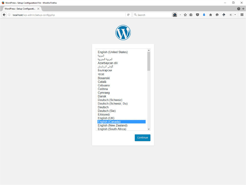
  2. Choose your language.
  3. Enter the information you just created. It should already be looking on localhost, and you should leave the Table Prefix alone. Press Submit.
  4. You should now see a message that WordPress found your database and everything’s going to be okay. Press Run the install.
  5. Now you’ll enter the site’s public name and create an administrator account. In my experience this username should be kept secret, and not resemble your real name or nickname you might want users to find you by. As always on the Internet, you need a strong password. Write it down! Enter a valid email address and choose whether to be visible to honest reputable search engines. I usually check this for my test site and turn it back on when my site’s launched.
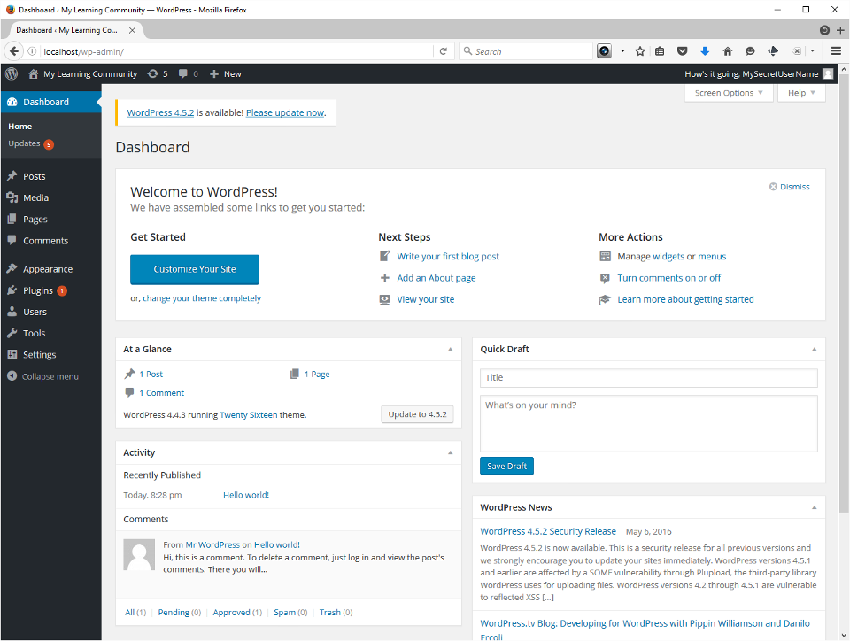
  6. Login to your new site.
  7. Apply any and all updates that may be awaiting you!
  8. Install and configure the plugins to finish setting up your secured online learning community.

Set up your secured online learning community

Add and configure plug-ins

These are presented in an ordered list, but some variation is allowed. Akismet (anti-spam) and my security plugin of choice, iThemes Security (anti-hacking/site intrusion), belong in every standalone WordPress blog. I set them up in this order, but APIs won’t actually work on a ‘localhost’ server, and you don’t actually need them until your site is on the Internet.

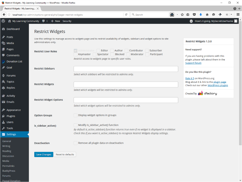
It seems intuitive to install BuddyPress before its various helpers/add-ons, but I’ve added and experimented in different orders on my test and live servers without obvious problems. I put Restrict Widgets last on the list because several of the others supply widgets, and you then set their visibility from the standard WordPress Widgets page.

Even without security it’s very unlikely your XAMPP-powered test site will be hacked while you configure these. I recommend installing and activating each of them in one task, and configuring them one by one in the very next.

  1. Akismet is pre-installed, but you need an active API key (free; required for your Live server only.)
    • 5-10 minutes, can be postponed until site goes live.
    • Follow the instructions to obtain and install the free API key, or it doesn’t work
  2. iThemes security with API key (free; required for your Live server only.)
    • 2-3 minutes to achieve superior basic security
    • Sign up for API (free) and then press a button to run “Security Check” test/check/setup.
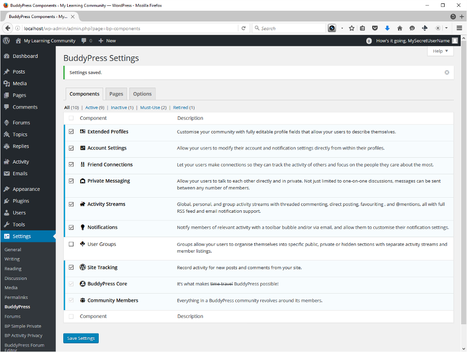
  3. BuddyPress and friends
    • 30-45 minutes to install and configure all
    • If you’re on the Internet, go to WordPress Plugins and use the Add New button, search one-by-one for the names on this list, Install Now and Activate the plugins
    • If you’re not on the Internet you need to download these when you are, and later extract the ZIP files you obtain into your xampp/htdocs/wp-content/plugins folder
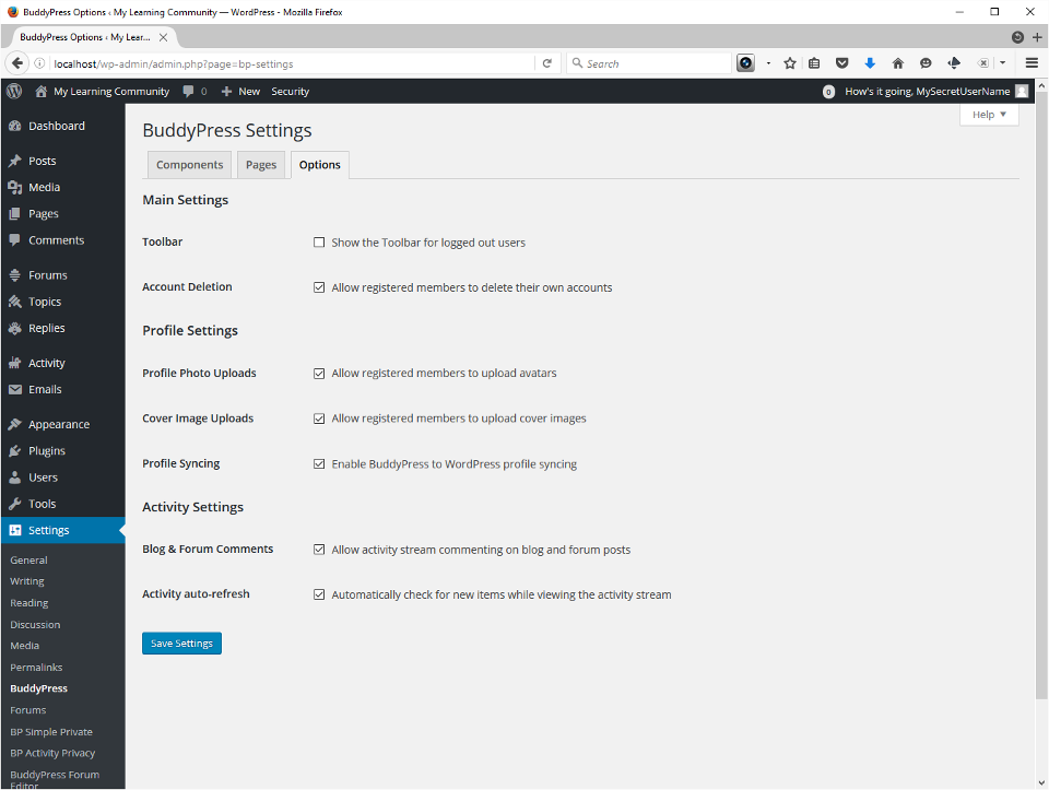
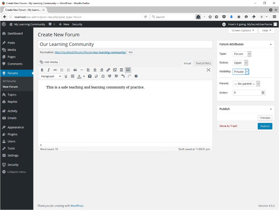
    • bbPress (Forums)Before I configure forums I create a private Forum, named after my community, to be the root of all forums.
      • 5-10 minutes
    • BP Simple Private
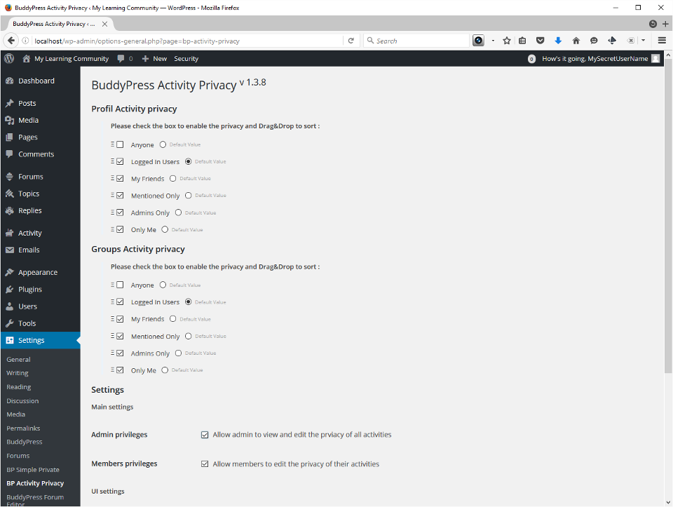
    • BuddyPress Activity Privacy
      • 1-2 minutes
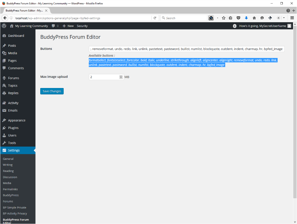
    • BuddyPress Forum Editor
      • 1 minute
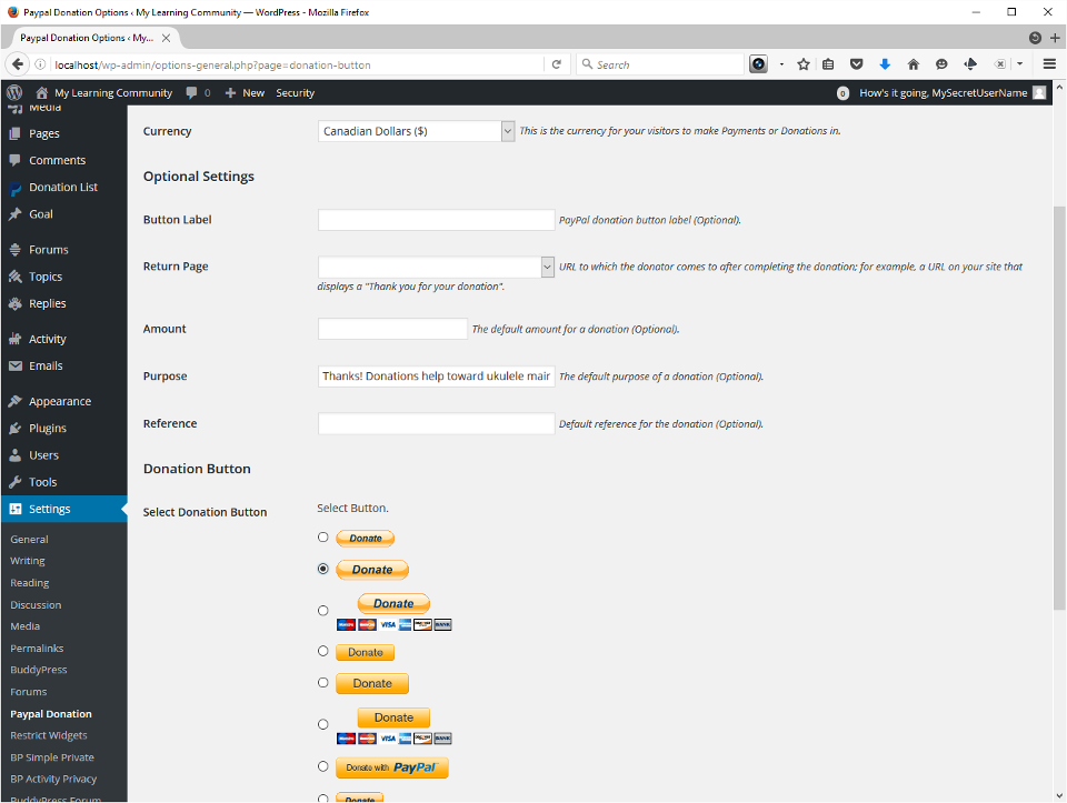
    • PayPal Donation Button
      • 5 minutes
      • Appropriate in some situations
      • Requires a PayPal merchant account
    • Restrict Widgets
      • 0 minutes
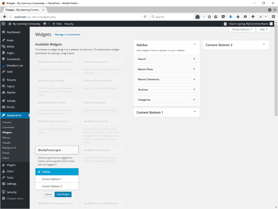
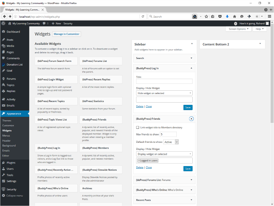
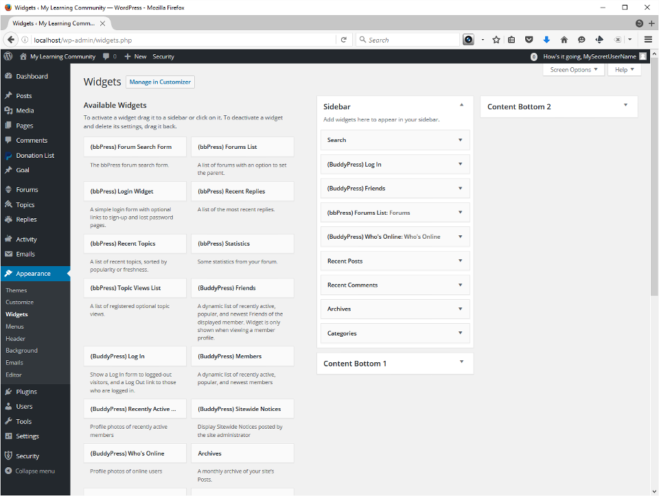
    • Configure WidgetsThis is another very important step. BuddyPress has created a number of widgets you can place in any area WordPress thinks of as widget territory. I use sidebards. I added 4 to start, but you can play with it and set up what you need. I chose BuddyPress Login, Forums, Friends and Who’s Online. The 3 screenshots show the process for placing a widget in the sidebar, setting the widget visibility properties, and finally my completed list after dragging and dropping them where I want them.
      • 5-10 minutes

Move it to your live web host

Depending on your circumstances you could do this now, or wait until you’ve added users.

Transfer the files to your public_html directory

I use FileZilla to do this. The remote address is invariably ftp.your_domain.com. You’ll need the FTP Server information usually found in your web host’s after confirmation message, which they usually send once it’s fully set up, a day or two after your first receipt for payment.

Export your test site database, and then import it to your live server

Export/Import using PHPMyAdmin

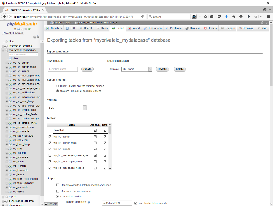
Return to localhost/phpmyadmin and select the WordPress database. Newer versions of PHPMyAdmin support export templates, and I’m using one here. The important things are to make sure all the tables are selected, and that you’ve got compression. Scroll down and press Go to do the export. The file will normally end up in your browser’s Downloads folder.

The final step is to log into your CPanel (or other site control panel) account on your web hosting server. If it’s the first time you can create a database just as we did above, and then use the Import tab. When the site exists and you want to update it with work you’ve done on your test server, best practice is to back up the database with an export first, drop all the tables, and import your localhost database into the just-emptied live one. If you’ve added files or updated plugins and themes you need to upload the affected folders by FTP. It sounds scary if you’re not used to it, but you’ll master it fairly quickly and build your own routines.

Don’t forget to change the site URL in the Options table!

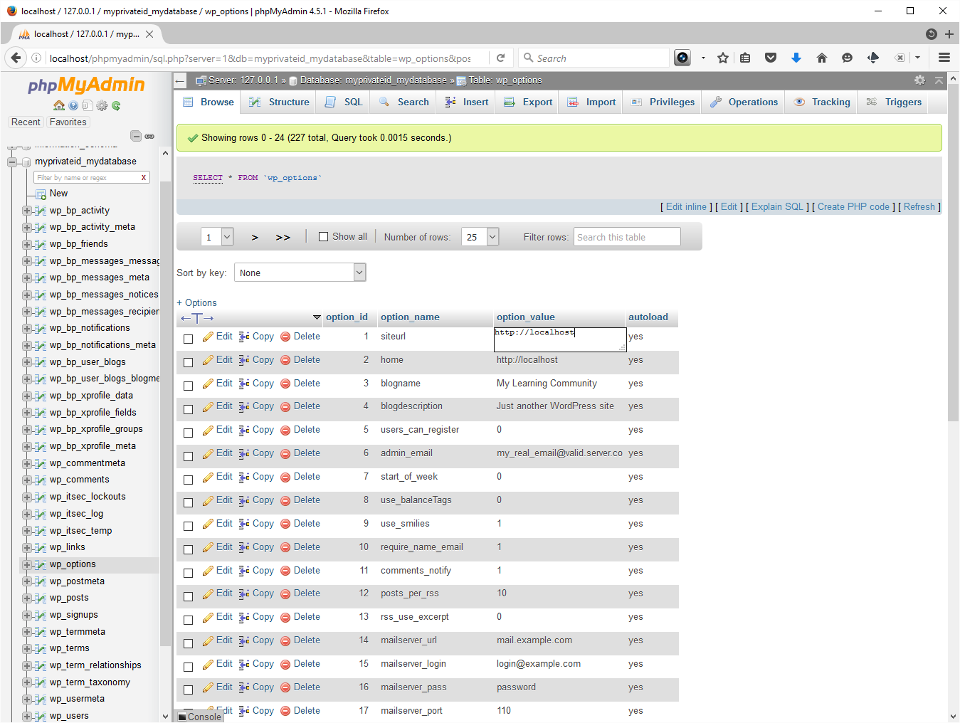
Very important!: Every time you swap databases from one server to the other you’ll need to update the site_url and home options in the wp_options table, or your localhost will redirect to Live and vise versa. Select the table in the left. Usually those fields are the first two in the list. Double-click to enter the field in edit mode, type the real URL of your community (without an ending slash), and Tab out of it to save.

Setting up WordPress for Online Learning (Part 2)

In Part 2 I’ll tell you how I install the LearnPress LMS plugin for WordPress at SingingForLove.net. I just have to figure that out first!

It’s the nature of DIY technology projects that they often take a bit longer. For me, the rewards have always been that much greater, and tend to be proportional to the extra effort.

I hope you’ve found this helpful!

§

Jun 13

Where should we start stopping hatred?

When I was 11, my family moved toEthiopia, on the Horn of Africa, for four years. I soon learned the language and it quickly became obvious to me that we’re all the same, and we all want the same things from life. 

The advent of Facebook revealed that some, but not all of my former school mates came away similarly impacted. “Great White Hope-ism” and primitivism still occur, subconsciously or not so much, amongst all of us raised in the Global North, and I personally never considered there can be an end to my own growth. 

I credit travel, my parents’ and family’s encouragement to question authority, and learning the language and culture of my hosts as important factors in my early discovery of our universal commonalities. 

I believe humans probably generate adequate capital to educate every parent and every child born in a similar manner, if we stopped spending it on war and self-aggrandizement. 

Until a day when such a utopian ideal could be achieved, I think something actually doable is to create such opportunities by the millions, for as many young people as possible. Opportunities to meet, live and work with diverse Others in extraordinarily meaningful ways, on genuine shared problems, in an evolutionary redesign of international exchange programs. With 21st century collaboration these could go on to create a 21st century “peace corps” no longer under the spectre of colonialism and white supremacy. 

For such a movement to gain traction to the point of having impact it would still require massive mind shifts and reallocation of resources, and like such efforts would meet overwhelming resistance every step of the way. 

So let’s get started. 

Mar 12

HTML5 3D or bust!

OK. So here we go… I’ve created a personal list of hands-on, self-empowering journeys in digital literacy on which I shall now embark. My aim is to design thick, rich learning1 that’s memorable.

As I’ve mentioned earlier, for many years, some number of educators have been intrigued by what they believe might be a special potential 3D can have for gamification and visualization—its “immersiveness”—in learning. Historically it’s been difficult to achieve.

My take on that is, if we’re waiting for a cadre of teachers who can keep up with current practice in tech-driven sectors and can teach it well in K-12, we’ll be waiting a long time. But there are many people doing those things who can teach well, and others just need an opportunity. Wonderfully blended situations can arise with modest support of professional educators. Educators can be familiar with current practice and keep up with lists of credible experts and other sources, hand that information over to learners, and turn them loose. It’s been called “planned serendipity.”

In order to create a more perfect HTML5–rich learning situation…

I plan to learn…

  1. Three.js
  2. What’s Three.js?

    Three.js is a JavaScript library, which means it’s a set of commands sometimes, as in this case, for the purpose of interacting with a specific API, presumed to be in plainer English than without a library. The specific API ThreeJS interacts with is called WebGL, and that basically interfaces with your computer’s graphics card, using complex geometry—so you don’t have to! This allows you to do things like draw in 3D on an HTML5 canvas—and to import and adapt the freely available and donated creations of others who draw much better than you do. My first foray is here and the next here.

    HTML5 <canvas>

    The amazing magic of the HTML5 canvas tag includes the ability to draw dynamically, and create “game loops,” used to animate nearly all modern computer games. The bad news is, with very few exceptions, what happens on the canvas stays on the canvas. But rather than go off on a tangent explaining exactly what I mean by that, I’ll just tell you it impacts interactions, and then jump straight to my own solution…

    In order to make either pure MP4 video or HTML5 canvas interactive I’ll do DOM manipulation and CSS overlays. This seems to be the general conclusion elsewhere in the community. Coursera and YouTube do the same thing, allowing links and other transparent or translucent items to float over top of the video. As browser support for all the HTML5 video and audio standards, like captioning and subtitles increases this means less and less additional work. But it highlights the foundationsl roles of the three “once and future” coding areas: HTML, JavaScript and CSS. These three aren’t going away anytime soon.

  3. Blender
  4. What will I do with Blender?

    Among the first things I’m learning to do is create UVMaps of 3d meshes and paint them with a two dimensional texture, to create 3-D characters and scenery. these might become parts of standalone webpages, or pieces of videos.

    UVMaps and “Painting” with Textures

    UVMaps are an ingenious way of translating 2 dimensions into 3, for the purpose of wrapping a flat image onto a known geometry. The known geometry might be a free model from a growing list of repositories, the flat image a photo of a prize race horse. Using a two tone checkerboard pattern mapped to the model as an intermediary, we can calculate the warp and apply it to the photo of the horse. Check this out!

  5. VFX For Filmmakers
  6. Which digital ‘video effects’ do I mean?

    Tracking, keying by color matching (green screen) or luminosity and other masking techniques, and compositing—including media created using browser-based scenes created on open source libraries.

Let’s look at each one.

Tracking

Tracking means placing various 2D objects, like images or movies, onto 3D planes, and assigning markers to identifiable features on the object. Then you assign a virtual camera that tracks those spots. Once you have this information you can use it to align other layers, place them relative to each other, and keep them in perspective in the camera’s view. Tracking can be used, for example, to stabilize a camera, or attach a movie to a flat image of a television screen.

Keying

Keying is usually short for “chroma-keying,” referring to colour-matching and replacement techniques, which quite often involve using greenscreens.

Norwich University of the Art‘s and HitFilm‘s 4-week MOOC “VFX for Guerilla Filmmakers” included a valuable look at the history of matte and masking techniques, highlighting their direct evolution to the digital analogies of today. Such perspective informs choosing where, or how to shoot scenes or employ screens of different colors, or why and when to key on luminosity or some other property.

Combining keying and tracking you can create rich scenes that tell exciting stories. It’s far from impossible, nor unheard of, for a creative person with a computer perhaps no more powerful than the one you’re using to read this post, possesed of free and/or inexpensive software and their imagination, to accomplish the sorts of things that once took Walt Disney Studios a dozen or more highly accomplished artists and engineers three months.

Compositing

Compositing is putting it all together. Walt Disney used to stack glass paintings on top of each other and photograph them from above. Video compositing software like Blender and (free) HitFilm 3 Express (and still-image editors like Photoshop and Gimp) use layers.

Wrapping up

So I’m out to create characters and scenery using Blender, rig and animate these scenes and tell stories using ThreeJS, and put it altogether using HitFilm. HitFilm 3 Express is free and will do all the masking, keying and compositing you need, and get you started tracking. I upgraded to version 4 Pro to get even more in the way of 3D tracking.

The right tools in the right hands…

Who’s a geurrilla filmmaker?

Certainly not I! If I can learn to use it purposefully, I think it can grab attention that might translate to engagement, and I can make things memorable in some of the elearning I expect to produce. All of this is a lot of fun, and I might get good enough at it to get some personal amusement, but I have no ambitions to see my work at TIFF.

But I just know there are future filmmakers and other storytellers to be out there, who only need access to this kind information, and the kind of start I’ve had using Internet resources, to get their imaginations pumping. I think there’s possibly a great deal of value in handing it over and turning them loose.

3-D animation can go into movies, and movies can go into 3-D animation, that can be rendered into semi permanent forms and standalone artifacts, or utilized and engaged with using a web browser. With this short list, it’s already within reach.

§
Also check out WebGLStudio.js, a platform to create interactive 3D scenes directly in your browser, and 3D Graphics for Web Developers from Pompeu Fabra University Barcelona. You need prior programming experience for this one.


  1. Learning design (LD) is distinguished from “instructional design” (ID) by a more holistic approach to achieving effective pedagogy and appropriate use of technology: “Learning Design aimed to provide practitioners with guidance and support to inform their design process which is pedagogically effective and makes appropriate use of technologies. It is seen as a more encompassing term than Instructional Design, which operates primarily at the level of multimedia; in contrast Learning Design provides a holistic approach to the design process.” (see e.g., Conole, 2015).

Feb 02

Let’s play some Blues

In a repressed society, artists fulfil a sense of harking back to instant gratification, or immediate expression, by doing things that function on the edge of society, or outside of what is conventionally accepted.
―Bat for Lashes
Instant gratification is like instant coffee, only it won’t keep you up all night.
―Jarod Kintz

The importance of instant gratification must never be underestimated, even as we shun the pitfalls. As a guitar student, I know I “both impressed and vexed” my teacher by practicing, and to a fair degree learning material he thought a year or more down the road, instead of what he assigned me (he told me so in so many words). As a guitar teacher in a music store there was also an economically practical reason to get kids “playing something” as quickly as possible, namely to keep them coming back every week, and their parents smiling. This week’s ukulele lesson will apply some of the approaches I came up with way back then, while hitting today’s (Ontario, Canada’s) curriculum expectations for the age group. 

Today they’ll hear some Blues, play some Blues and with any luck begin to feel their own Blues… in 12 bar cycles of 4/4 time! 

Musical content

I’ll use technology—the ‘TuxUkulele’ track introduced last lesson [video]— to walk them through counting and time signature. They’re already good at the counting part and today I’ll teach a 4/4 conducting pattern, showing patterns of other time signatures in the process. 

Image, conducting patternImage, conducting patternImage, conducting pattern

Conducting Patterns
3:4     4:4     6:8

We don’t have computers with our ukes at present, and I won’t subject them to a lecture with a software demo. I’ll always start with a hello and a review and teaser, but then we’ll get the instruments out and begin strumming and playing notes. 

I’m walking back one step from last week. My goal for today is to do a blues “vamp” on the Bb chord, and a “lick” (also “riff” and yes, “motif”) with a triplet feel over top of it.

With ukes in hand…

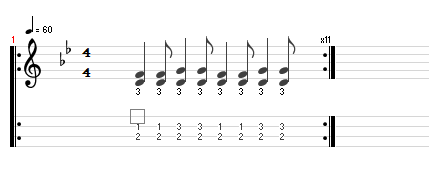
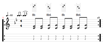
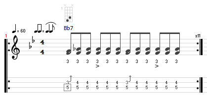
  1. [TuxGuitar (*.tg) file] Teach vamp… with and without “swing feel”
    image, notation and tab for lessonimage, notation and tab for lesson
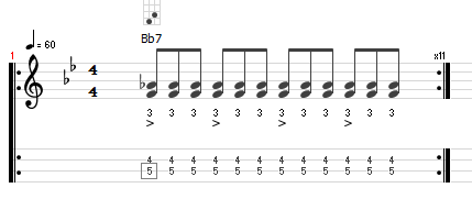
  2. Teach lick… Swing feel makes no difference. Why? Bends and slides cool, ambiguous major/minor 3rd
    image, notation and tab for lessonimage, notation and tab for lesson
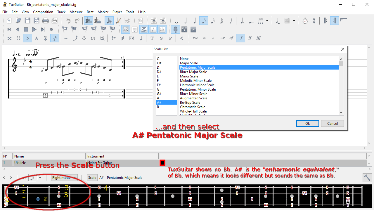
  3. [TuxGuitar (*.tg) file] Teach scale and fingering…
    Hand position… keep thumb behind, hand cupped; hammer on
    “Blues Major” and “Pentatonic Major” are different… how?

    image, notation and tab for lesson
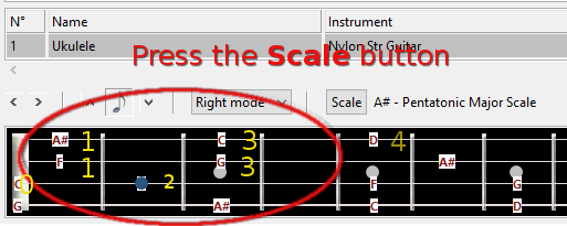
    Fingering

    image, notation and tab for lesson

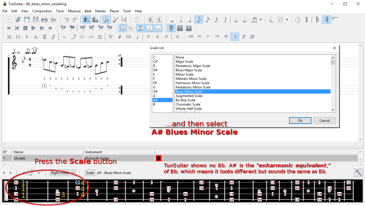
  4. [TuxGuitar (*.tg) file] Teach scale and fingering…
    Hand position… keep thumb behind, hand cupped, pinky hovers over frets
    “Blues Minor” and “Pentatonic Minor” are different… how?

    image, notation and tab for lesson
    Fingering

    image, notation and tab for lesson

Those are nearby, convenient Bb major and minor pentatonic scale patterns that form a perfect segue into ‘TuxUkulele.’

On the SMART board

(keep this short, unless everyone has a computer with TuxGuitar on it)

  1. Launch TuxGuitar, then open ukelele template
  2. Add swing; tempo <= 60; key Bb 
    • Opportunity to show conducting pattern  
  3. Show scale; play 1st position pattern (2 notes/string) for and with the learners 
  4. Show notes;
  5. Show chord symbols;
    • Opportunity to use conducting pattern  
  6. Repeat for lick (if time and engagement allow)

Back in the real world

  1. turn off software (or use purely as metronome)
  2. listening time
    • Robert Johnson Crossroad Blues [Show lyrics]
    • Charlie Patton 34 Blues [Show lyrics]
    • Howlin’ Wolf Killing Floor [Show lyrics] Is this still “swing feel?” (“straight 8ths”)
  3. Identify lyric pattern, 2+1 form
  4. play, student conductors, etc.
  5. Easy Tux Blues, (using tritone relationship) [TuxGuitar (*.tg) file]

§

Resources

How to read music – Tim Hansen [TEDEd Lesson]