Dec 13

Mind mapping, concept mapping—making the relationships between ideas visible

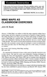
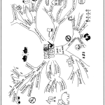
In his 2004 article published in The Journal of Economic Education John Budd describes an in-class exercise “…in which small groups of students each create a Mind Map for a specific topic.” He says creating mind maps is “…an example of an active and collaborative learning tool that instructors can use to move beyond “chalk and talk” …and incorporate diverse learning styles.” The author presents ideas for mind map topics for a wide variety of economics courses, and several lovely examples of students’ maps, drawn freehand and collaboratively. “hierarchies and associations flow out from a central image in a free-flowing, yet organized and coherent, manner.”Mind Maps can be lesson planners, lesson plans, and lessonsFirst page of article, Budd (2004)  about Mind Maps
There is now a good selection of mind- or concept-mapping software educational experience designers may find very helpful in making thinking visible, by offering ways to illustrate the connections between ideas. Nearly all of them are built for Internet collaboration. My goal in this post is just to share an inkling I’ve been getting that such software can find a role in lesson planning, lesson plans, and as John Budd and others have found, in the lessons themselves.

I wrote about one such program, Compendium, back in March, and I’ve tried my hand at mapping an understanding of cognitive apprenticeship. First I simply listed the pieces of the Collins, Brown and Holum (1991) framework, assigning symbolic icons to imply their role, positioning them visually so as to reflect their hierarchy. Then I use colour-coded arrows to indicate relationships between them. In the software these objects can all be opened as dialog boxes, which can store further details. “Mouseover” or “rollover” effects (anything the software does in response to a user placing their mouse pointer over something on the screen) let you peek inside.

UPDATE: I learned 2012-12-15 in Compendium Institute Newsgroup Digest #1389, that Compendium will receive a long overdue overhaul, and the source code seems to be finding its way to more friendly repositories. This recording of a Compendium developer meeting contains details, and may also be of interest to see how Compendium is used to add idea-mapping to the task of recording minutes. The recorded meeting demonstrates another technology-based approach to making thinking visible (and audible).
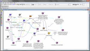
attempted Mind Map of cognitive apprenticeship

Fig. 1—Mapping the Cognitive Apprenticeship Framework
Trying to cover all the bases: making thinking visible while designing a lesson. Icons, positioning, colours, arrowhead direction have meaning, follow the designer’s logic… (cont…)

Two close-ups of the maps within (neither completed):
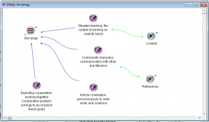
Map of Sociology of a learning experience

Fig. 2— Sociology
…general priorities and strategies unfold: coloured arrows illustrate relationships to and betweenthe ideas; each item can become a map of future brainstorming. Big questions asked here, “Have I planned for this?” “Who are my experts?” get deep answers at the next level…  (cont…)
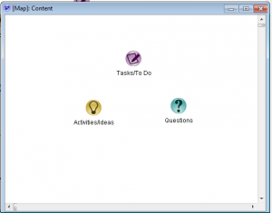
compendium mind map

Fig. 3—Content
…where you can be clear and specific about content, methods, and activities. Compendium and similar software let you add lists, links, video, documents, and to publish the results.

These maps list the parts of the framework. In Compendium you can draw additional items as you brainstorm and you can put terms “inside” other items, for example double-click the Content->Questions icon and find the actual questions stored inside. You can label the lines, change the directions of the arrowheads or put arrowheads on both ends. You can also export an interactive version in HTML [also here and here] and other formats.

Wikipedia has a list of free and proprietary mind-map and idea mapping software. I’d like to try it all at some point but thus far I looked at “VUE,” or Visual Understanding Environment, a project at Tufts University. I found it to be very intuitive, it has a large and versatile set of features, produces a result similar in many ways to that of Compendium, and it can be used as a unique and powerful presentation tool. Also like Compendium they have a user community and a gallery that will tell you far more than I possibly can.

Budd points out some very significant differences between the mind map and the traditional, linear outline and states these have powerful implications for learning:

…note that each branch is captured by a single key word, not a phrase or sentence. Using single words reduces ideas to their core. Important ideas are not obscured by extraneous words, and new associations are not limited by more specific phrases. …The central point in the Mind Map must always be an image because the brain is drawn to an image more …differences in the size of the branches and the associated words are used to reinforce associations and to add emphasis. …the use of color is important in creating Mind Maps. …many Mind Maps use one color for each major category to aid in organization. …These differences can make Mind Maps powerful tools. …Research on memory and learning emphasizes the importance of associations, and the radiant structure of a Mind Map with explicit branches promotes associations. The use of color for different categories can also make more powerful associations. The use of emphasis in a Mind Map, for example with thicker main branches and larger printing, can also help the recall of information. The focus on using single key words can foster more expansive connections, and confining the entire Mind Map to a single piece of paper allows one to see the entire picture at once and perhaps stimulate additional associations.
(Budd, 2004:37-8)

Student-produced Effects of Labor Unions

Budd (2004) fig. 3 Student-produced Effects of Labor Unions

I should note that John Budd’s article is accompanied by samples of hand-drawn maps that, in my opinion, also reveal how far technology still has to go to match humans’ capacity for expression. Neither Compendium, nor from what I’ve seen so far VUE, has the ability to vary the width of connecting arrows, let alone supply the “branches” of a map with bark [n.b. Since first writing that sentence I’ve seen many others that do thicknesses (still no bark). See “Vic’s list” at the end of this post]. Educators can do much to influence the design of software by engaging directly with software developers and designers on social networks like Twitter. You do not need software to use mind maps in lesson plans.

Mind Maps can be used to add active and collaborative learning to courses. Students are engaged in active learning as they wrestle with ideas, associations, and categories in creating a Mind Map-they are creating their own Mind Map, not simply looking at one created by the instructor. The exercise is collaborative because the Mind Maps are created as a small group effort. A collaborative relationship between the instructor and students can also be established as the instructor helps with the constructions of the Mind Maps, but as a “guide on the side” not as the “sage on the stage” (Budd, 2004:42).

Because of the reliance on hierarchies, says Budd, concepts or classroom exercises that do not fit traditional outline structure are probably not good candidates for the creation of a mind map. Even in early explorations of collaborative concept mapping software I’ve noticed, in forum discussions and newsletters, a common motif that points to another criticism: mappers often say things like “this works for me” while maybe the internal logic isn’t quite as apparent to everyone. I believe such criticism can be overcome by perseverance, collaboration and openness to feedback.

I’ve experimented using Compendium to take notes in meetings, for sorting research, choosing between possible software solutions, and for planning (Conole & Fill, 2005). I’m now very interested in presentations using VUE. When it comes to mind mapping software I now often find myself saying, “This works for me.”

SOFTWARE SITES, in their own words:

The Compendium Institute (Open University and others) is an open forum for the ongoing development and dissemination of the Compendium methodology and software tools. Compendium is about sharing ideas, creating artifacts, making things together, and breaking down the boundaries between dialogue, artifact, knowledge, and data. http://compendium.open.ac.uk/institute/

The Visual Understanding Environment (VUE) is an Open Source project based at Tufts University. The VUE project is focused on creating flexible tools for managing and integrating digital resources in support of teaching, learning and research. VUE provides a flexible visual environment for structuring, presenting, and sharing digital information. https://vue.tufts.edu/

What surely must be the definitive list, “Vic’s compendium of software that supports knowledge management and information organisation in graphical form. Includes mind mappers, concept mappers, outliners, hierarchical organisers, KM support and knowledge browsers, 2D and 3D.” http://www.mind-mapping.org/

§


Reference

Budd, John W., (2004) Mind Maps as Classroom Exercises, The Journal of Economic Education, Vol. 35, No. 1 (Winter, 2004), pp. 35-46. [Available on line but missing accompanying graphics
www.legacy-irc.csom.umn.edu/faculty/jbudd/mindmaps/mindmaps.pdf, retrieved 2012-12-10]

Cognexus.org, recorded meeting 2012-12-12, Compendium Developer meeting, http://www.cognexus.org/Compendium_Futures/2012-12-12_C_Developer_Meeting.wmv, retrieved 2012-12-16.

Collins, A., Brown, J.S., and Holum, Ann (1991), Cognitive Apprenticeship: Making Thinking Visible, American Educator, [1991 reprint available on line at http://elc.fhda.edu/transform/resources/collins_brown_holum_1991.pdf accessed 2012-09-17].

Conole, G. and Fill, K. (2005), A learning design toolkit to create pedagogically effective learning activities, Journal of Interactive Media in Education 2005(08). [jime.open.ac.uk/2005/08].

McLeod, S. A. (2010). Kolb, The Learning Style Inventory. Retrieved from http://www.simplypsychology.org/learning-kolb.html 2012-12-03

Multimedia Learning by Richard E. Mayer (2009)
Dec 09

Educators see Twitter at the hub

Twitter infographic

Authenticity in learning can be understood as the extent to which the learning is situated within a practising community of people who share some united interest in the knowledge being sought or produced, and a common idea of its meaning and value, “…who share a concern or a passion for something they do and learn how to do it better as they interact regularly” (Wenger, 2006) Sociology is an integral element of the authentic learning environment.

  On Twitter’s 140-character limit…

Several authors have argued that rather than this being a drawback, this characteristic offers benefits for learning. Educause (2007) suggests this helps develop skills “in thinking clearly and communicating effectively”. Rankin (2009a & 2009b) notes that this forces students to focus on a central point. Dunlap & Lowenthal (2009) argue that communicating in this style is a “professionally useful skill for students to develop”.
…However this aspect of Twitter, …has also been blamed by academics for contributing to declining English writing skills (Kelley 2010).

There is now plentiful evidence that a growing number of educators, and many more who think of themselves as stakeholders in education generally, are using social networks, and more than a few sites and software applications have emerged to compete for parents’, students’, teachers’ and administrators’ attention, everywhere, all at once. There are powerful new ways to create, manage, and share your own resources and an overwhelming number of great resources available from others. While a site like Pinterest may drive a great deal of traffic to blogs the micro-blogging tool Twitter’s unique feature set has helped establish its role at the hub.

3 Ways Social networking impacts and supports learning

Social networking platforms and tools are already impacting and supporting learning in at least three ways. First, social networking itself is a tool with a skill set for learning. Second, social networking can be used to deliver and enhance curriculum. And third, social networking can be utilized to create learning experiences in collaboration with others. Teachers find individual articles such as 30 Twitter Hashtags For Science Lovers and 50 Ways to Use Twitter in the Classroom immensely helpful, but if my own timeline is an indication, they do add up! Most of probably hundreds of such no-doubt wonderful ideas often get swept away in the “digital noise.” A classroom teacher’s bookmarks can include Edmodo, YouTube, and Facebook, Teachhub, PBL-Online and Edudemic, but it’s increasingly clear that Twitter is the choice to join these spokes at the centre.

New Twitter users commonly describe an experience curve that travels from scepticism, trial participation, conversion (getting it), dramatically increasing usage and connections (Levine 2007, Stevens 2008, Seimens 2008, Shepherd 2009) through to potential overload (Sierra 2007).

Teachers use Twitter to plan field trips, chat with industry professionals, connect classrooms, facilitate research, post supplementary materials, to engage students in the classroom, parents outside the school, and colleagues and administrators in networks they can design according to need and interest.

It’s not surprising to learn that “design of teaching strategies and practices related to virtual engagement and collaboration is instrumental to achieving positive educational outcomes,” but some early research suggests not all are equally ready, that students may need “…to improve their capacity to initiate self-directed, collaborative practices as a means to more effectively take ownership of their learning” through incorporating new technology. (Junco, Elavsky, and Heiberger, 2012). Similarly for teachers, learning to use Twitter to grow an effective Personal Learning Network (PLN, a.k.a. Community or PLC) is not the same as learning to use it as a tool in a learning situation, in or out of the classroom.

What you Tweet, when you Tweet it, the length of your Tweets, whom you retweet and who retweets you are all factors in getting established on Twitter. You can over-use hashtags or under-use them, and good use of images in tweets can make your tweets up to twice as engaging.

TweetStats is a service that reveals a great deal of information about how people actually use Twitter. One tab shows how many Tweets happened, when, in reply to whom, from what kind of device, and top retweets for a particular user. On another you can visualize the data as a word cloud1 (called a TweetCloud, naturally) of top mentions and topics, and once you’ve done so for an account you can track follow and unfollow stats from that point forward. If you have an idea of a rubric2 demonstrating engagement and on-task behaviour, or other standards you wish to establish, either for your personal learning community or a learning experience you design, TweetStats can already report some enlightening information. It seems to me this is a direction in which educators can push for development, or show initiative by launching their own open source projects.

As a stakeholder in on line education, what other sets of data would you like to see in statistical reports? Must diagnostic, formative and summative assessments be built in? How would you do that? What would it look like?

§


Notes

  1. From visual design, a word cloud is a form of weighted list, a visual representation for text data. Usually the importance of each tag, word or phrase being highlighted is represented by variations in font size or color.
  2. A rubric is a measuring tool that experience designers can use to assess participant learning and engagement. Using a set of criteria and standards directly tied to the stated learning outcomes, educators can assess each student’s actual performance. When a rubric is agreed-upon and communicated prior to the student’s work being completed, it serves as a model or exemplar, and makes the grading process clear and transparent.

Reference

Brown, J.S., Collins, A., and Duguid, P. (1989). “Situated Cognition and the Culture of Learning.” Educational Researcher, 18(l), 32-42.

Davis, Gordon B., Editor (1986) Understanding The Effectiveness of Computer Graphics for Decision Support-A Cumulative Experimental Approach, Communications of the ACM, Vol 29 (1) 40-47.

Dugan, Lauren (2012) How Frequently Should You Tweet? [STATS] posted October 30, 2012 on AllTwitter The Unofficial Twitter Resource http://www.mediabistro.com/alltwitter/how-frequently-should-you-tweet-stats_b30568.

Ferriter, William M. (2010), Why Teachers Should Try Twitter (Meeting Students Where They Are), Educational Leadership, 67(5) February 2010, pp 73-74;
[Available on line http://www.ascd.org/publications/educational-leadership/feb10/vol67/num05/Why-Teachers-Should-Try-Twitter.aspx, retrieved 2012-11-30].

Junco, Reynol; Elavsky, C. Michael; and Heiberger, Greg (2012), “Putting twitter to the test: Assessing outcomes for student collaboration, engagement and success” British Journal of Educational Technology [Early View, Article first published online: 1 MAR 2012 available from author’s site: http://reyjunco.com/wordpress/pdf/JuncoElavskyHeibergerTwitterCollaboration.pdf, retrived 2012-11-30]

Lave, Jean and Wenger, Etienne (1991). Situated Learning: Legitimate Peripheral Participation. Cambridge: Cambridge University Press.

Lave, Jean (1996). Teaching, as Learning, in Practice, Mind, Culture, and Activity (3:3) pp149-164.

Webducate [‘webducate.net’ website/blog] (2012), Twitter in learning and teaching – literature review http://webducate.net/2012/08/twitter-in-learning-and-teaching-literature-review/, retrieved 2012-12-03

Wenger, E. (2006) Communities of practice, a brief introduction, http://www.ewenger.com/theory/, HTML retrieved 2011-11-03 or http://wenger-trayner.com/wp-content/uploads/2012/01/06-Brief-introduction-to-communities-of-practice.pdf, PDF retrieved 2011-10-03.

Dec 02

Some best practices for posting infographics?

As often happens when we go searching the web for something, I ended up with something else, and learned something different than I started out to learn. I was searching for statistics about social media. I soon discovered how pervasive infographics have become, even compared to six months ago. When done well they are clearly very good at presenting data quickly and coherently. But there are some other things I expect when I go searching for data, and they seem to be as easily overlooked as they could be to include, if only we take the extra couple minutes to consider. I believe I’ve also seen some hints that with infographics it may even be easier to misrepresent and distort data than with such well-known devices as bar graphs, and well understood yet often repeated practices such as moving the origin to influence scale.Infographic

UPDATE: Accessible Image Maps (below, under Presentation)

From Wikipedia:
Information graphics
or infographics are graphic visual representations of information, data or knowledge intended to present complex information quickly and clearly.[1][2] They can improve cognition by utilizing graphics to enhance the human visual system’s ability to see patterns and trends.[3][4] The process of creating infographics can be referred to as data visualization, information design, or information architecture.[2]

Infographics aren’t new. The article above links their origin to cave paintings. I remember posters in my doctor’s office in the 60s that fit the description. Neither myself nor most of the adults in the waiting room would have been likely to pick up a peer-reviewed journal or seek out the study that uncovered the data being presented. There would likely be some fine print in the corner that indicated who prepared it, and you could track it down if you were interested. In the information age and on the World Wide Web that would be both lazy and unacceptable. For end users with sight, graphic presentation of data on the Web may be even more effective in some cases.
Whether graphs are actually superior to tables—in business decision-making, for example—has been a bone of contention for some time (e.g., Davis, 1986:46-7). I would suggest that on the World Wide Web the ability to select, copy and paste the text in a tabular display would in many cases be more satisfactory to many end users than an attractive display that was perhaps not as portable.

File Format

One “solution,” or perhaps just a happy accident, is that many infographics are posted as PDF files1. These can support embedded links, can be downloaded and printed maintaining the integrity of the original (and its copyright notices, etc.) and in many cases support copy/paste. PDF files can be made accessible; that becomes a process that must be included in the development cycle. As I’m writing this, it should be noted, only certain WebKit browsers—Chrome, Konqueror (Linux) and Safari  (Mac only)—display PDF files without additional software. Native and open formats like PNG are more universal. In my opinion SVG is the one to watch. It’s a “vector” graphic format, which means it maintains quality at any size. Most newer browsers will display SVG, and the spec contains some very exciting abilities of the “coming soon” variety, such as zooming, timecode and animation, that should greatly enhance our ability to organize and communicate the meaning of data. In either case you should put references, links, and anything else your visitor may want to know that isn’t in the data itself in plain text in a caption underneath. If you’re on WordPress there’s a caption box in its standard image upload form you can use. Regardless of platform this should be relatively easy and may go a long way to advance the usability and usefulness of your data.

Data Obfuscation

Infographics may contain mixtures of several types of data display, including graphs and tables. All of the abilities to distort and misrepresent data, whether intentionally or not, are therefor multiplied. A prime example is this infographic released by the US Republican Party to convince their constituency why they believed the Affordable Care Act was a bad idea. A combination of  illogical colour use, bad layout, poor choice of fonts and font-size, meaningless relative proportions and little white space make the system it claims to represent look overly complex, and to many perhaps, even ugly.

Republicans Party version of a graphic purported to represent ACA flowchartOn the site where this lives commenter Nick Dobbing, founder and principal designer at Wovenland Systems in Vancouver points out, “Notice all the bright primary colours in the chart, all the many different shapes, with no sense or order in the way they’re used. No help to anyone sincerely trying to comprehend the diagram… but boy howdy, it sure makes it look more complicated! And that’s all that this diagram is about.” When other designers redid the graphic with a commitment to display the information with integrity  it looks quite different.
Citizen designer Robert Palmer's graphic representing ACA flowchart

I encourage you to read Robert Palmer’s

Open letter to Speaker John Boehner from citizen designer Robert Palmer of California infosthetics.com

I’ve included only the portions relevant to my discussion.

  • I have removed the label referring to “federal website guidelines” as those are not a specific requirement of the Health and Human Services department. They are part of the U.S. Code. I should know: I have to follow them.
  • I have relabeled the “Veterans Administration” to the “Department of Veterans’ Affairs.” The name change took effect in 1989.
  • In the one change I made specifically for clarity, I omitted the line connecting the IRS and Health and Human Services department labeled “Individual Tax Return Information.”

Robert Palmer
Resident,
California 53rd District

Presentation

Many sets of data may form lovely graphics that are nonetheless too large and complex to fit a single browser window. In my experience a popular solution is to make the graphic longer, not wider. This is in keeping with a standard web mantra that vertical scrolling is okay, horizontal scrolling is bad. I’ve read recent reports that scrolling is less a big deal to those who’ve grown up on the mobile web, and it’s easy to find designers who agree. I’m a centrist in this case, I much prefer to get what I came for front and centre, but I’ll adapt and go with the flow—if it’s clearly a flow, not an eddy.

Accessible image maps are also worth considering. At minimum you must use ALT tag in the main image, and later in each hot spot. (Penn State, 2012)

The future

Designers are still discovering new abilities within HTML5. A feature with many yet-to-be-tapped applications is the new data attribute that can be applied to any element. Source code for a legacy tag that displays an infographic image might look like (press letter M to widen)
<img src="path/to/infographic.png" alt="Description of image">;
we call img the element, src and alt are its attributes. We can now add custom attributes that begin with data- and retrieve them easily with JavaScript (and even more easily with jQuery). For example,
<img id="myInfographicWithDataAttributes"
  data-mySource="Fouchaux (unpublished manuscript), Answer to the Ultimate Question of Life, The Universe, and Everything"
  data-mySourceURL="http://not-in-our-lifetime.com" src="path/to/infographic.png" alt="Description of image">

You can create a new object and retrieve the value
myData = $('#myInfographicWithDataAttributes').data();
What you called data-mySource and data-mySourceURL are now available as myData.mySource; and myData.mySourceURL


Conclusion

I think I’m getting some ideas about possible best practices for posting infographics. Please use the comment section to critique my suggestions and to offer your own.

  1. The most useful format when the graphic contains links, references end users may want to paste into a Google search, or the document is to be printed or downloaded is PDF1. However, currently only WebKit-based browsers: Chrome, Konqueror (Linux) and Safari for Macintosh can display PDF without additional plugins, PDF files can be large, and they require extra care to assure accessibility.
  2. Unless I absolutely need my audience to download and print I’d be inclined to post a PNG (all browsers) or SVG (all newest browsers) image and include links, references and citations in a plain text caption underneath.
  3. Mayer’s principles of multimedia design, especially concerning coherence and spatial contiguity, apply. Good use of whitespace, a sensible colour scheme are key, but these are indicators of good design in any medium. Illogical colour use, bad layout, poor choice of fonts and font-size, can obscure, distort, and render meaningless any set of data.
  4. I’m personally not a fan of long, skinny and scrolling. Unless the data demands otherwise I’d try to keep all the information visible at once. If scrolling is necessary there’s still general agreement that it should be vertical.

Further reading

The United Nations Statistics Division Knowledgebase on Economic Statistics offers these Making Data Meaningful guides that are “…intended as a practical tool to help managers, statisticians and media relations officers in statistical organizations use text, tables, charts, maps and other devices to bring statistics to life for non-statisticians. […] The first guide provides guidelines and examples on the use of effective writing techniques to make data meaningful. The second guide provides guidelines and examples on preparing effective tables, charts and maps, and using other forms of visualizations to make data meaningful. It also offers advice on how to avoid bad or misleading visual presentations. The third guide aims to help producers of statistics find the best way to get their message across and to communicate effectively with the media. It contains suggestions, guidelines and examples.”

PENN State’s Image Maps in HTML explains image maps and how to make them accessible.

§


Notes

  1. Note that PDF (in strictly speaking) is not an image format, but a scriptable rich text document format that can contain different types of multimedia content, including vector and bitmap graphics, audio, video, forms, intra- and inter-document hypertext links and a hierarchical contents listing. You should handle accessibility outside the web browser before attaching your PDF.

Reference

Davis, Gordon B., Editor (1986) Understanding The Effectiveness of Computer Graphics for Decision Support-A Cumulative Experimental Approach, Communications of the ACM, Vol 29 (1) 40-47. [PDF]
Dugan, Lauren (2012) How Frequently Should You Tweet? [STATS] posted October 30, 2012 on AllTwitter The Unofficial Twitter Resource http://www.mediabistro.com/alltwitter/how-frequently-should-you-tweet-stats_b30568

Penn State (2012) Image Maps in HTML, http://accessibility.psu.edu/imagemaps, accessed 2012-12-02

Educase Learning Initiative (2012) http://net.educause.edu/ir/library/pdf/ELI7052.pdf